Android has come an unbelievably long way from the first time I used the operating system in 2009. In fact, it wouldn't be much of a stretch – if at all – to say Android has come a long way in every single update since Android 1.6 Donut.
The interface has drastically changed several times. The most drastic and recent interface changes are straight from Google's own Matias Duarte, the brain also behind the famed webOS interface. Quite a few unique features have surfaced in recent updates, too, such as Face Unlock, multiuser support (for tablets), external and wireless display support, incredible performance tweaks, Google Now and many more.
The platform has matured, collectively, in appearances, performance, ecosystem and in functionality faster than any other mobile operating system.
Of course, it still isn't perfect. And despite a bevy of new features being added just last year, there are functions many of us still long for. With Google I/O scheduled for May, the next Android update is likely approaching quickly. And while it's impossible to say what exactly Google is cooking up for what may be Android 4.3, 5.0 or something in between, Key Lime Pie is all that's on many Android enthusiasts' minds.
I have been using Jelly Bean off and on ever since it was first released on a multitude of devices: Galaxy Nexus, Nexus 7, Galaxy Note II, etc. And last week I finally started using stock Android 4.2.1 full-time. It's a wonderful update, but there are just some things that feel half baked or are missing altogether.
Below, I have listed some of the smaller requests I have for Key Lime Pie.

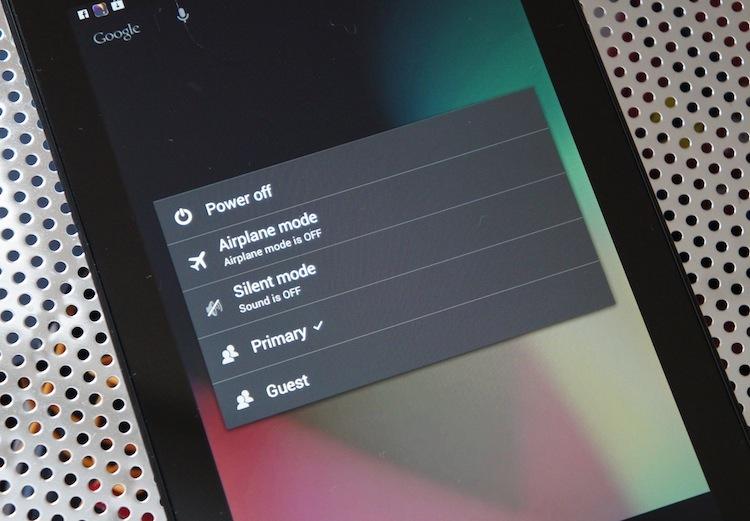
In Jelly Bean version 4.2, the Android developers added one of the most requested features to the mix, multiuser support. Unlike smartphones, tablets are devices that are often shared amongst entire families, much like laptops or other devices that aren't necessarily as personal as a smartphone. Problem is, mobile platforms aren't setup for multiple users quite like a desktop OS is.
Before Jelly Bean, there was no feasible way to switch users, to login or logout and to separate your apps and accounts from other users of the device. I honestly haven't dealt with this feature a whole lot since the 4.2 update. But I do have one major complaint: it doesn't work on smartphones.
Stay with me. I don't plan to share my phone with a ton of people. I don't plan on letting them use my phone for Facebook, to browse the Web or much of anything else, especially not as things currently are. I don't need support for multiple users on a smartphone. Few do. So I can certainly understand why Google made the feature specific to tablets. However, a guest mode – that prevents access to SMS, phone storage and anything besides what the owner deems appropriate without a password – would be fantastic.

In version 4.2, one of Android's most distinguishing feature which typically adorn users' home screens, widgets, found their way to the lock screen. That's right, you can now choose from a select portion of widgets to apply to lock screen pages to the left of the standard lock screen. And the camera can now be quickly accessed from the lock screen with a simple right-to-left gesture from the right edge of the display.
As cool as lock screen widgets may sound, the functionality is quite limited. There are third-party applications that allow much more customization and allow all widgets to be applied to your lock screen. But I've tried them and they're simply not my cup of tea.
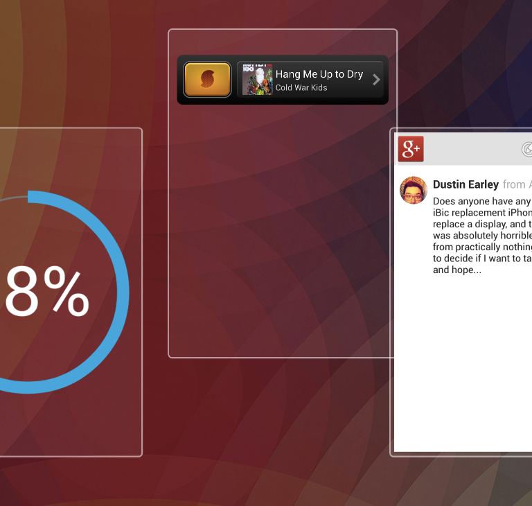
In my use, I have only used a single widget on my stock lock screen. SoundHound ∞. I hit the power button, swipe left once and tap the orange button to discover the name of a song. However, like the digital clock widget on the main lock screen, the SoundHound ∞ widget is only 4 by 1, at least by the home screen grid. Widgets for the lock screen are quite limited and only one widget can be applied per lock screen. What that means is I would have to swipe twice to access the Calendar widget from my lock screen and a third or fourth time for any other widgets I wanted to add to the mix. This is hardly any faster than simply unlocking the phone and flipping to the widget.
I don't need a ton of widgets on my lock screen. But it would be nice to be able to apply more than one to a single lock screen. And it would be great to be able to change the default lock screen.

One area where other platforms have effectively left Android in the dust in is image sensing. More specifically, taking photos in poorly lit areas or at night.
The Nokia Lumia 920, for example, excels in low-light performance. And with the right app and a very steady hand, so can the iPhone. This is because the shutter speed has been tampered with. Nokia fixed the Lumia 920's PureView camera within a housing of springs which offers optical image stabilization. This allows the shutter to be kept open longer so more light can be captured, thus resulting in a low-light photo of an entirely different caliber from effectively every other smartphone.
With the iPhone, there are a handful of applications that allow the user to toggle the shutter speed. You don't have the same level of control you would have over, say, an SLR. But using applications like these, you can get some pretty awesome nighttime shots. (See image above, for example, which was taken with the iPhone 5 using the 645 PRO app and a slower shutter speed.)
With Android, this is a pipe dream. There are no applications that offer adjustment to the shutter speed. This is mainly because every Android manufacturer uses a different image sensor, meaning they all have different drivers. However, it would be possible – at least from my understanding – for Google to develop a broad API for adjusting shutter speed within the camera application and third-party manufacturers could implement the feature at will.
This one is a very long shot … but I'm keeping my fingers crossed.
![]()
I wrote about this just a few hours ago. But I can't write this article without at least mentioning it. I use all sorts of instant messengers, SMS, email, and social media clients. I have accounts for everything and am constantly using a handful of services at a time to communicate with everyone.
A large portion of those services are Google services, yet they all require separate applications and do not at all synchronize. Google Talk and Google Messenger overlap almost entirely, yet they are totally different services – one offers features the other doesn't, and vice versa. Gmail, Google+ and Google Voice all have their own applications, too. But there is a simple way all of these services could be combined into a single product without losing any value whatsoever. It would also make for a universal inbox of sorts which, effectively, would kill two birds with one stone.
Luckily, there is a Chrome OS leak that suggests an all-in-one Google chat application is on the horizon. Fingers crossed that Google doesn't simply launch it on Chrome OS and brings it across the board.

Another much-requested feature that Google added in Android 4.2 was Quick Settings. From the notification shade, you can tap the icon in the upper right corner to access a control panel that offers toggles and fast access to some of the most important settings. You can also perform a simple two-finger drag downward from the top of the display to access this panel without opening the notification shade.
Here's my problem: the two-finger swipe downward only sometimes works. If your fingers don't hit the display at approximately the same time, the notification shade opens instead of the Quick Settings panel. And something about opening the panel and hitting the Quick Settings button doesn't seem intuitive or time-saving. Don't get me wrong, it's a great start.
But there is a lot that could be done to make it better. For example, by Samsung's quick controls, which simply dwell above notifications in the notification shade, it takes one swipe and one tap to toggle Wi-Fi on or off. The stock Android Quick Settings requires three or four interactions to perform the same task. (Tapping the Wi-Fi tile in the Quick Settings page opens the Wi-Fi view in Settings instead of simply toggling the connection on or off). There is work to be done, Duarte!
Android has come further than any other mobile OS available – new or old. But that doesn't mean it's time for Google to rest on its laurels. Google is now known for pushing the envelope with Android, and it should take that and run with it.
We all expect Key Lime Pie to be one of the best Android updates to date, and it would be especially great for the platform, seeing as its largest competitor, iOS, is catching flak at every turn for growing stale and boring. Here are the features I want to see in Key Lime Pie. I have no idea how possible or likely any of them are, but a man can dream!
Tell us in the comments below what you hope or think we will see in Key Lime Pie later this year!