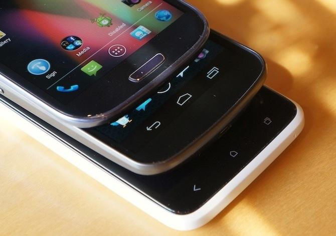
When the Samsung Galaxy S III was first announced, the most overlooked feature was probably the navigational button layout, one physical Home button and two capacitive buttons for Menu and Back.
It's expected that Samsung's international devices – where the Korean company will be less likely to be sued by Apple – will come with home buttons. But in the past, all of its U.S. models have come with either all capacitive or all physical navigational buttons. We expected the Galaxy S III would be no different, that alterations would be made to the design for the U.S. models.
We were most definitely wrong.
Every model of the Galaxy S III (that I'm aware of) has a capacitive Menu button on the left, physical Home button in the middle and a capacitive Back button on the right. And this configuration – along with the actual design of the phone – was easily one of my least favorite aspects of the Galaxy S III.
That gripe carried through my firsthand experience with the device. Throughout my review period with the Galaxy S III, I constantly found myself tapping the button, as if it were capacitive and didn't require any pressure, instead of fully depressing the button. This ultimately led to me tapping a time or two more before realizing I wasn't pressing the button. By the time my review period had ended, I still found myself tapping the button. I hadn't taught myself to press instead of tap, even after a week or so with the device.
Then came the Galaxy Note II, which I had been anticipating all year. It, too, came with the same button configuration. A capacitive Menu button on the left, physical Home button in the middle and a capacitive Back button on the right. And it looked almost identical to the Galaxy S III, only larger with more squared corners.
It was just moments after getting the press materials from Aaron in an email that I decided that I would probably hate the device. I assumed I would never get over the button, that it would only frustrate me to the point where I hated using the phone.
After all, that's what happened with the Motorola DROID X and the HTC myTouch 4G. Despite being a long-time BlackBerry user, I have never liked any Android phones with physical navigational buttons. Not a single one.
That said, after having the Galaxy Note II for a few days shy of a month, the physical button is finally starting to grow on me. (Notice I didn't include it on the list of things I would change about the Note II.) There's a part of me that actually likes an analog button for double-taps and long pressing. For those two particular use cases, the tactile feedback is a nice advantage.
Of course, artificial tactility, or haptic feedback, is available for most phones with on-screen or capacitive navigational buttons. But I hate the feel of haptic feedback and immediately disable it as soon as I configure any phone. Feeling the button click assures me that I have pressed the button, as well as feeling the the button dip below the surface of the glass covering the display.
Not only that, but it also doubles as a way to wake the device from being locked.
The only thing I don't like about Home being a physical button is that it doesn't exactly play nice with the S Pen. There is no way to navigate home with the S Pen through Quick Commands (S Pen gestures), though you can press the button with the S Pen if you're slow and careful. Or you can just use your index finger. But it would still be nice to be able to navigate home using the S Pen.
I never imagined I would say I actually like Samsung's decision to continue using physical buttons. But here I am, saying it with no remorse.
How do you feel about Samsung's unusual navigational button layout, ladies and gents? Do you like the combination of capacitive and physical navigational buttons? Or do you prefer on-screen? Capacitive? All physical?