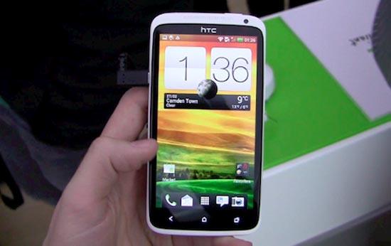
Earlier this week at MWC, HTC took the wraps off of a trio of smartphones that feature both its One branding as well as the new Sense 4 user interface. One HTC executive has used the occasion to touch on previous versions of the Sense UI and how things will be different with Sense 4 and the One series. Speaking to Pocket-lint, Kouji Kodera, HTC's chief product officer, has said that the company simply "added too many things" while moving from the original Sense up to Sense 3.5, explaining that originally Sense was meant to be simple but that eventually the experience become "cluttered." Kodera continued:
"There where too many things in there. Even on the home screen we had four or five icons before consumers got a chance to add things themselves. For the HTC One range we have taken it down to Sense 2 again."
Kodera also said that HTC didn't try to change everything about stock Ice Cream Sandwich with Sense 4. Instead, HTC worked to find keep several ICS pieces intact in order to find a good mix between Android 4.0 and the new Sense.
Back in January, HTC said that it plans to simplify things in 2012 by releasing fewer devices and focusing more on a small lineup of hero devices (something that Kodera reiterated), and this new, refined take on Sense seems to go hand in hand with that decision. HTC's Sense overlay has been criticized in the past for being a tad "in-your-face," so it's good to hear that the company is working to change that and make things a bit simpler for the end user. If you'd like a quick peek at Sense 4 in action, check out the video below, which shows HTC's custom skin in action on a One S. What do you all make of Sense 4 so far? Does it indeed look like HTC has made the overlay simpler to use?
Via Pocket-lint