Just last week, Motorola updated their Ice Cream Sandwich upgrade schedule for their latest crop of handsets. While we've only got a general idea as to when six of Moto's devices (both phones and tablets) will be updated, the good news is that some older devices – like the Atrix 4G – have finally been confirmed to be receiving an Ice Cream Sandwich update.
But for those more recent devices that were branded as "Ice Cream Sandwich-ready," we have no idea when their updates will be dropping. The update schedule provided by Motorola only included Q2 and Q3 as possible windows, but devices like the DROID RAZR, RAZR MAXX, DROID 4 and 10 others are currently in the "Evaluation and Planning" phase of the update. We don't know if this means they will get their updates around the same time as other devices or much later. In fact, for some of the devices that aren't so new (DROID 3, DROID X2, etc.) may not be receiving an update at all. The last line of Motorola's description of the Evaluation and Planning phase reads:
"Please note that some products that enter the Evaluation and Planning phase may not complete the upgrade cycle."
Still, it's good that Motorola is being as open and as transparent as possible about the updates. That's a far cry from software updates in the past. They've released in-depth explanations that detail each major step of the update process and given us a time frame in which we can expect some updates to start dropping. Despite updates taking far longer than they ever should, we can't ask much more of Motorola.
Well, that's a bit of a white lie. For two years now, Motorola has been skinning their Android devices with their own interface. Originally dubbed MOTOBLUR, it was one of the most invasive, in-your-face, aesthetically unpleasing interfaces to be forced upon Android users. While the widgets were some of the first resizable widgets, they were bland and ugly, the icons were cartoonish and it had the tendency to eat battery life for breakfast. Not everyone hated 'BLUR. But, by a long shot, it was far from a fan favorite.
Over time, Motorola started toning their interface down, and they eventually swapped the MOTOBLUR moniker for Motorola Applications Platform (MAP). In some of the most recent iterations, they've actually added some very nice features, like the Webtop and Smart Actions applications.
But since the Ice Cream Sandwich announcement, we've wondered just how OEMs would react to the new holo theme that Google has introduced. Google has long had the dream of removing the need for custom interfaces – not getting rid of them entirely, just creating software that is pretty enough to where it doesn't have to be skinned to look presentable. But once we started seeing leaked images of TouchWiz and Sense UI atop Android 4.0, we kind of lost hope of a better world for those who both enjoy custom skins and the stock interface. HTC's Sense 4.0 is largely reminiscent of legacy Android builds and alters nearly every single aspect of the interface, top to bottom. And Samsung's latest TouchWiz interface more closely resembles pre-Ice Cream Sandwich builds of Android, too.

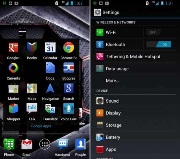
Yesterday afternoon, however, some screenshots of the DROID RAZR's Ice Cream Sandwich build were leaked, revealing a happy balance between MAP and the stock Android holo theme. The home screen touts the stock Android launcher with Motorola's love-or-hate icons. Folders look like they would on the Galaxy Nexus, but the app drawer has a few sort features that are associated with earlier builds of MAP and MOTOBLUR. And the Settings app looks mostly stock with the addition of some MAP icons on the far left side.
It's an interesting combination, to say the least. But it's surprisingly ... bearable. I've never been a fan of Motorola's devices on the software side. I've always loved their hardware – save for their choice in displays – but software has been a sore point in my experience. With the benefits of Motorola's proprietary applications (Webtop, Smart Actions, etc.) and the beauty and simplicity of mostly stock software, I feel like I could actually use a Motorola phone again and enjoy it. That would be a first since the original Motorola DROID.
That said, there are some even bigger benefits to boot. With lighter alterations to the stock interface all around, updates should take far less to complete. That doesn't speak for how long it takes to push an update through the carrier approval process or how long it might take to make the Android source code work with their hardware. But common sense should explain how fewer changes to the software would yield faster turnaround times.
It isn't clear whether this MAP build is a reflection of the close relationship that Google and Motorola have shared as of late, or a byproduct of the pending acquisition. But I would bet that Google is flexing some muscles here. Either way, I'm actually surprised by how nice this update looks and am actually kind of excited for all of those recent Motorola users. May they finally see what life is like with less 'BLUR.
Kudos to you, Motorola, for listening to our crying and whining.
How do you feel about the leaked screenshots, RAZR and Moto users? Do you like the changes? Or are you more partial to the older MAP builds? What about you non-Moto users? Could an update like this in the midst of overbearing interfaces sway you in Motorola's direction?