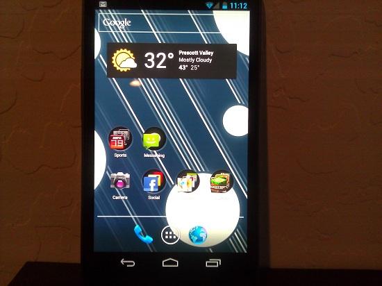
Now that Android 4.0 Ice Cream Sandwich is out and about, and not just in the international markets, the shininess has probably worn off for most of you. Whether that means you bought a Samsung Galaxy Nexus, or you’ve been using it in some variation or another in a custom ROM on your current device, you’re probably used to the operating system now. It isn’t your newest toy anymore, more than likely, and the flare has died down. With that in mind, then the unconscious blackout of irregularities within the OS, or pieces that just don’t work within the whole puzzle may have lifted and you can probably understand where I’m coming from with what I’m going to say. While I think Ice Cream Sandwich is probably one of the most important updates to Google’s mobile OS ever, now that the “new toy” feel has died down, I can officially say that the multitasking menu in Android 4.0 Ice Cream Sandwich is completely pointless.
For those of you who don’t know what I’m talking about, here’s the gist: multitasking has always been a key factor in Android – it’s one of the selling points of the system, and has been since the day it launched to the public. Over the years it’s stayed pretty much the same, with a “recent apps” screen that popped up once you held the Home button long enough. It worked well enough, but just having a “recent apps” screen wasn’t good enough for some people, and so Google changed things up in Android 3.x Honeycomb. For tablets, there was an on-screen button you could press to activate a list of your recent applications, all thumbnails and beautiful to look at. They added that Honeycomb-based feature in Ice Cream Sandwich, and for all intents and purposes it’s a great addition for the smartphone.
But, while it’s been called the multitasking menu, it’s called the Recent Apps list by Google. The on-screen button is always present in Android 4.0 (unless you’re in a game, or watching media), and it makes it easy enough for anyone to bring up a recently used application. But, despite the change in aesthetics and activation, the Recent Apps list is the same exact thing as the Recent Apps screen that was in previous versions of Android. Changes are good, but it only changed at face value, and after using Android 4.0 for a while now, as a daily driver, I realize that it’s more or less pointless.
In all honesty, it’s not necessarily easy for me to write that. Because I can’t sit here and tell you that I don’t use the multitasking menu/recent apps button. But, even when I do, I find myself being more frustrated by it than anything else. I’ve found that the drop-down notification shade and the multitasking menu/recent apps list don’t really play well together. I’ll give you a situation. Let’s say you want to open up a few of your favorite and most-used applications early in the morning, so you can just access them via the recent apps list at the touch of a button. Great, no problem whatsoever with that. However, the moment you get a text message and you drag down that notification shade to access it, the menu loses its footing.
Now that you’ve accessed that text message, if you just hit the Home button to leave the message, the multitasking menu/recent apps list will show you just that text message from that point on, and nothing else. It isn’t a big deal for some, but you’ll have to swipe that Messaging thumbnail out of the recent aps list, and then open Messaging again, to be able to have the multitasking menu reflect just the Messaging app with your list of conversations, rather than just one conversation with one person. Even if you access that conversation from the recent apps list, go back to your list of conversations within the Messaging app, and then go back Home, you’ll be greeted with that conversation in the recent apps list and not the full list of conversations in your Messaging app.
In all actuality, maybe the multitasking menu/recent apps list isn’t completely pointless after all. Maybe, just maybe, it’s just the strange relationship between the menu and the notification shade that has me so confused. After all, the recent apps list does exactly what it says it should, which means that it works, and that’s probably all people ask for. But, when you use it and you’re forced to exit an app, just to have to access it again, it kind of feels like the point has been lost.