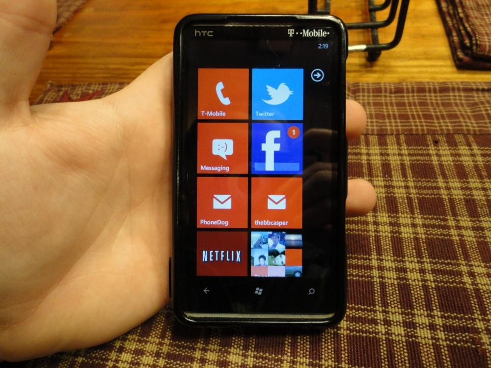
Windows Phone wasn't exactly met with much fanfare when it hit the US shores late last year. Sales have been rather poor and devices have been quickly lost in a sea of Android. At one percent of the US smartphone market share, there is definitely room for improvement. For Microsoft, it all begins with Mango.
Mango, in case you didn't know, is the code name for the Windows Phone 7.5 update that finally arrived on Thursday to the majority of Windows Phone users. The update boasts over 500 features. But I would go as far as to guess that nearly 450 of the new features will go overlooked. They're tiny features we take for granted when using other platforms and slowly begin to notice as time passes with a Windows Phone in your hand. Well, a pre-Mango phone, at least.
I last tried Windows Phone back when the first batch of phones were released. To be frank, I was hardly impressed and happy to be back on Android after the review period was over. But a lot has changed since then. I thought it would be high time to give Windows Phone another crack.
Is Mango enough to allow Window Phone to compete with the likes of Android and iOS? Yes. Is it enough to make buyers choose Windows Phone instead? Read on to find out.
If Microsoft wants to revolutionize the smartphone with Windows Phone, they should have started with the basics: updating. I will admit that updating from NoDo to Mango was a fairly painless process, but it brought back agonizing memories of updating my BlackBerry using Desktop Manager and Windows (desktop) updates. Not only do you have to wait for your phone to backup and for the download to complete, you have to update to update. (Meaning, if you are not on the latest software, you must update to it first, then proceed with the Mango update.) This can become cumbersome and time consuming.
Not having an OTA update was pretty surprising. Well, not really. But I would love to be able to have updated my phone without having to use Windows (bleh). Regardless, updating was relatively painless and at least the majority of Windows Phones received the update at the same time. Good on Microsoft for finally getting this down.
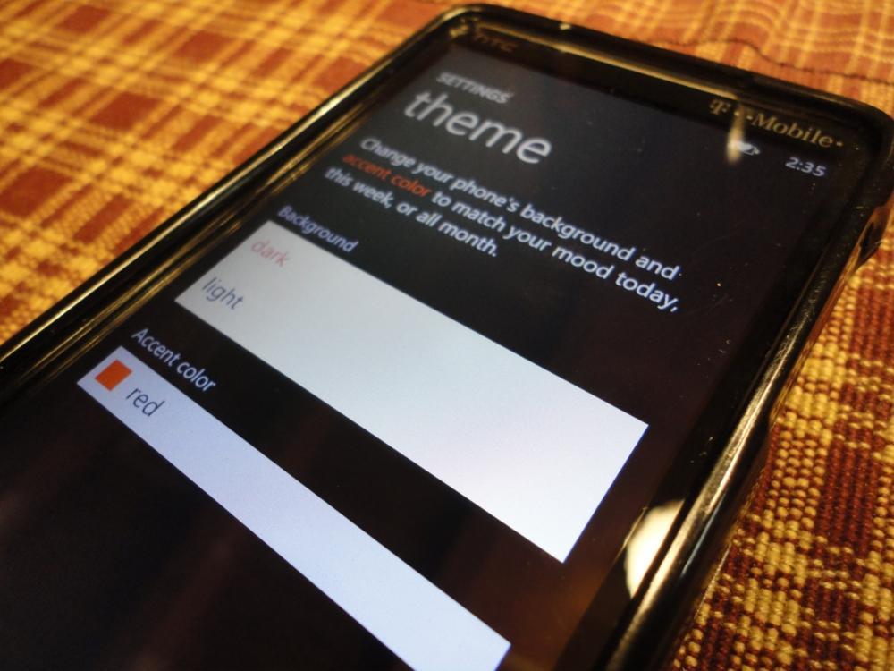
To the untrained eye, the differences in the interface will be mostly minimal. In fact, I had to search around for a while before I really noticed what was different. After playing around with it a bit, I realized just what had changed. The tiles now display more information, and third-party applications have been opened to live tile updating. This both makes the interface quite a bit more interesting and … less drab. It certainly adds to the questionable functionality and viability of the tile interface.
Microsoft also added one extra color into the tile color selection bin. Can you guess which one? But the background colors are still limited to “dark” or “light” (black or white). Quite honestly, I haven't been nearly as bored or uninterested in the interface this go around – quite possibly because it's faster. That said, it still could use a little work. They need to add more colors to the bucket and allow texturized backgrounds if nothing else. A white or black background is plain dismal. The Metro UI isn't terrible, but I want options.
You may recall my first go with Windows Phone. I could not have been more excited to try it out; I was ready for something new … something different. Well, I got what I wanted, but it wasn't quite what I expected. The system performance, overall, wasn't too bad. But launching apps and the subsequent lag was atrocious.
Mango, unsurprisingly, is a great improvement over version numero uno. Applications open much more quickly. Everything is extremely snappy, and performance has been wonderful. I have been using it pretty heavily for the past few days and really haven't encountered any problems. This update shows a lot of promise for Windows Phone and I have been quite impressed, on performance alone, thus far.
Like I said before, there are over 500 new features in Mango. It's impossible to cover them all. So I've picked some of the ones that stuck out the most.
Social integration is obviously one of the bigger implementations in Mango. Integration was there before, but Microsoft really went above and beyond when considering the weight that social media has on a person's use with a phone. Twitter, Facebook and LinkedIn can be found throughout the software, from Me Hub, Person Hub, the Camera app and more.
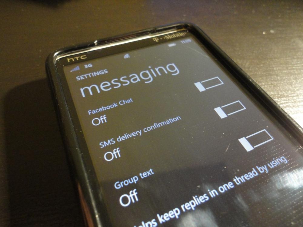
If I'm to be totally honest, I will never use these features. I have always preferred third-party services to built-in, but I did spend quite a bit of time fooling with the integration. You will find a friend stream and people's Facebook statuses within the People Hub. Within Me Hub, you can locate your social notifications, “what's new” (which is a stream of your latest activity) and your social profile. But the greatest integration of all, in my opinion, is the inclusion of Facebook Messages (Chat) in the stock Messages application. So Facebook Messages will show alongside your SMS and MMS. Genius and begs for a rebuttal from competitors. Although I will never use these social integrations, it's nice knowing they are there and Microsoft didn't forget arguably one of the most important factors of smartphones in today's socially driven world.
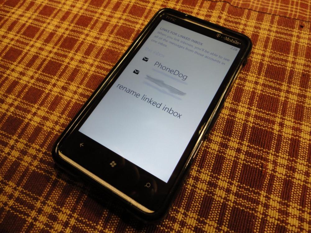
Prior to Mango, emails and messages were not threaded. In other words, instead of grouping conversations together, each text message and email was treated separately. I was definitely happy to see threading in Mango. As tiny of a feature as that may seem to be, threaded emails make a huge difference for me. Also, instead of having a separate tile for each email account, you can group them together and hide them into a single tile. I have a love/hate relationship with this as I hate having separate tiles for each account, but I also hate my mail being merged into a universal inbox. Either way, it's a nice feature to have.
Probably one of the most pleasing experiences in my use with Mango thus far has been browsing. Internet Explorer 9 is quick. And it renders pages very well and much faster with an improved Javascript engine and hardware-accelerated graphics. Pinch-to-zoom was extremely fluid and even challenges the smoothness of the iPhone. There, I said it. I honestly did not expect the browser to be so fast. Kudos, Microsoft.
One of my biggest reasons for sticking with Android, no matter what, has been my investment in the platform itself. Seeing as Android offers free, built-in, turn-by-turn navigation, I got rid of my GPS. I rely on my Android phone to get me from point A to point B. Mango could possibly change that. It now offers turn-by-turn navigation. The problem, however, is that the directions are not spoken, but instead are just listed. This is great to have while in a pinch, but not something I would want to use from day to day, especially in heavy traffic. Nonetheless, it's nice to see at least some sort of navigation in Windows Phone, so if I were to get lost in Charlotte, I could at least read my way out.
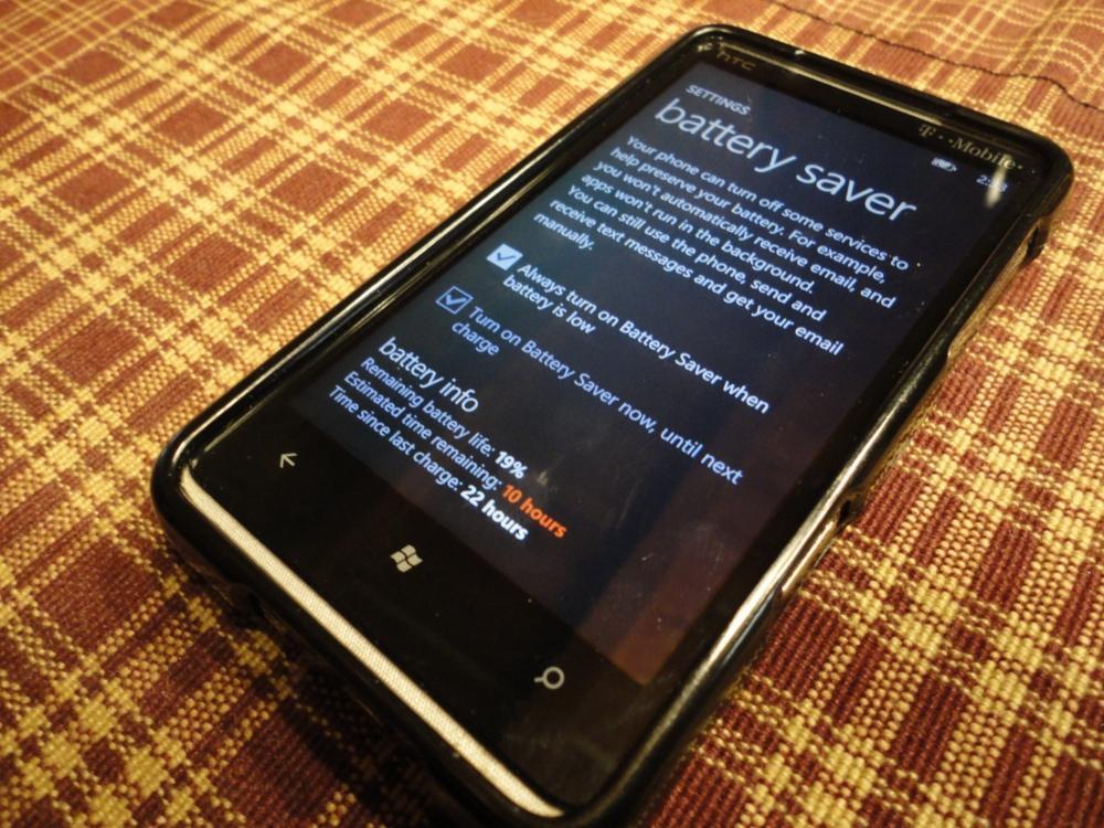
I will admit that I still used my iPhone a lot over the past few days – Windows Phone still lacks quite a few features that I desperately need. So I can't truthfully comment on battery life. It's definitely better than what I recall, and standby time has been more or less exceptional. But the Mango feature that I truly love is battery saver. Nested within the Settings application, battery saver can be set to always turn on when the battery is low, or you can turn it on manually when you need to squeeze as much life as you can out of your phone. Beware, though, as battery saver will prevent you from receiving emails automatically and apps will not run in the background. My battery was at 19 percent around 2 PM today when I enabled battery saver. At 8 PM, when I got home, the battery was at 10 percent. Although I did not use the phone a lot during those six hours, I think battery saver should speak for itself.
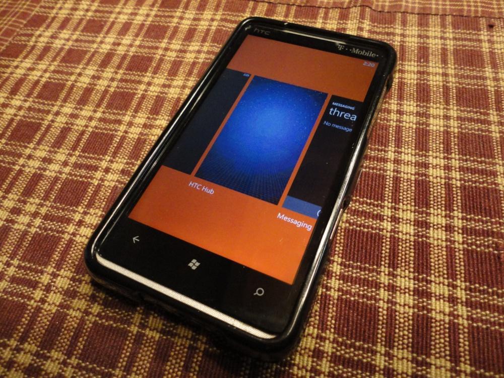
Another major gripe I had with Windows Phone last time was the lack of multitasking. Being a long-time BlackBerry fan and huge advocate of Android, multitasking is a must. Mango doesn't necessarily bring full or true multitasking to Windows Phone, but it does bring task switching – much like that of iOS. Holding the back button will bring up a webOS-like card system. These cards display the applications currently “paused.” Once you select one, it will resume from where you last left it. I found it very useful and found myself using it more than I originally thought I would. It's not the best implementation, but it's usable.
(Note: you may notice more than one "card" for a specific app. This is due to not all applications supporting task switching yet and more than one instance of the same app can be running at the same time.)
To be honest, I didn't know what to think when I swapped back to a Windows Phone. I used the HD7 on NoDo for a few hours prior to Mango and I was ready to pull my hair out. After updating, however, the experience has been totally different. Refreshing and pleasurable, even. Social integration, Internet Explorer 9, sheer speed and near flawless performance finally make Windows Phone a true contender.
Mango doesn't make Windows Phone perfect, though. It still needs some work – the interface especially. I'm still not 100 percent sure I could fully leave Android just yet, as there are many applications that I have yet to find alternatives to on Windows Phone. That said, I could finally see myself using a Windows Phone as my personal device, which I never imagined myself saying (or typing). I will definitely be looking forward to the Nokia Sabre and future Windows Phone updates.