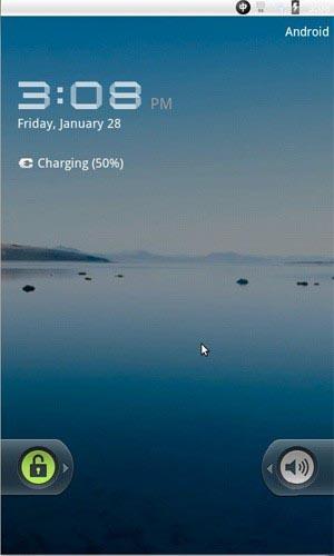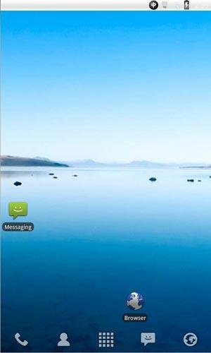
There's been plenty of speculation as to whether or not Honeycomb would eventually make its way to handsets, but we've seen quite a bit of evidence to suggest that it's a tablet-only version of Android. However, some users have found, after digging through Android 3.0's emulator, that that may not be the case. The emulator defaults to a 1280x768 resolution, which is a perfect size for tablets. Once its resized to a more phone-friendly resolution, though, you're presented with an image like the one that's above. The default launcher is pretty crash-tastic, but after loading up an alternate bit of software like LauncherPro, you can see plenty of smartphone support. This comes in the form of a revised, Froyo-esque lock screen and status bar and a browser without visible tabs like in regular ol' tablet Honeycomb.
This is by no means confirmation that Android 3.0 will eventually make its way to phones, but it is rather interesting that the emulator can switch to a UI that would work on a handset. The question is, why isn't the status bar more Gingerbread-like? Considering that Honeycomb isn't even officially out yet, it's all a bit tough to figure out right now. Perhaps the emulator is able to demo a phone environment, but Honeycomb will remain on tablets. Later on, though, tablets and phones could be reunited under one OS, like Ice Cream Sandwich? That's certainly one possibility. Do you have any other ideas?
UPDATE: Mobilized has learned that Google is planning an event next Wednesday where they'll dive into Android 3.0 and show off just what makes the OS tick. Stay tuned!
