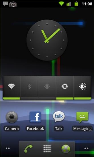
Something that we've all been waiting patiently for over the last three months has been Google's latest update, Gingerbread, or Android version 2.3. Just in time for the holiday season, Google graced us with what turned out to be a minor update that focused primarily on refining the user interface and cleaning things up a bit. You wouldn't expect many huge changes when moving from version 2.2 to 2.3, but I was definitely expecting a lot more than what Gingerbread brought. I'm assuming most of the major changes will come with Honeycomb, which is either version 2.5 or 3.0.
In all honesty, I don't think the update lives up to the hype, but it is a welcomed update nonetheless. It makes less impressive displays pop a little more, adds some cool effects, and overall, it just looks a lot better. I will admit, I was turned off by all of the green to begin with, and I'm not in love with it, but it isn't as bad as some of the blurry images made it look.
One of the first changes you will notice upon updating to Gingerbread is the bottom dock on your homepage. Rather than the well-known (and my personal favorite) glassy, three-button dock with rounded corners, you will find the same three buttons with a darker gray, slightly transparent, squared dock.

Probably the biggest improvement with version 2.3 is the overhaul in the notification bar. Before, the stock notification bar was white and the pull-down background was a very bland and boring gray. Now the notification bar has been modified to look better, conserve space in the already cramped notification area, and conserve power on some devices (ones that use Super AMOLED and AMOLED). Since the notification area is so small, many of the icons have been reduced in size, the “AM” and “PM” have been left off of the time, and the battery meter has been turned in a vertical position rather than horizontal. The background is now black which makes the signal meters, battery meter, and notifications more noticeable.
When you pull down the bar you will notice that it is now several shades of grays and blacks, giving it a much more refined look. The carrier label and “Clear” button now sit in a light gray area. The notifications are a very light gray, almost white, with black and light gray text. The unused space is now a dark gray and so is the pull-down tab. It is a very clean look and give the UI a sleek feel.
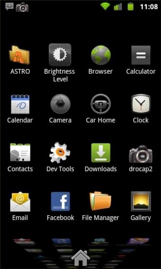
Not much has changed in terms of icons and the application menu, but many of the stock icons have been recolored to match the green theme found throughout the UI. Highlighted icons are now backed by an orange glow. Before, the entire space for the icon was filled with the orange selector, now the orange is tighter to the icon, however, this may not be so for every third-party application.
You will also find a “Downloads” icon that keeps track of all of your recent downloads. Before, this was hidden deep within the browser and was a pain to navigate to every time you wanted to find something you downloaded. It was easier just to use a third-party file explorer. With this Downloads app, you have the option to easily delete any old downloads too, thanks to the check box and pop-up delete button that appears when you check a file. The Power Control widget has been slightly modified as well, but nothing major. The sync, location, and Wi-Fi button on the widget have been updated and match the other UI changes in the notification bar.
A less noticeable change in Gingerbread is power management. According to the Android 2.3 highlights page from Google, the power management system has been updated and more closely monitors applications that may be eating up too much power. It will kill processes that may be cutting into your battery life, and it gives you the ability to closer watch what is using up your battery. Battery use can now be found under Application settings and About phone.

The new keyboard introduced in Gingerbread is one of my favorite changes. An update for the stock Android keyboard was long overdue. The stock Android keyboard was boring and annoying to use; it was all gray with taller keys that were all touching, and no option to long press for numbers. Now the keys are spaced out and the keyboard looks much more clean. Pictured above, you can see that the keyboard strongly resembles that of the iPhone keyboard, which is loved by many. One advantage it has over the iPhone's keyboard though, is the option to long press for numbers rather than having to hit the symbol key to bring up a number pad.
The auto-correct on the new keyboard works really well, and so does the new text selection method. It isn't much different from the old, but the tabs are a little larger and easier to maneuver. One negative I have found though, is if text is selected and you want to change your keyboard, you will have to unselect the text first. It isn't a big deal, but it's a little annoying getting used to it at first.
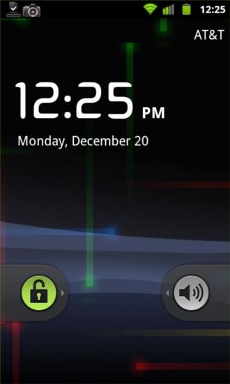
One little change that Google added that everyone seems to love, even as minor of a change as it is, is the “TV power-off” animation when the device display times out or you lock your screen. Which leads to another change. The unlock or “sound on” or “sound off” sliders on the lock screen are also a little different. Again, the glassy look has been traded for the dark gray transparent color. They have also been shortened quite a bit.
The list slider has also been changed. If you're scrolling through a long list of either your contacts, missed called, message, whatever it may be, the slider has been altered. It's now shorter and a slightly darker and transparent gray to match.
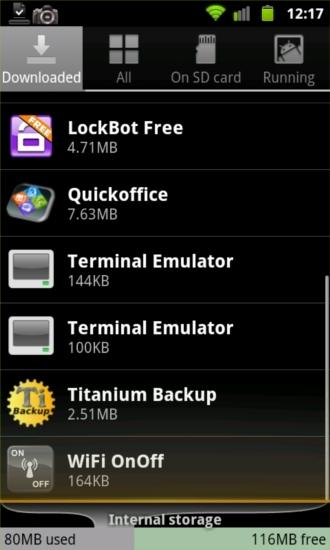
Application Management has been made more prevalent in the update as well. A shortcut to it has been added to the homescreen menu page and the actual interface has been updated. At the bottom of the all Apps, Downloaded, and Running tabs have your memory info (Internal storage and RAM) displayed at the bottom of the page.
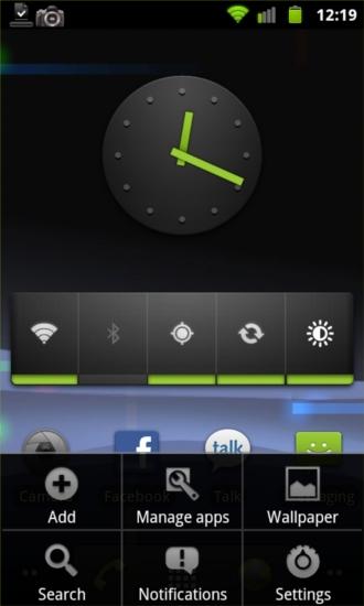
The menu pages, that can be brought up in nearly every application, has been changed to a black background. Before, the pages were very ugly and plain with their white backgrounds. The menus now match the dark theme across the UI and look much better.
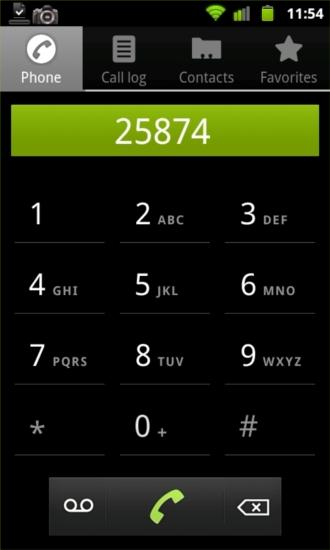
Quite a few changes have been made to the dialer page. No more gray buttons. Now the buttons are all black with a gray line underneath. When you press a number, the button turns green and the bar that shows the numbers you've dialed displays in green as well. The dock at the bottom of the page matches the dock at the bottom of the homepage, with a voicemail button on the left, call button in the middle, and a delete button on the right.
A change I was hoping would come in 2.3 is an update to the stock Messaging application. It's still the plain black or white background and very, very boring. Sure, there are replacements that you can download, but I personally don't have time to fool with them. As much as I switch devices or make changes to my device, setting it up is a hassle. I would prefer Google touch on this at least a little and catch it up with the rest of the UI.
When it comes down to it, the Gingerbread update is just mainly slight changes here and there that result in an overall pleasing change to the UI. There may be some behind the scenes changes that I'm unaware of, but they're likely so minuscule that they probably don't matter a whole lot. I have noticed a few things that have improved, like battery life, but it isn't a significant improvement.
The problem with the Gingerbread update being mainly UI changes is that when they finally get to your devices that have been skinned by HTC, Samsung, Motorola, etc., the changes will be even more minute. These manufacturers like to do their own thing with Android, and MOTOBLUR, Sense UI, or TouchWiz will mask many changes brought in Gingerbread.
Google is definitely trying to step it up in the graphics department, and I'm glad to see it, but the hype for the Gingerbread update lead to a bit of a letdown. Everyone expected a Froyo-like update with many changes to stock applications, added features, etc. Instead, this was a very minor update set to make Android a little more pleasing to look at and improve the battery life some. I'm glad Google is working hard to improve their UI and that they pushed out the Gingerbread update, but I'm not overly impressed.