Last week I spoke about Motorola's vision of what Android should be, MOTOBLUR. While I'm not a fan, it definitely makes things easier for basic and first-time smartphone users. Since MOTOBLUR isn't by itself in the realm of Android customer user interfaces, I suppose I'll touch on the others.
HTC's very popular user interface, named Sense UI, is by far my favorite. Being my first experience with Android, I grew very used to it and all the unique features it brought to my handset. Sense raised the bar for social integration with Android and showed many users how simple Android could be, given the right interface.

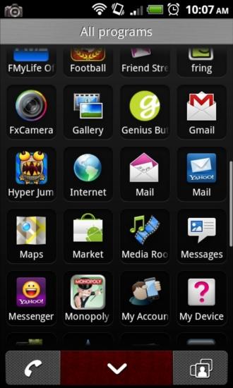
The first difference you will notice when turning on a Sense-skinned device is the bottom dock. Much like MOTOBLUR, the old Sense UI had an app drawer button on the left, and call button in the middle, but on the right side is a plus sign for adding widgets. On the myTouch version of Sense, or Espresso 2.1, the right button is your favorite contacts. With the new version of Sense, which is much like Espresso 2.1, the far left button is the app drawer, middle is the call button, and the right button is a shortcut to personalization.
Personalization is where you can set your device up to fit your needs and wants. You have the option to adjust your homescreens to either 5 or 7 pages, you can choose your theme, change your homescreen and lock wallpaper, and set up your ringtones and notification tones. Rather than all of these settings being scattered about the operating system, Sense brings them to one centralized location. Themes is an aspect only found in the newer versions of Sense. No longer are the days of having one generalized theme for the masses, HTC has supplied us with options to cater to personal preferences.

Previously named Scenes, myModes is a way to focus your device on what you're currently doing. Using myModes, you can set different modes like Home, Work, and KidZone. Home will disable email notifications to help you focus on family, Work will make sure you stay productive, and KidZone disables messaging and the dialer to keep kids doing what they do best without messing anything up.
My favorite aspect of the new Sense UI is the changes made in the notification bar and pull-down page. Depending on what theme you choose, the pull-down notification page will look differently. At the top, you will have a texturized and pattern-filled section for the carrier info and clear notifications button. The biggest change is the Recent applications section. Much like when you hold the home key, the most recent eight applications are displayed and scrollable. The actual notifications themselves are white with black text, and the rest of the page is themed to match the rest of the skin.
Another change that Sense UI brings is Power Saver, much like that of Battery Saver in MOTOBLUR. In settings, you can enable or disable it, and limit exactly what it effects. It allows you to choose whether it changes the screen brightness or timeout, disables Bluetooth, onscreen animations, and many other settings. If turned on, it automatically enables itself when your battery hits the designated level and disables when charged above the set percentage.

Probably the most favorite thing for most about Sense are the glossy black widgets that have been the inspiration for paid widgets in Market like Beautiful Widgets. Whether it's the flip-clock with weather, the slick looking agenda or calendar widget, or the people/favorites widget, one of them is sure to win you over. Also, if you're wanting more, HTC gives you the option to download extra widgets within the add widget screen. One of my favorites is the Call Mom widget. You can set a contact to the widget and it will keep track of how long it has been since you talked to them. The gauge will help you keep track, and let you know when you should call them and touch base.
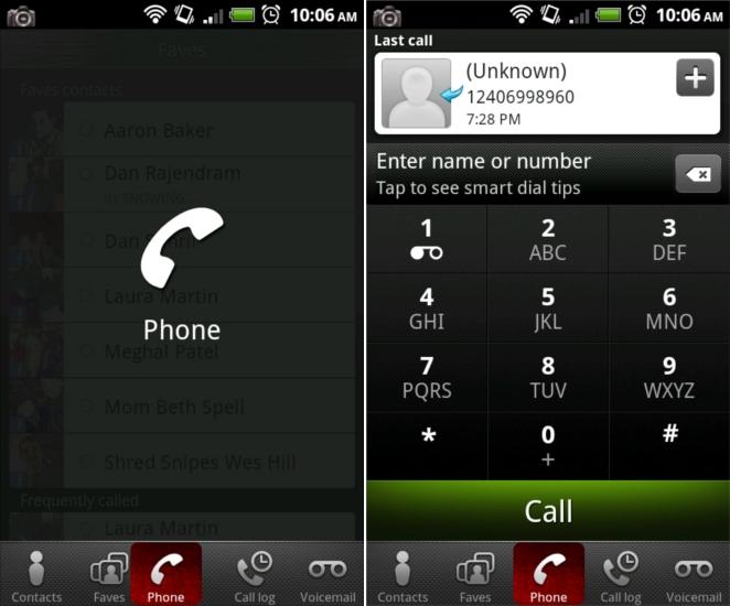
The trademark of HTC-made user interfaces is slide-over tabbed pages (pictured above). You can either tap a tab to change the page or you can slide your finger from tab to tab to get a "mouseover" style effect. This can be found in the gallery, contacts page, individual contact view, and in Media Room. Sense UI skinned devices also have a different camera application, which I'm not particularly fond of. I've never been able to take any type of breathtaking photo with a device sporting Sense. The focus has always seemed finicky and image stabilization never seems to work for me (I have pretty shaky hands though).

Sense also has its own icons for many of the stock applications. Where I didn't like MOTOBLUR's icons in the least, I do like some of HTC's, not all of them though. They're, for the most part, high quality, bright in color. If you have a T-Mobile device though, you will notice a lot of their favorite fuchsia plastered all over.
When it comes to Sense, I love nearly everything about it. Between the high quality graphics and option to choose different themes, there is a lot to like. HTC kicked off the custom user interface craze and they continue to raise the bar with each update.