This fall is shaping up to be the season of mid-range Android smartphones, and if Motorola's press event at CTIA Enterprise & Applications a few weeks ago is any indication, they're leading the charge. Flipout, Flipside, Bravo, Citrus, and DROID Pro - all Android devices, and all coming to the United States by the end of the year.
AT&T shipped me the Motorola Flipout, the carrier's latest Android device. After a day with it, here are my first thoughts:
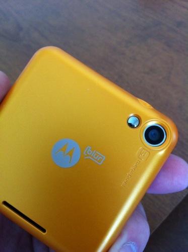
- The Motorola Flipout ships with an AC adapter module, USB cable, 2 GB micro SD card (installed in the phone), and two battery covers (black and orange). For those that like to customize, I'm hoping that AT&T will sell additional battery covers. Personally, I'd sport a green one if I could.
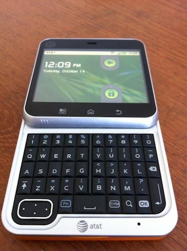
- As you would expect from the name, the Flipout is a square device that flips open by a swivel hinge. The form factor is nearly identical to the Nokia 7705. The swivel hinge is solid, and opens with a reassuring click. This phone is clearly geared towards the buyer that's migrating from a feature phone, the teenage crowd, or the style-conscious person.
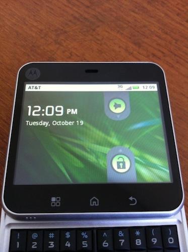
- The phone packs a 2.8-inch screen, which is small but usable. It's a standard LCD with 320 x 240 pixels. In comparison to the high-end devices on the market, it's tiny and pixelated, but it's all about perspective. New smartphone buyers that are used to low resolution, tiny featurephone screens will probably consider it to be a bit of an upgrade.
- For a mid-range device, it's pretty speedy. Applications loaded without delay, and using pinch to zoom in the browser was a pleasant experience. I've often felt as if there's a significant performance drop between mid-range and high-end Android devices. If the "new" mid-range units are this speedy, I can recommend them to my family and friends.

- Flipout offers Android 2.1 with MOTOBLUR, which is a welcome improvement over the mid-range Android 1.X devices of the past. As expected, it comes with the typical AT&T bloatware like FamilyMap, Maps, Navigator, Radio, and Wi-Fi Hot Spots. Unfortunately, you can't uninstall it. Unlike high-end Motorola devices like the DROID X, Flipout has the full version of BLUR. It's a bit more in-your-face, but is a nice overlay for first-time smartphone buyers.
- Flipout's five row QWERTY keyboard is quite good. I like the five row configuration, the keys are tactile, and the small D-pad is unobtrusive. I spent part of yesterday thumbing out text messages, and e-mails, and after a few minutes of adjustment, I was typing with ease. There's also an on-screen QWERTY for when the device is closed, but I don't care for it. The keys are tiny, and the space bar is located just above the home button, making it easy to slip and accidentally return to home.

- No flash and no autofocus means that the 3.1-megapixel is decent for daylight shots, but that's about it.
- I'm working with the Flipout in Charlotte, and call quality has been good so far. I was in an AT&T fringe area for a brief time yesterday afternoon, and was able to make a call, despite some choppy audio. Otherwise, the earpiece is nice and loud, the speakerphone works well, and I paired the usual Bluetooth headset to it without a problem.
- This is a minor frustration (and I mean minor), but it irritates me that AT&T opted to place their network identifier on the top status bar. Regardless of what you're doing, "AT&T" is present, and when you have more than a few icons present (text message, missed call, Android Market updates, etc.), it gets cluttered.
- The Flipout has an 1,170 mAh battery, so don't expect stellar battery life from it. With a full charge yesterday, I was able to make it through about seven hours of moderate to heavy use before the Flipout powered down. With light to moderate use, it may make it through the day. I'll have final numbers in the review.
For more information on the Motorola Flipout, click over to my unboxing. If that wasn't enough, make sure you check out my full Motorola Flipout review!