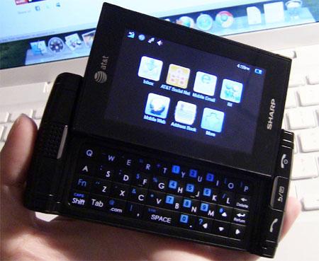
The Sharp FX is definitely what you would call a "high-end" messaging phone. It has a beautiful 3-inch capacitive touchscreen WQVGA display and an overall solid feel to it. It may not have the specs of a smartphone, but it sure does look like one. I've been using the Sharp FX for about a day now, so let me tell you what I think of it so far.

Like I said before, it feels very solid in the hand and the black finish looks very sleek. The only complaint I have so far with the design is that the sliding mechanism on the keyboard is a little bit too loose. When the keyboard is tucked away underneath the top panel, it slides around a bit. This has caused a few problems when I'm pressing the camera shutter button. The pressure from my thumbs on the bottom of the top panel makes it give a little which makes it difficult to take a good picture. This may just be the demo unit I was given, but it is definitely a problem.

Moving onto the beautiful screen I talked about in the introduction, I can tell you that I'm very pleased with the work that Sharp put into making a great-looking display for a device in this category. High-quality displays are usually saved for smartphones, but, while this is no Super AMOLED or Retina display, you can definitely tell a difference between it and other messaging phones. Colors are bright and crisp and text is sharp. It is a capacitive touchscreen and I haven't had too many problems with it so far.
In the few short minutes I've had with the web browser, I've noticed that it's pretty fast. I've only loaded up Phonedog.com, but it didn't have any problems with the mobile site or the desktop site. One odd thing though is that the web browser only works in landscape mode. This isn't too big of a deal since landscape mode allows you to see more of the page anyway, but it may rub some users the wrong way.
Sharp FX's UI is pretty standard. The homescreen offers four shortcut buttons at the bottom of the screen for calling, contacts, Social Net, and the main menu. One interesting feature is that from the homescreen, by swiping either to the left, right, top, or bottom of the screen, you can access Mobile Web, IM, Social Net or My Stuff. This is a pretty nifty feature that I'm sure will come in handy for quick access to major programs.

The keyboard on the Sharp FX is hidden underneath the main display. It is set up in a grid format and has three full rows for letters, one row for the spacebar and other shortcuts, and three navigation arrows integrated within the bottom two rows. I would describe it as a mixture between the original Droid keyboard and the Droid 2 keyboard. It has the grid format of the original Droid, but the keys are raised like bubbles. They are a bit slippery than other keys and the doming causes my fingers to slide around even more, but I think it's a decent keyboard that I could easily get used to. (Bear in mind that I'm still working on that so I may change my tune in a week for the full review.)

So far, the only thing that disappoints me about the Sharp FX is its camera. For a phone that costs nearly one hundred dollars on contract, I would expect something better than a 2 MP camera with no flash. I haven't had a chance to test out the picture quality, but the numbers alone are less than stellar. It does, however, have 4x digital zoom and it captures video. I'll put the camera through further testing to see how it performs.
A few other nice features that the Sharp FX has is a 3.5 mm headphone jack and a microSD card slot that supports an up to 32 GB card. It also features Mobile TV from Media Flo, AT&T GPS, and access to mobile e-mail and Facebook.
The Sharp FX is off to a great start. I'll check back in about a week to give you my full review.