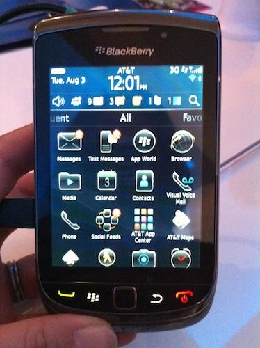
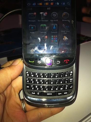
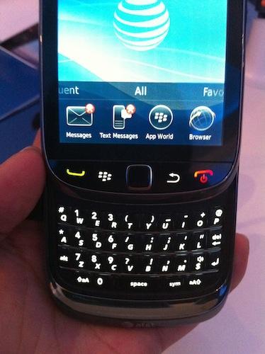
Just got back from the BlackBerry media event in New York City, where I got an up-close look at the new Blackberry Torch RIM’s first slider phone, with touchscreen and hardware QWERTY keyboard. The vid is being edited right now, but in the meantime, here are some very fast first impressions after a few minutes with it.
Physically, this is most definitely a BlackBerry. You can’t look at the device without thinking of the Bold 9700, with a very similar size and shape — at 4.4" (5.8" open) x 2.4" x .57". (It’s a tad thicker, thanks to the slide-out keyboard.) When you look at it, you think it’s going to be heavy, but it’s only 5.68 ounces — surprising lightweight, and on par with the 9700. And I have really small hands, but the device felt very nice in my palm.
When it comes to keyboards, no one does them like RIM, and this is definitely no exception. There’s very good travel when pressed, decent amount of separation between the keys, and the individual ridges on the buttons that we know and love so much. Although RIM wouldn’t agree with this statement, on a hardware level, it really did hit me like a “bridge” device for Bold users crossing over into the touch experience. It has both touchscreen input as well as optical trackpad/hardware QWERTY for hardware navigation, and everything’s accessible with both. The capacitive display looks bright and crisp, at 3.2" (360x480 res), and launching apps felt adequately responsive.

When the first leaked images hit the web, some users were concerned about “the lip.” Yes, it has it, most definitely, but it doesn’t get in the way of typing at all. Plus, RIM’s implementation is probably one of the better mechanisms I’ve seen. (I wasn’t a fan of Palm Pre’s slider that curved and pushed the upper component up and out — and originally caused some hinge issues — nor the Moto Cliq, a fatty of a phone with a stiff mechanism and spring.) The Torch slid smoothly, and though it’s not a skinny phone, the fact that it houses such a great keyboard (with tactile ridges) made me think it would be thicker than it was.
As for the OS, BlackBerry 6 brings some new things to the table. After a moment or two to get used to it, the UI felt pretty easy and intuitive. (Maybe not as much as WebOS, but for an OS 6 newbie, I found it easier than using Android for the first time.) Like RIM said, the changes aren’t so totally revamped that a BlackBerry aficionado would be lost, but it’s enough to excite them, bringing in some organization, simplicity, functionality and decent third-party integration for on board features, like Social/RSS Feeds.
Thing is, although the user experience is good, it wasn’t great. Don’t know if it’s the 624 MHz processor, but I found stuff like the scrolling action wasn’t very zippy or smooth, and tap-to-zoom text in the WebKit browser was fine one minute, jittery the next. Still, for what is basically a 1.0 version of a revamped platform, it’s not a bad start at all. I like the redesigned homescreen — A LOT. Being able to swipe through apps in a mini tray on the homescreen is handy, and being able to customize that to see one row or two made me giddy. (I’m an iPhone user, remember? We can’t do that…)

Speaking of the WebKit browser — honestly, I don’t know what to say about that. The browser itself looks fabulous, and there are new menus that really help simplify stuff like sharing or bookmarking. This is a huge step forward for BlackBerry web surfers. The biggest downside however was the fact that it was excruciatingly slow. But it’s important to remember that I saw this on a demo floor, and the connectivity there, with the rush of media folks and bloggers overloading the system, could be what was at fault, and not the handset. The Wifi got blown out, and let’s face it — everyone knows AT&T isn’t the strongest in NYC. To be fair, we need to reserve judgment on internet speed until we get a review unit in the house and try it out in different coverage areas.
Mostly what I loved about today was hearing about RIM’s commitment to app developers. This, I think, will be a key to BlackBerry’s future success. The company clearly knows that it needs to deliver for the devs, making development of BB apps less cumbersome and difficult. By adding in an enhanced user experience that will make it easier for customers to search and discover programs at affordable price points, this should pave the way to the future and silence a lot of critics.
RIM seems to be firing on all cylinders with new hardware, software and dev program. Some people have been saying that the platform is antiquated. Will this be a revitalization of the brand? We’ll have to wait and see, but this could be the moment that RIM turns it around.
