The Good: Google integration, plenty of room for apps (16GB), webOS
The Bad: I didn't love the physical keyboard, settings were less intuitive than I would have preferred
The Verdict: All in all it's a great little device and clearly has its place in the market. If you like surfing the web and other media-type functions, the Palm Pre Plus fairs very well in those areas, and I'd highly recommend you giving it a shot.

In early 2009 Palm announced the Palm Pre and webOS - a new look and feel in terms of hardware, and a complete shift in platform from the legendary PalmOS to the sleek, media-friendly webOS. Some said it won the show at CES 2009 and were disappointed that the announcement for release was as non-specific as it gets - first half of 2009. As with many things, it seems that the introduction of webOS left Palm "fanboys" drooling, Apple "fanboys" saying "MEH" as they glanced briefly at the device while passing by in their converse low-tops, jeans and turtlenecks, and the rest of the world thinking "it looks like Palm has finally done what they've needed to do to save themselves." I've heard it mentioned in passing that Palm's biggest mistake was announcing the device six months before it was released (leaving too much time in between launch and release for people to lose interest and move on to the next big thing), and the events that took place shortly after may or may not be proof of that.
Fast forward to now and we've (sadly) seen the whole thing break down. Earlier this year Palm announced less than satisfactory sales revenue, then rumors arose about Palm going under or being bought out. Finally HP (seemingly out of nowhere) announced they would acquire Palm. Palm fan or not, many who believed that webOS was a good thing were happy to see HP willing to breathe a new life, perhaps with better hardware and overall resources, into the OS. And like any other industry that has a significant following, drama is always lurking around the corner. A few days ago HP put the veritable kibosh on Palm when CEO Mark Hurd said "We didn't buy Palm to be in the smartphone business...We bought it for the IP" - presumably leaving webOS as the only evidence of the company's existence. Of course, no sooner did I write this than we find out that HP still intends to use webOS for cell phones among other things.

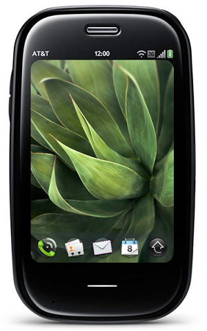
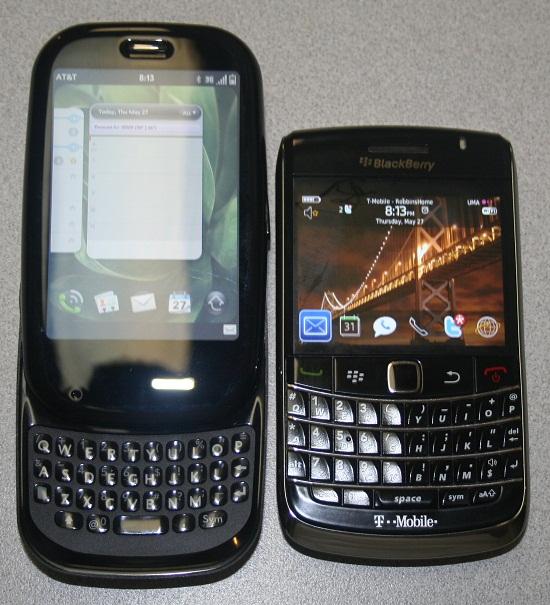
The Palm Pre Plus weighs in at 138.5 grams which is roughly $1.40 worth of US nickels. The phone is 2.3 inches wide, 3.9 inches tall, and 0.67 inches thick. It has the look of a rather large, almost squared off egg, though it is sleek and feels rather comfortable in the hand - both while the slider is engaged as well as when it is not. The 3.1 inch HVGA touchscreen display looks small at first glance, but in landscape mode web pages render quite nicely, and pinch to zoom certainly never hurt anyone (save Andy Rubin, who does not "like two-handed operations").

Just below the screen is an area that is roughly 1-inch thick. This area is used for 'gestures' which, to my knowledge, is a feature unique to Palm and webOS. The gesture area allows for three functions: sliding your finger from right to left is the equivalent of hitting the 'back' key on any other device, sliding your finger from bottom to top takes you out of whatever app you are currently using into card mode, which shrinks all your apps into small cards that you can shuffle through and tap on to select. If you don't like swiping up, tapping on the gesture area accomplishes the same goal, and in my opinion is much easier. Additionally, while in any app, sliding your finger up on the gesture area and continuing on to the actual screen will display the quick launch bar and enables you to select from those apps which you have pre-selected as important to you.

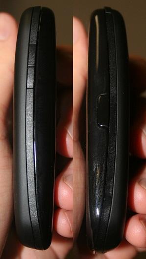
The device has a total of two buttons and one switch when the slider is not engaged. On the left hand side is your volume rocker which appears to be two separate buttons, but true to it's name is simply one button that rocks back and forth. At the top right corner you'll find the power button which is used for turning on and off the device as well as sleeping and waking the screen. It's a pretty handy little button, and you'll be doing yourself a favor by hitting it just before you put the Pre Plus in your pocket or holster. The right hand side of the phone is where the microUSB port is located. Unfortunately, that particular location makes it impossible to charge the phone while in the pouch that comes with the device.

The face of the device is black, very shiny, and plasticy, but the hardware actually feels very solid. The back of the device has a rubberized feel to it, making it easier to hold. It's also home to the speaker and the 3MP camera with LED flash. I can't decide how I feel about the slider keyboard, and by that I mean both the way it slides and the usability of the keyboard as a whole (more about that below). In terms of design, though, it actually looks quite elegant when the slider is engaged, and I think it has something to do with the way the phone is ever-so-slightly curved to fit the palm of your hand.

The Palm Pre Plus is certainly a different beast when compared to BlackBerry, Android, and iPhone. And while navigation of the device became simpler once I acclimated myself to webOS, I still found it to be less intuitive than the claims suggest. Through further research and playing with the phone, I realized that settings can be found in a few different locations. Within each app at the top left corner of the screen is a drop down menu that provides options that are generally specific to the app you are currently using. Additionally, when you open launcher if you swipe to the rightmost page, there are several options (sounds & ringtones, Bluetooth, date & time, etc.) that can be set from that page. Lastly, and this is an interesting feature, on the page with the options I just mentioned a few sentences back, there's a help icon. When you open the help app, you can type in anything you want to know about how to use your phone. For example, I wanted to learn how to setup certain notifications, so I typed in 'notifications,' and was given several options to sift through and directions once I found what I was looking for. The first time I typed 'notifications' I actually messed up the spelling, but the app noticed it and gave me a few options to choose from.

The 600MHz processor can't be called zippy per se, however, I'd be lying if I didn't say the phone holds its own in terms of speed. Probably my favorite thing about the Palm Pre Plus on AT&T is its integration with Google. When you set up the device and enter your gmail address, it's like you've owned the phone forever. Google has integration with BlackBerry as well, but it doesn't even come close to the Pre in terms of function. Once you're set up, your email, calendar events, and Google Talk friends are all at your disposal - and easily accessible at that. I truly love the fact that transferring contacts is a thing of the past, and webOS paired with its Google integration make for a great team.
Surfing the web when in a strong 3G area was pretty fast. As mentioned in my "first impressions," the device certainly held its own when visiting the PhoneDog homepage, and was truly speedy when viewing the mobile version. When using Wi-Fi the thing flies, it's a beautiful sight and when in landscape mode, though pinch to zoom is an option, in many cases you don't need it.

The camera on the Pre is nothing to write home about really. For taking snapshots of things that come up in passing and posting them to your favorite social media sites, you're fine, but I'm not sure it would pass as a substitute for an actual camera. Using it as a video camera, on the other hand, is another story. Though, again it's no HD quality video camera, I didn't notice any lagging and in general it held up well in my testing.
Though I've heard many favor the slide-out QWERTY keyboard, in my testing I found it to be more difficult to use than my BlackBerry Bold 9700 as well as my Curve 8320. Perhaps it's the fact that when you press the keys they don't go as far down as on the BBerry making the tactile feel of the keys less desirable. Additionally, when typing on the top row of keys I often found my thumbs butting up against the bottom portion of the display anytime I typed letters 'E' through 'I'. Perhaps if the phone slid up just a tad more, this would not have been a problem.

Call quality was great on my end and I didn't miss a single call while talking and driving around the metro Atlanta area on AT&T's network. In speaking with those I called, they also reported that the call quality was good on their end, and that they could hear me loud and clear. I managed to pair the device with the Bluetooth device built in to my car as well as with my Plantronics headset and both were able to initiate and receive calls flawlessly.
Overall it seems like the Palm Pre Plus is a device very worthy of consideration. webOS is a great operating system, and with the knowledge that HP intends to continue development for the platform, we can only imagine that it will continue to be improved upon. The size and feel of the device worked well for me, and will undoubtedly be an excellent decision for those who prefer QWERTY slider devices accompanied by touchscreens. Assuming that the HP/Palm purchase goes through without any hitches (it's not completed yet), the Palm Pre Plus will not be the last Palm form factor sporting webOS. It also means you can (hopefully) look forward to continued updates and support for your device. If you haven't seen or played with one yet, and you're in need of a new device on AT&T, I'd highly recommend you at least go and check it out for yourself.