What's Good: Multitouch-aware capacitive display; Good QWERTY board; Zune Pass compatibility; Kin Studio provides automated Web-based backup
What's Bad: Featurephone features at smartphone price; No calendar, games or downloadable apps; Limited syncing options; Poor ergonomics for camera use
Note: Kin One and Kin Two are basically identical in terms of software and general performance, including the 600MHz NVIDIA Tegra processor that they both employ. As such, appropriate portions of this review are shared with my Kin One review.
A few years ago Microsoft bought Danger, inventors of the Sidekick family of messaging devices. Time passed and little was known about what, if anything, the Danger group was working on inside of Microsoft HQ, save a few leaks about "Project Pink." Pink was rumored to be Microsoft's self-branded foray into the messaging phone category, and said to consist of two launch phones codenamed "Pure" and "Turtle."
Then Microsoft killed off Windows Mobile and announced Windows Phone 7 (Series) and everyone kind of forgot about Project Pink. For a few weeks, anyway.
Fast forward to a rainy Monday morning in April, and "Pure, Pink and Turtle" became "Kin One and Two," as Microsoft officially launched their new devices for "Generation Upload" at a nightclub in San Francisco. Complete with a new mobile OS and heavily visual user interface, an online component called "Kin Studio," and Verizon as launch partner, Kin showed the world that the Danger group had in fact been hard at work since being folded into the MSFT's world.
Question is, are Kin One and Two actually any good? Sorta, but they're so overpriced (think monthly plan costs, not up-front sticker shock) that it's impossible to see them only for what they are. Instead I keep comparing them next to the Android and webOS phones in Verizon's lineup and seeing the Kins for all the things they're not.
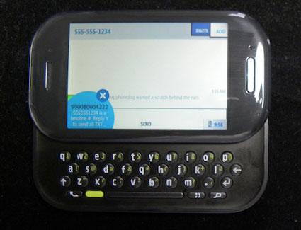
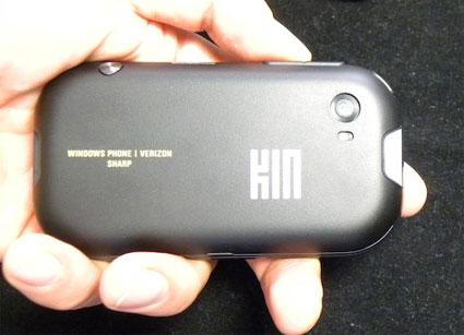
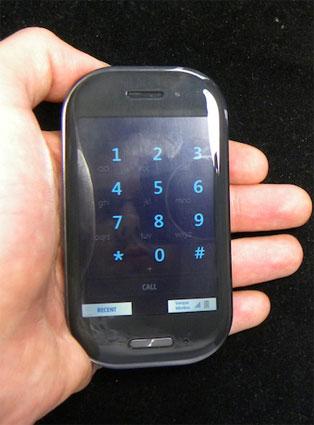
Kin Two is the higher end of the two Kin phones. A horizontal slider with a touchscreen and full QWERTY thumbboard, Kin Two measures up at 4.25 x 2.5 x 0.75" and weighs 4.7 ounces. The phone is done up in what its maker calls "Carbon": a textured gray/black soft-grip finish on the bottom half of the phone is complimented by a glossy, semi-translucent plastic bezel around the display portion of the device. Kin Two is pretty nice looking, with its grey-on-grey color scheme and rounded corners that bring Palm's Pre and Pixi phones to mind.

The display is a 3.4", capacitive touch affair with 320 x 480 pixels worth of resolution. Text, graphics, images - it all looks pretty good on Kin Two, even if the display is on the low end of current size and resolution specs for smartphones. Kin Two supports multitouch input including single and two-finger taps, double taps, swipes, and pinch-to-zoom. There's one hardware button on the front of the phone, mounted dead center directly below the display. A single press of the button takes you back one screen in the user interface, while a press-and-hold will bring you back to The Loop (home screen).
Take a look around Kin Two and you'll find 3.5mm audio and microUSB ports, and hardware buttons for the Camera, Volume Up/Down (rocker switch), and Power/Screen Lock. There's an 8MP camera on the back of the phone that's flanked by an LED flash, features auto-focus and anti-shake technology, and shoots 720p HD video. Photos, video, and music is stored on 8 GB of internal, non-removable flash memory; there is no microSD expansion slot.
One big design flaw has to do with the placement and operation of the camera button. Mounted on a curved surface near the upper right of the device (as you hold it in landscape orientation), the camera button is easily accessible via your right index finger. That's a good thing. Problem is, between the weird angle that the button is mounted on and the heavy action involved in pressing the thing, the camera button is both uncomfortable to use and winds up leading to hand shake during image capture … which leads to blurry photos. Or at least it did for me. Repeatedly.
The QWERTY board, on the other hand, is pretty good. With a fairly standard four-row design marked by extra short, but usable, keys on the bottom row (Space, function, etc), the keyboard is bolstered by an offset layout and nice chiclet action on the circular buttons. I am annoyed that typing a comma is a two-button affair - Function + Period - but for all I know periods aren't cool on Facebook and mySpace, so I might be the only Kin user to ever complain about using the thing to punctuate sentences.
Before you read on, bear in mind that I'm a 30-something year old guy who's tied to computers and smartphones all day for work, tweets his head off but rarely uses Facebook for personal reasons. So I'm not Microsoft's target audience for Kin. That doesn't mean I don't have worthy opinions about Kin One, but it does mean that a 22 year old single woman with a super active nightlife and close ties to her social networking friends may feel a bit differently about the Kin experience than I did. That said …
What's Confusing: The Loop and The Spot
Kin is crazy. There's support for four different social networks but no Calendar app or games. Contacts are automatically synced with your various social networking accounts, but there's no way to auto-sync to address books, either on your local machine or on the servers of popular services like, y'know, GMail. Every photo you take, every video you shoot, every message and call you send or receive are automatically backed up to servers fronted by a timeline-based Web browser called Kin Studio.
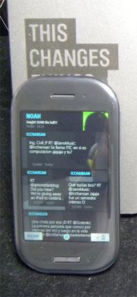
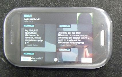
And then there's The Loop and The Spot. The Loop is your home screen. Your home screen is a giant mosaic of photos and text headlines that represent updates from your social networks and news feeds. Concepts like wallpapers, app icons and widgets don't apply here: Kin is The Loop is the loop is your social network and you change the look and functionality of it by adding/removing feeds and friends. From The Loop you swipe one way to get to your apps menu and swipe the other way to dive into your contacts.
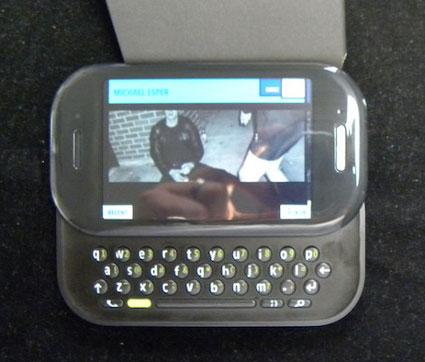
The Spot is this little dot at the bottom of most screens throughout Kin's UI. When you want to share something with your peeps, you drag it to The Spot. The idea is that you can share most anything - photos, URLs, snippets of text, things posted to your Loop - with as many of your contacts as you like via The Spot. All you do is drag, in any order, some stuff and some peeps into The Spot, then open The Spot up and choose your method of sharing (SMS/MMS, Email, Post to Social Network) and that's it. Easy. In theory.
In practice The Loop and The Spot are equal parts cool and frustrating. What's cool is the unique, highly visual approach Microsoft took to Lifecasting and giving those always-connected Gen Upload kids a way to stay in touch. What's frustrating are the limitations of the systems in place. To wit:
- Loop updates aren't pushed to you in real time, they're pulled on roughly 15-minute intervals. There's no changing that schedule.
- There's no Twitter client on Kin. The Loop is your Twitter client. That's too bad because The Loop doesn't support DMs, viewing @ replies or even just looking at your personal stream in one fell swoop. For any of that, you'll have to visit twitter.com.
- The Loop is fun to look at first. And if you only have a dozen or two contacts it's pretty fun to use. But if you've got upwards of forty or fifty friends across Facebook, mySpace and Twitter - let alone if you, like most members of Gen Upload have a network numbering in the hundreds - The Loop quickly becomes frustrating to use as a tool of any practical sort. At least it did for me. Scrolling through dozens upon dozens of differently-sized tiles chock full of photos and status updates and tweets and RSS headlines got to be laborious after a short time. Maybe I'm old and crusty, but I wanted some separation and I wanted a boring old list UI that was easy to scan for important information.
Microsoft programmed the loop to push updates from your favorites to the top of your list at any given time. They, like HTC and others before them, conducted some research that shows that people tend to communicate with a small percentage of their contacts a large percentage of the time. So The Loop has that going for it. But it's still not customizable enough for my tastes. Motorola's MotoBLUR may also be a somewhat overwhelming way of viewing social networks and feeds, but at least it lets me separate updates from other updates from RSS headlines to a greater extent.
What's Great: Kin Studio and Zune Pass
Kin Studio is great. Except that it only runs on Silverlight-enabled Web browsers. In a nutshell, Kin Studio is an automated backup of every photo, video, message and phone log entry that's wirelessly beamed from your Kin to Microsoft's servers without your needing to do anything to enable it. When you visit your password-protected Kin Studio page, you can view your Kin life by way of a nifty timeline. Photos, videos, etc etc - it's all there in chronological order for your perusal. Your contacts and feeds are also accessible via Kin Studio. You can also share things via The Spot from Kin Studio, including full-resolution copies of photos and HD videos shot with Kin Two.
Zune on Kin is also great. Kin One and Two are basically the mythological "Zune Phones" finally made real. Kin Two features 8GB of onboard memory for storage of photos, music, videos and everything else. While that doesn't sound like much memory for a multimedia phone, remember two things: First, full-resolution photos are automatically backed up to Kin Studio and replaced with much smaller versions optimized for viewing on Kin Two's 320 x 480 display, a clever trick that should preserve plenty of room in K2's flash memory. Second, Zune Pass.
If you're going to get a Kin Two and you listen to a lot of music, you really should consider a Zune Pass. I have a pretty sizable music collection and generally get my music on a purchase-to-own basis, but whenever I listen to satellite radio (usually in a rental car) or get a chance to demo something like Zune Pass or Rhapsody, I'm inevitably tempted to change my ways. Kin Two comes with a 14-day free trial of Zune Pass, and after that it's $14.99/month for unlimited streaming to your phone (and Zune HD and Web browser) and 10 songs you can download and keep. Yeah, it's renting music and not owning it, but it's a pretty good deal. Especially considering the size of the Zune catalog. The only issue with Zune Pass on Kin Two comes when you're out of cellular and WiFi coverage - no data means no music, except for what you've downloaded or sideloaded into memory.
Kin Two supports audio-out via an integrated 3.5mm headphone jack and stereo Bluetooth. Plugged into good earphones or powered speakers, high-quality audio tracks coming forth from K2 sounded quite good.
And Oh Yeah
I could go on and on here, but real quick:
The phone functionality on Kin Two is fine but not great. Call quality ranged from decent to pretty good, but you're not going to mistake voice calling on Kin for voice calling on a Nexus One or Motorola phone with high-end noise reduction technology. I had issues getting an automated conference call system to recognize touch tone input from the phone, though apparently it's a known issue having to do with calling into such systems while in speakerphone mode.
Kin Two's 8MP camera disappointed me a little bit, mainly because of those ergonomic issues related to the button placement that I mentioned earlier. When I was able to take shake-free photos, they came out okay but a little bit blown-out, color and saturation-wise. To be fair, however, you can bypass the hard button and use the onscreen shutter control, instead. 720p Hi-Def video came out a bit better, but not on par with a standalone camcorder.
Web browsing on Kin Two is okay. The browser supports pinch-to-zoom, which is great, but it's built on Internet Explorer, which isn't great. You'll have a better time on the Web via Kin Two than most dumbphones, but Android or iPhone it's not.
Email isn't great. Kin Two struggled with HTML formatted Emails. But, hey, Gen Upload posts and tweets, they don't Email.
There's no IM client. None. *Scratches head*
Microsoft and Verizon are taking something of a chance with their new Kin duo of phones, what with their arrestingly different user interfaces, curious omission of features like calendars and IM clients, and smartphone-level monthly data pricing. Me? If I had to choose one Kin or the other I'd take Kin Two - I prefer its horizontal slider layout and two-thumb friendly keyboard, not to mention the extra memory and HD video capture not found on its little sister, Kin One.
But if I had the choice between a Kin Two and an Android or webOS smartphone also on Verizon? I'd take the smartphone, no question. Kin Two is neat - it has a neat-looking UI and neat features like Kin Studio and Zune Pass. Problem is, the neatness wore off for me as soon as I found out I couldn't easily sync contacts from Google or read HTML emails on the thing. And the lack of a decent Twitter option just made things worse. Then again, I'm not quite as interested in lifecasting as some other potential Kin buyers might be. So take my review with a grain of salt, Generation Upload. Kin Two's okay at what it does, but maybe you're better suited to judge the value of what it does than I am.