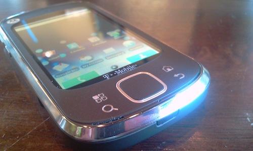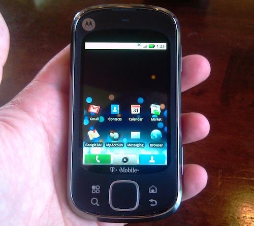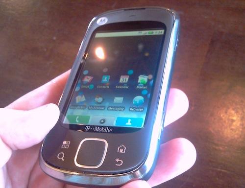
At first glance, one could find similarities between the Motorola CLIQ XT and its predecessor/brother, the CLIQ. As a result, several have written off the device as a revision of the original, which I find unfortunate. Truth be told, the CLIQ and CLIQ XT can (and do) exist together, and serve two different demographics well. If you're a fan of touchscreen-only devices, I think there's a lot to like in the mid-range Android device.
The Motorola CLIQ XT ships with the phone, battery, AC adapter, and USB cable (which doubles as the power cord). Motorola includes two backplates in the box: a texturized black one, and a smooth purple one. measures in at 4.59 inches tall by 2.33 inches wide by 0.48 inch thick, and weighs 4.4 ounces, making it absolutely perfect to carry around in the pocket, purse, or briefcase. The 3.1-inch screen is on the smallish side, but it's still perfectly functional for most users. It's funny, though - despite the screen being somewhat cramped when reading text for an extended period of time, I found the on-screen QWERTY keyboard to be very easy to use. In fact, I'd rate the QWERTY keyboard on the CLIQ XT as one of my favorites, despite the small size. If you're a Swype fan, the device comes pre-loaded with the keyboard. The device offers a small LED that glows when you have an update, message, or the battery needs to be charged. It's non-obtrusive, and I like it.
I still find MOTOBLUR to be a challenge to use. Every individual that I introduced the device to appeared to be more confused when they handed the device back to me. Call me crazy, but MOTOBLUR (and any "overlay UI," for that matter) is intended to make the device easier to use, not harder to use. I get the direction that Motorola's trying to take here (consolidation of social networking and general communication into one medium), but I find it to be a bit cluttered and less functional than other Android "skins" such as HTC's Sense UI. As a prime example, I don't want my Twitter contacts in my main address book, yet didn't see an option to remove them without deleting the entire account.

The device runs Android 1.5, which at this point, is a bit long in the tooth. Fortunately, Motorola has committed to upgrading the CLIQ XT to Android 2.1 later in the year, so at this point it's a waiting game. Until that happens, however, I have a hard time recommending the device to certain users due to the lack of multiple Gmail accounts, speech-to-text, and other upgrades that you get in 2.1.
The Motorola CLIQ XT offers a 5.0-megapixel camera, and in my initial testing, it takes fantastic pictures. Complete with flash, autofocus, and digital zoom, it's well equipped. There's a slight shutter lag, but it's not nearly as bad as other smartphones like the DROID and BlackBerry Storm2.

I've been working with the CLIQ XT in the Charlotte metropolitan area, and in my testing, call quality has been great thus far. I've experienced no dropped calls, and overall call quality is very clear and crisp. Speakerphone is on par with most other devices, and my Bluetooth headset connected without issue. Though I haven't conducted formal testing just yet, overall data speeds seem to be reasonably fast.
All in all, the CLIQ XT offers a modest feature set for a mid-range Android device. While many seem to dismiss it due to the similarities to the CLIQ, I find that the feature set and form factor separate it and in some cases, make it a better option. The thin size makes it perfect for the pocket, and the rubberized buttons at the bottom of the unit seem perfectly equipped to handle the test of time.
The Motorola CLIQ XT can be purchased at T-Mobile retail stores or online at www.t-mobile.com for $129.99 with a new, two-year customer agreement. Stay tuned for my full review!