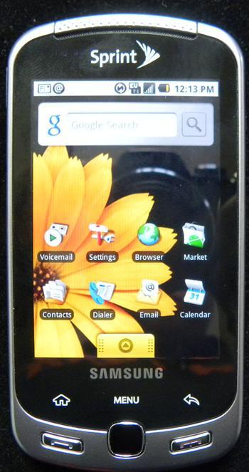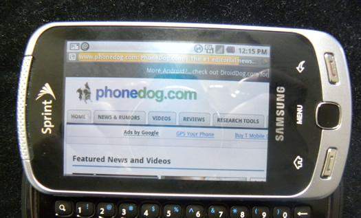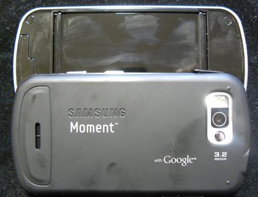
I had high hopes for Moment as the hard QWERTY Android device I'd been waiting for. Sadly, even after using it I'm still waiting.
It's not just that Moment ships with Android 1.5 while Moto Droid has 2.0 and HTC Sense and MotoBlur are solid value-add propositions to stock Android 1.x installs. And it's not just that Moment is kinda big and bulky in a world full of thin touch-only handsets with passable virtual QWERTY boards.

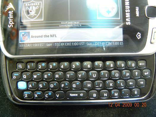
No, the problem with Moment is all of that added to its utterly bizarre QWERTY layout. The buttons themselves on the QWERTY board are very good - great, even. It's just that they're in strange places. The 'z' button is to the left of the 'a,' the 'enter' key is in the same row as the 'p' and the space bar is sandwiched in between the 'p' and the 'b.' Look at the keyboard on whatever device you're using right now and tell me how that layout makes any bit of sense.

It's too bad, too, because a stock Android install is customizable enough that a device with Moment's viivid OLED touchscreen, 800MHz of ARM11 processing power and nicely tactile keyboard could really appeal to a wide swath of power users. But somehow Moment just doesn't have the appeal in person that it does on paper.
