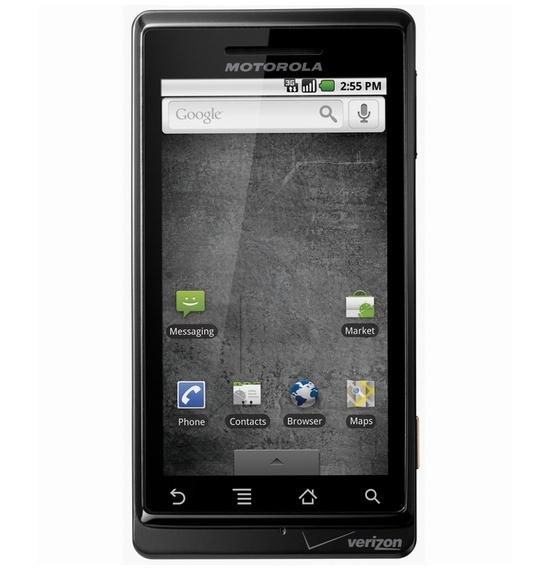
What's good: Android 2.0 with Google Navigation; 3.7" WVGA capacitive display at 480 X 854 is visually stunning and sensitive to the touch; 5 MP cam has dual LED flash; 3.5 mm audio jack; browser handles HTML5 and ships ready for Flash 10.1.
What's bad: Physical keyboard is difficult to use; sliding mechanism not spring-loaded; because it's the first Android with this screen resolution, customization apps don't always work properly, so you're kind of stuck with vanilla Android. That said, Android 2.0 is very nice.
So, this is it. This is the phone that caused the Android community to gather together and vote... to nominate the Motorola Droid as the official mainstream ambassador for all Android phones. Well, not exactly, but the end result is the same. Verizon's gung-ho media assault has included: taking over digital signs in Times Square so they can be used by consumers to display the results of their voice-controlled searches; bashing the iPhone with a series of "iDon't"ads on national television; and calling in a long list of PR favors, which has resulted in Droid-related conversations popping up in situations ranging from anchor-to-anchor banter on the evening news to late night comedy bits to concert ticket lines crowded with tweens. This is the one that made it. And while it's certainly not my dream phone, it is the one that's right for the job. It came at the right time, and to the right network. It came packing Android 2.0 and Google Navigation. Android has hit officially the big time.

The Droid looks like a high-quality device. It feels sleek and solid. There is a distinguished air about it. The capacitive buttons below the touch screen glow a soft white light and respond to your gentle touch with a satisfying and subtle buzz, as haptic feedback is integrated tastefully with the UI. When closed, Droid looks stylish and expensive - perhaps reminiscent of Sony Ericsson's general aesthetic, but maybe that's just me. The battery cover is metal, which reminds me that I'm not playing with a toy - this is a sophisticated piece of technology. The volume rocker sits on the right side, which isn't my preference, but it's different. Other than that, there's a dedicated camera button, and that's it for external controls. The 3.5 mm audio jack and 5 MP camera with dual LED flash are great, but those aren't the features that will really grab your attention. What will?
The screen. The screen is more than enough to win over both casual users and experienced cell phone junkies. The colors are bright and sharp, and the display is physically larger than we've seen on any other Android phone to date: 3.7" at 480 X854 pixels. That's a 16:9 aspect ratio - a true widescreen. It's sensitive to the touch and has an oleophobic coating that makes the display resistant to fingerprints and easy to clean. This is the first part of the phone any shopper will pay close attention to, and it's likely to hold their attention. Until, that is, the phone is opened.

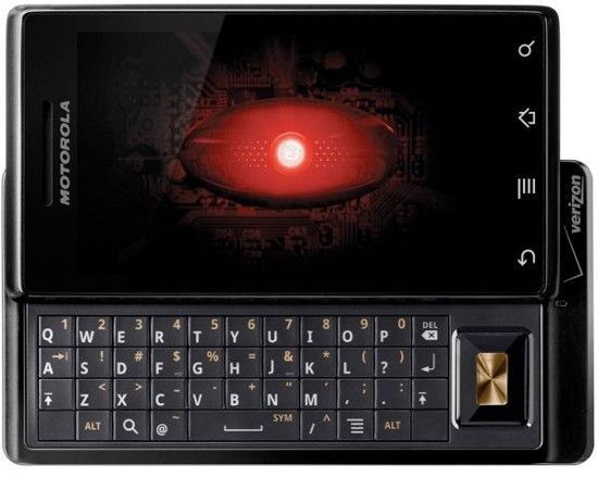
Droid's sliding mechanism is not assisted by and springs, arms, or any other diddlydoos that'll help it along in the direction you push it. Opening and closing the phone via tongue-in-groove is entirely manual. Many of you will think I'm being too picky, looking for reason to dislike the phone. But hold this thing next to a G1 and give each display a good open/close test. The G1 behaves in a manner more consistent with a high-end device - at least in my mind. I don't like opening the Droid. Not just because of the sliding mechanism, but because of what's beneath that display panel - the keyboard.
Droid's keyboard isn't just difficult to use; it's nearly impossible - for me, anyway. I know it takes time to adapt to a new keyboard, but I couldn't even get past the first few days. Despite a conscious effort to adjust, I installed a virtual QWERTY program, Better Keyboard, out of frustration and used that for the remainder of my loan period. (I don't like the default Android virtual kb.) The Droid's hardware keys are flat, not separated, and arranged in a grid. None of the characteristics of a touch-type capable QWERTY are there. It's a hassle. No problem. I like Better Keyboard.
But look at that image above again. Droid doesn't have the trackball I've come to take for granted on Android devices, so if you're in the middle of typing an email and need to accurately jump to one section of the text to drop in a few forgotten words, you've got to slide the keyboard out to access the D-pad. So what? Much ado about nothing, right? O.K., I'm willing to let this gripe slip. Many of you will feel differently about the keys and don't care about a trackball. And besides, Droid will make up for these shortcomings in the eyes of many users.
Android 2.0 is intuitive and easy to navigate. Everything is where I want it and there isn't any unnecessary clutter or complication. That goes for everything from system settings to the web browser - which operates beautifully, by the way. People who were put off by the bogging down of previous Androids by too many background tasks will be thrilled to browse on Droid. I went three days with heavy use and no reboot and was able to browse while listening to music without experiencing more than a slight hiccup when a web page was loading. Once loading was complete, I was zooming around the page like butter. I only wish pinch-and-zoom was available. Ah well, you can't have everything.
I'm still waiting for a true media management solution to replace doubletwist, and I'd really like a desktop program for app management. but overall, Android is ready to play with the big boys. I've seen Google navigation woo more than a few people over to my local Verizon shop - that is, before navigation made its way to Android 1.6.
I'm not going write too much about the features that can be found on all Android devices, but for those of you who don't know anything about Android at all, Droid is fantastic for email (I prefer the standard pop3 email client over the included GMail app), web browsing, instant messaging, and staying organized. It's still behind in terms of syncing to your computer and it can't be dropped into an existing ecosystem like Apple provides. But fans of other big name devices can get by with an Android device now. The apps are getting stronger and the phones are getting faster.
As for call quality, I did run into problems - both when I was on the Droid and when my contact on the other end was. So many factors play into call quality that I usually hesitate to mention it. But I did run into problems. Your experience will likely differ.
Motorola's Droid is the snappiest Android I've used to date. This is a significant issue, as one of the most common complaints I hear from Android users is regarding lag. This complaint has generally come from those using a customized version of Android - like HTC's Sense - but does come occasionally from those running vanilla Android, as is found on this device. Android 2.0 brings some interesting new features to the table that won't be fully realized until developers have had some time with it. Voice control, gestures, better accessibility tools - all of these are wonderful. But the most exciting new feature is the navigation now integrated in Google Maps. Turn-by-turn audio cues, on a phone, by one of the biggest names in tech has people guessing at the future of dedicated GPS units.
Combine the Droid's speed with limited exclusivity to Android 2.0, slap on a killer screen and put it all up for sale on Verizon before the holidays and you have a major hit on your hands. If you've already got one, there's plenty to be happy about. But don't rush to the shops just yet, folks. Better phones are coming. Faster phones. Phones with decent hard and software keyboards. Phones with comparable screens, Android 2.0., and Google Nav. They are coming. They are coming soon. While Droid may be the hottest Android on the shelves at the moment, it won't be for long... Though it may be the hottest vanilla Droid for a little while. If you're into patching together your own custom homesceen and don't mind the keyboard, this one might be for you.