Sometimes I’m surprised by the number of people who choose phones based on looks. I shouldn’t be — I used to do the same thing. Actually, I still do, to some extent. If a phone has everything I want and need, but looks like a cellular version of Ugly Betty, I’m probably not going to haul that around for long. But does that make us superficial? Perhaps. Or maybe we’re not so wrong in this after all, since the form factor (or physicality) of a phone really is important.
Good design is about more than just looks; it impacts the way a device feels in our hands and our joy (or sorrow) while using it. So with that in mind…
THE MOTOROLA DROID, DESIGNWISE:
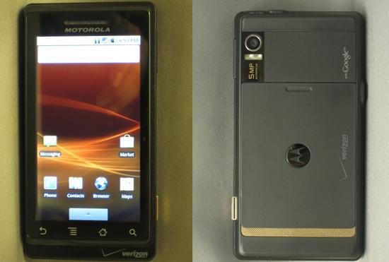
The Phone Itself, In General: The Droid is sleek, sophisticated-looking and — well, kind of heavy. Reports say that it only beats the iPhone by an ounce, but I find it really hard to believe. Maybe it’s the balance of the device, since its so lean and tall. But it’s nice that it feels like a phone for adults, and not a plastic Hasbro toy. The metal and glass (for the display) are what give it the heft, and the soft, matte-black backing feels good to hold. And despite the large side-sliding QWERTY keyboard — which is similar to computer keyboard layouts — it is surprisingly thin. Unlike other bloggers, I actually don’t mind the gold accents on the back. It kind of reminds me of an 80s retro design detail, so I kind of dig it.
At first, I liked the Droid’s looks. But eventually, I realized that a large, heavy rectangle with boxy corners wasn’t the right shape for me. I like rounded corners that don’t feel like they’ll tear a hole in my pants pocket or show early wear because it’s clanged around in my purse. (And is it me, or does it kind of have a masculine aesthetic to it?) Not the least of all, the Droid’s sleek shape and weight makes me worry that my clumsy hands will drop it or accidentally send it flying into the nearest wall.
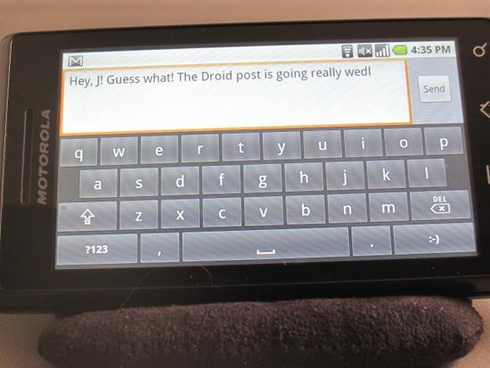
Keyboard: The Droid was criticized for its QWERTY keyboard. It’s true — it’s pretty flat and really stiff. I don’t like flat keys in general — which sadly is typical for slider phones — but I’d rather this than none at all. I’ve been pining for an iPhone keyboard for a long time, and at least Droid users get one. But it’s not exactly a joy to type on. As for virtual keyboards, those that prefer onscreen action will do fine with the Droid, at least in landscape mode. The keys (both physical and onscreen) are pretty large, so big fingers won’t be disadvantaged. Portrait mode is another story. The virtual keys are a bit cramped, so one-hand texters, take note.


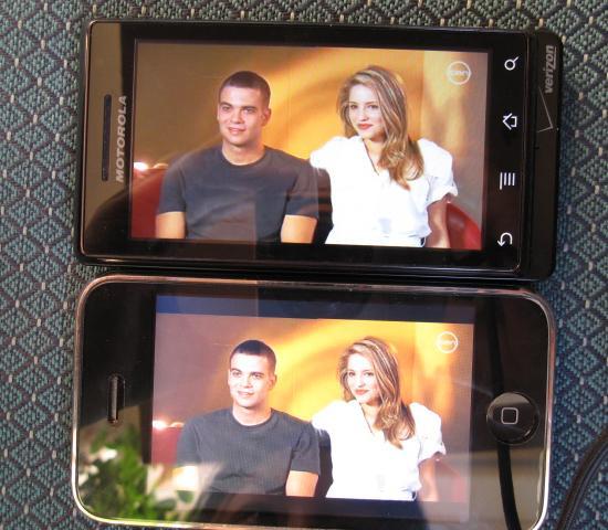
DISPLAY: The high resolution, glass screen offers colors that are ridiculously rich, so games, pics, vids, etc, really “pop” nicely. In fact, I have to admit it has a more stunning display than the iPhone. And yes, the difference is noticeable to the average eye. The viewable area is also a little bigger, at 3.7 inches, beating iPhone’s 3.5 inches. That may seem like nothing, but it’s really, really not.
The size, coupled with the homescreen’s small icons, makes the display feel positively massive. And in the early afternoon, with the sun blazing in my eyes, I could still see the screen, which was really crisp. (It doesn’t do as well with the sunlight beating right into the display, but to be fair, I don’t really know any smartphones that do.) Those big luscious colors really shine while web browsing or watching YouTube vids.
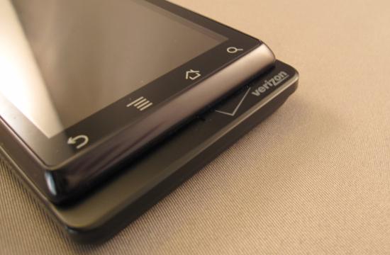
"The Lip": It doesn’t seem to serve a purpose, other than housing the microphone and Verizon logo. Couldn’t Motorola have gotten rid of it to make the phone slightly smaller? I guess it’s not really a dealbreaker, though; just a point of curiosity.
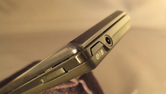
Other: The Droid’s “ON” button is kind of a bummer. Several phones — including the iPhone, HTC Hero, BlackBerry Tour, Samsung Jack, MyTouch, etc… — let you hit a front-facing button to wake it. Easy. Not so with the Droid. In fact, there are no hardware buttons on the front at all. The only way to wake it is to find and hit that little button at the upper right corner. Since it’s flush with the top, it’s not easy to find without looking or using two hands. Meanwhile, good luck not dropping it while you’re bumbling with the phone. It’s already slipped out of my hands numerous times (luckily, onto my couch and other soft surfaces), but on the go, my luck might run out all over a concrete sidewalk.
On the plus side, it has a standard headphone jack (3.5 mm), so most earbuds should work for audio. There’s also a separate button for the 5 MP camera with built-in LED flash and zoom, and camcorder. I am incredibly jealous of the LED flash. My iPhone doesn’t have one, so it was nice, though bittersweet, to play with this one. (BTW: IMO to date, I actually think BlackBerrys have the most wicked flash, for better or worse. Man, those could light up outer space.)
I could really go on, but these seemed like the biggest joys/issues with the physical phone. If you have a Droid, and want to help out other people thinking of getting it, offer your thoughts on the handset design below.
Click to go back to the Preface or to Part 1: The Android OS (in 10 minutes or less). Or continue on to the last and final part: Major features