Last night, Samsung and T-mobile unveiled the Samsung Behold II with a launch date of November 18 and price tag of $229.99 (with two-year contract). Sammie’s second Android handset and (the maker’s first for Tmo), the Behold II sports the TouchWiz 2.0 interface (with a 3D cube UI for 6 multimedia features) running on Android 1.5. The phone has:
The Behold II feels good in the hand. From the previous unofficial photos, I kind of thought it would be more “plasticky,” but the device has a decent amount of weight so that it feels substantial (though it’s not as heavy as the DROID). And it’s thinner than I thought it would be, with rounded corners, which make for good “pocketability.” While fans of physical keys may pine for the lack of QWERTY keyboard, they’ll definitely like the front face buttons. Overall, it’s a quality build.
I am such a fan of AMOLED screens, and this one is quite decent. Maybe not as snazzy as the high-res display on the DROID, but still vibrant and crisp, with great colors. The slightly protruding camera button on the side of the device is a nice touch — it sticks out far enough that you can find it without looking, but not too far out — and half-pressing it engages autofocus (like real digital cameras).
Like I told Noah, the UI didn’t really do it for me. Your mileage may vary, meaning that if you’re already a fan of TouchWiz, it’s probably neat seeing it on top of Android. But it seemed to slow things down a bit, in terms of responsiveness, and it just didn’t seem worth it to me. It didn’t help me navigate, and the Cube’s “cool” factor wore out after about a minute.
Considering all the buzz about Verizon's Moto DROID, it's hard not to make comparisons. Given that the Behold II comes with a noticeably laggy UI on top of Android 1.5 for $229, while Verizon’s listing the Moto DROID for $199 (with Android 2.0 and superior display), I’m kind of worried for the success of this offering. But, and I can’t stress this enough, this is a first impression after playing with it for 5 minutes, so take it with a grain of salt for now — at least until PhoneDog can get in and really test it for a full review.
Below are a mix of promo pics, along with images I shot myself. You can tell which is which because in my photos, the film is still on the face. Noah told me that PD fans like it when the film is removed in the unboxing vids, so I left that on for now. I also took some shots of the handset next to the Moto DROID, the iPhone 3GS and the Palm Pre, just for size comparisons. (There’s even a pic next to a Sharpie, so you can really get the thickness of it.)
So enjoy these images for now. I’m in the throes of vid editing the hands-on demo, so you can see it in action, so look for that later today.
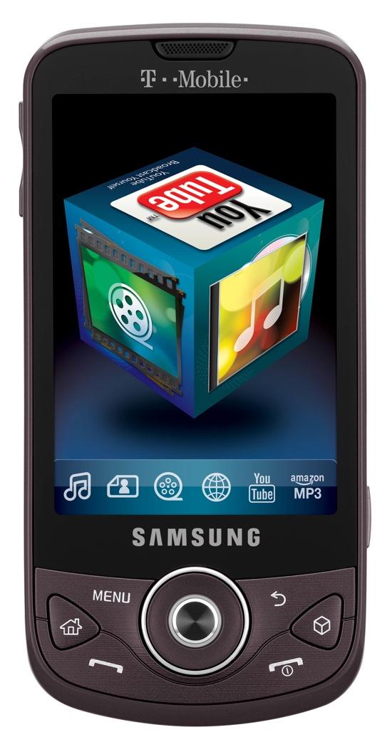
Behold II (promo pic 1)
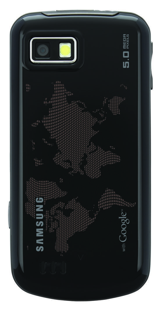
Behold II (promo pic 2)
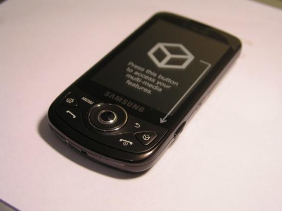
The front of the Behold II
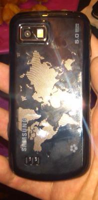
Back of handset (camera, flash)
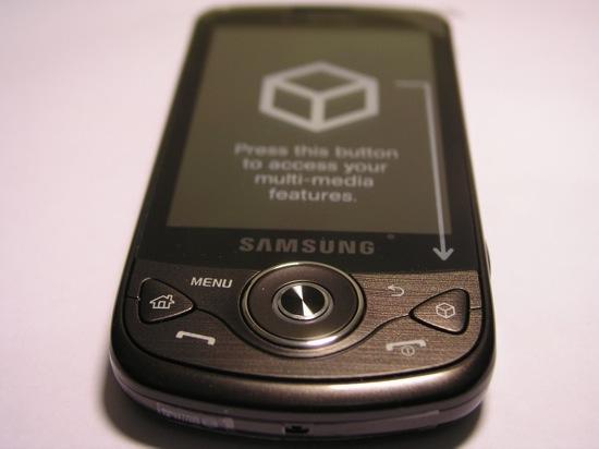
Front face buttons
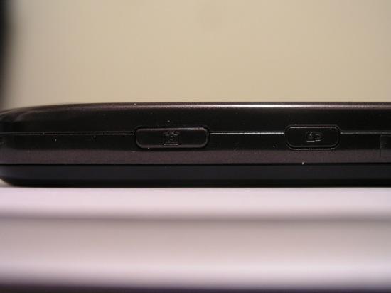
Camera button, lock button on right side
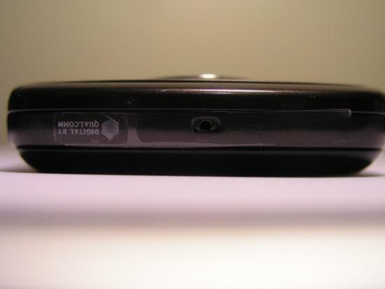
Microphone
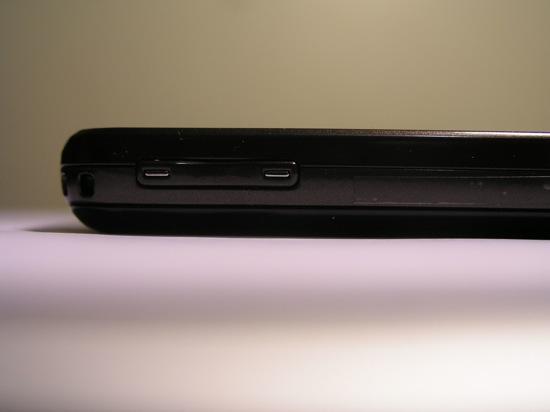
Volume rocker (left side)
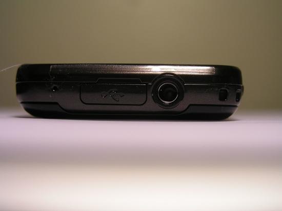
USB and 3.5 mm headphone jack (top)
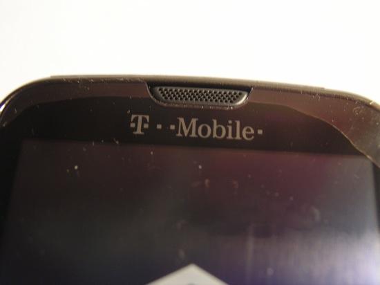
Tmo branding
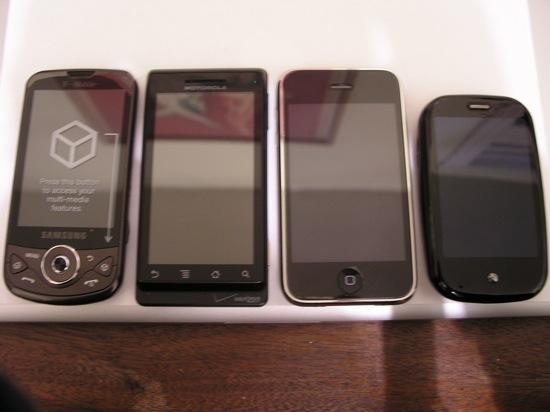
The Behold II, next to DROID, iPhone 3GS and Palm Pre (length comparison)
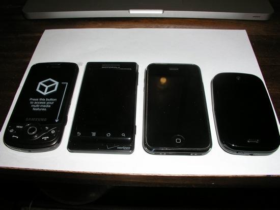
Another length comparison (without the distracting reflection in the glass)
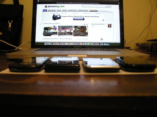
Thickness comparison (again, Behold II is on the left)
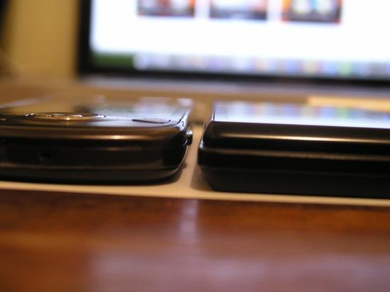
Behold II next to DROID
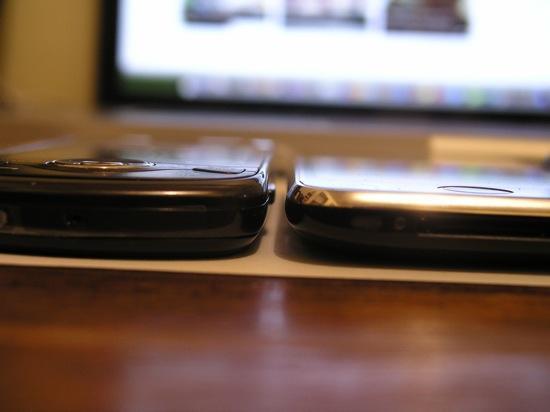
Behold II, next to iPhone 3GS
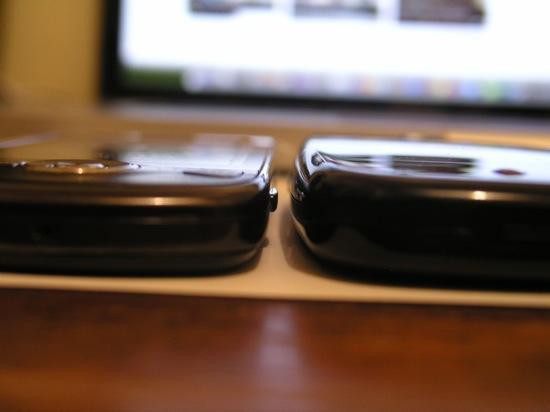
Behold II, next to Palm Pre
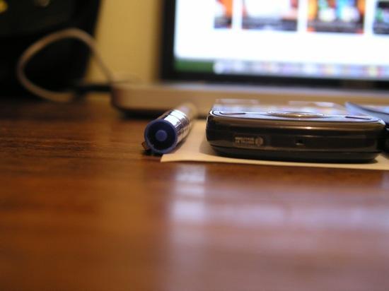
Behold II, next to a Sharpie!