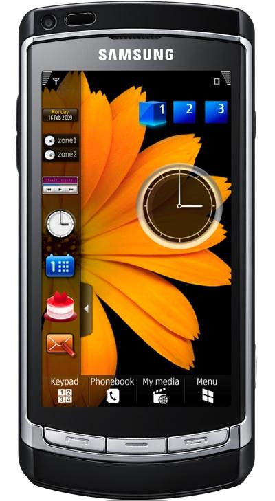
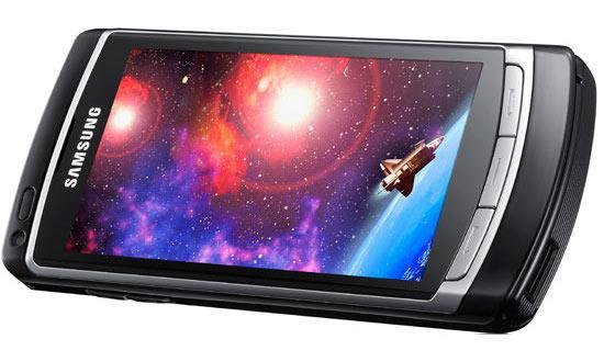
What's good: the 3.7" AMOLED touch-screen at 360 x 640 pixels looks fantastic; the 8 MP cam is probably the best I've used on a phone - for still photos and video, which are easily shared; 3.5mm audio jack doubles as TV-out; comes with 8 or 16 GB of internal storage and supports microSD up to 32 GB; 1500 mAh battery and good sleep implementation mean it can go a very long while without recharging; TouchWiz makes Symbian much more usable.
What's bad: Symbian problems turn up at unfortunate times; simple actions take far too many taps; keyboard leaves much to be desired; I wish it had a Xenon flash, but LED is O.K..
This GSM unlocked quad-band device turned heads from its first hands-on appearances in tradeshow videos from Barcelona last winter. And it was all about the screen, up front. The Omina HD's AMOLED display is gorgeous, and thankfully, capacitive. The next bullet point (arguably of only two) is the stellar camera that meets the latest MP standard for consumers and also shoots 1280 x 720 HD video. This device is sure to satisfy visual urges; from the design of the hardware, to the glow of the screen, to the photos you shoot, to the videos you can edit a bit right on the phone. Samsung's TouchWiz UI goes a long way to dress Symbian up and make it more usable than stock, but there are still some areas where annoying issues may pop up and remind you what you dislike about Symbian, if anything. Still, it's a usable phone for those willing to pony up the cash, and a great camera.

Talk about sexy. When lit up, the i8910 looks like it's made of screen, and people notice. Black metal might make this phone better match its price tag implies, but the silver and black plastic do work well together. A proximity sensor and secondary cam sit above the display. There are only three buttons on the face; send, end, and menu. The right side features a hold key, dedicated camera button, and microUSB port. The left, a volume rocker and microSD slot. on the top there is a 3.5 mm audio (and TV-out) jack and a centered lanyard clip point. On the back you'll find that 8 MP cam with LED flash. Under the cover is a 1500 mAh battery, which, along with the software, is all kinds of greatness. At least when you keep things simple.
Inside, the guts enable stereo bluetooth, Wi-Fi with DLNA, and assisted-GPS, which takes care of geo-tagging images. The saftware alos does smile, blink, and face-detection and WDR (wide dynamic range) images. Hard-core photographers may find the preset scenes (fireworks, candle light) a bit limiting, but I think even high-end consumer photographers will be more than satisfied with their options. Exposure value can take acute adjustments, but focus is auto, macro, and face-detect. Video options include slow-mo, and time lapse. TV-out makes this an easy winner for shooting sports, school plays, or a day at the beach.
The interface is TouchWiz on top of Symbian, which I'll get deeper into in the usability section. You have a decent number of fairly useful widgets when you first boot the device. And anyone familiar with another TouchWiz phone will be right at home. The music widget, while simple, does it's job and is usually enough for me. The photo frame widget is cool, as is the little control panel widget that lets you switch between screens - though I don't have enough widgets that I really use to make that necessary. Maybe I'd throw the birthday reminder widget into the mix if I knew I was keeping the phone.

As I said, the phone's most important features are looking right at you from the front and back of the device; the display and the camera. Neither disappoint. In fact, both are quite striking. The screen is sensitive and the software responsive. The camera is a pleasure to use, if a bit slow between still shots. Maybe 7 seconds, not a big deal considering the end result. Where I ran into trouble, as I often do if things aren't just right, was the virtual keyboard.
With so much space and such a beautiful screen, I just don't see how the state of the virtual qwerty can be justified. It's not that the keyboard is horribly unusable or anything, it just doesn't live up to the rest of the phone. It doesn't look very nice, it doesn't have any sort of auto-correct, suggest, or completion, and it requires extra taps for selecting a field and closing the kb. O.K., I may have been a bit picky regarding that last detail, but once you've used the Omnia HD for a bit, extra taps are a real issue.
TouchWiz does help this phone a great deal, but take, for instance, one of the web apps disguised as a widget on the home screen. Take Facebook. I tap the icon. I tap the user ID field. The kb comes up and I enter it, tapping a couple of buttons to switch between letters, numbers, and symbols. And despite going slowly and having plenty of space, I can't do this without making a few errors. That is not unusual in itself, but on the Omnia, I make errors every single time I type. That is not the norm for me.
I tap the check box and the kb closes. Repeat for password. Oh, the shift key is locked whenever you press it. Annoying. I can't find an option to change this. I click "Log in." Save your login details? Sure. "Opening a secure connection. Content cannot be seen by anyone else. Continue?" Oh yeah. There you are, Symbian. Yes, continue. "Website has sent a certificate which is out of date. Accept anyway?" I can click "back" or "options." I got for options and am given: "Accept this time only," or "certificate details." Ugh. This time only then. "Website has sent a certificate which is out of date. Accept anyway?" I click on "options" and "accept this time only" (even though I'd love to say "never bother me again.") Woops, I got my password wrong.
Granted, that was after clearing private data, and there was an additional problem in this instance. But true to Symbian, the browser doesn't remember any of the stuff I wish it would. And forcing me to double-tap any selection gets to be torture. This is unfortunate because I like the way the software looks. I like the "Help, I'm stuck inside a cube!" navigation of the home screen. I really like that there are multiple home screen panels to drop your widgets on. It's cool to see the fairly new "widget downloader" widget, but the selection is pretty weak right now. Notes, Christmas Countdown; these are the options. Nothing for Twitter or most of the other stuff I like on my personal home screen.
I want to make a quick note about call quality. I had very, very good performance on calls. I have read several reviews that said voice quality was abysmal. Network is one of many crucial factors in this regard. I can say the i8910 out-performed most of the phones I've tested in my current residence in terms of call quality. Do your research, because your experience may vary.
I find myself complaining about many of the same things across multiple Symbian reviews and articles. I don't mean to nit pick or harp on them. I just find that the same hurdles continue to inhibit my use of Symbian phones, and I think they buyer should beware. Especially when you're looking to spend upwards of over seven bills. Nevertheless, this phone looks hot, and if you are big on talking and shooting, it will definitly satisfy. But if you are big on widgets, browsing, and that sort of use, you might feel that the software is getting in your way. I've had time to adapt to this phone, and I have to some extent. But the familiar protests remain. The net of it is this: If you want a decent phone with a killer cam and great screen, you'll love it. If you're a fan of Symbian, even more so. If you really need to type and navigate the OS a lot, try before you buy.
Check out Samsung's i8910 home page here.