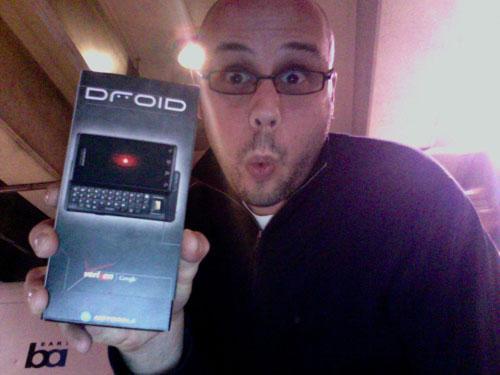
I'm just out of a meeting with Motorola and Verizon reps in San Francisco, and headed back to the office, Droid review loaner in hand, to unbox the device on-camera and start testing. So here, from the BART train platform, are some first-impressions of Droid gleamed during my briefing with the PR folk. Bear in mind that this all comes from notes I took during a 30-minute meeting, and so really should just be taken as first impressions.
Goes without saying I'll have much more for you, including hands-on video, very soon:
- Droid is the most luxurious looking Android device to date. That much is apparent on first glance. While I wouldn't have chosen metallic gold accents to compliment the phone's Black metal and glass design, Droid's long lines and low, wide profile scream "high end smartphone."
- Droid's display is big, bright, and very easy on the eyes.
- Droid is big and heavy. That's not necessarily bad, as it's also pretty thin. It's got that heft about it that I once likened to what a Mercedes S-Class phone might look and feel like. Droid's footprint is a little larger than that of iPhone 3GS, and it was apparent as soon as I held it. Heck, to carry the car metaphor out a bit further, if iPhone 3GS looks kinda like an Audi TT, all curvy and sporty, Droid totally looks like a big, black Mercedes with tinted windows and, yeah, some aftermarket gold trim.
- The combination of Droid's hardware and the Android 2.0 software seems to have yielded the fastest-responding Android device I've ever seen. I spied one "exception" warning box during the demo, but in general the phone zipped along from home screen to apps and back again, and transitions looked faster and smoother than on 1.x Android phones I've tested.
- Android 2.0 is the first iteration of the OS that I might really call ready for the masses. I'll have to play with it for awhile myself to be sure.
- From what I was told, and the little I saw, Android 2.0 is full of plug-in framework-type goodies that will make developers very excited about the future of the platform.
- Google, Motorola, and Verizon really seemed to put some thought into how to market Droid to the new wave of "Mass Smartphone" users. From the polish of Android 2.0 to the nifty home and car docks that launch their own UIs, Droid is full of little consumer-friendly touches that 1.x Android devices have generally been lacking.
- I didn't test the hard QWERTY during the briefing. It looks bigger than the one on MOTO Cliq, but not that much bigger.
- The virtual QWERTY is multitouch aware. The Web browser is not multitouch aware but does support double-tap to zoom.
- You've already heard this, but Google messed up an entire industry with that free navigation app that debuted on Android 2.0 and Droid today. We couldn't get a GPS signal in the building I was in, but the app looked solid and ties into Google's massive Maps database, so I'm guessing it probably works alright.
I'm almost to my train stop now, so I'll stop here and get to some actual testing of the phone. But I'll leave you with this thought: In retrospect it seems like Google went with some of the smaller US carriers to launch Android, get the platform into the hands of developers and early adopter consumers, and generate some income via sales of the T-Mobile G1 and myTouch 3G while getting their first "real" consumer release, Android 2.0, ready. I don't mean that to say that T-Mobile, Sprint, or their customers got bamboozled with "not-ready" hardware and software. But between Droid & Android 2.0's feature sets and performance, and the more consumer-friendly look and feel of the Droid hardware, it's hard not to think that Google, Motorola, and Verizon were happy to bide their time over the past year or so until 2.0 and Droid were ready to blitz America in time for Holidays 2009.
