I wasn’t a fan of Windows Mobile 6.1. I found the interface clunky, old-fashioned and hard to navigate. But part of my New Year’s resolutions for 2009 was to be more open-minded about Microsoft’s mobile OS (despite being an iPhone/Apple girl), and although the year is mostly over, I’m still trying to remain true to my word. So I had a brief, yet close up, look at 6.5 earlier this month, and you know what? I’m still not feeling it. An improvement, yes (especially the homescreen), but unless you’re well-versed with WinMo to begin with, it’s not an easy transition, especially if using a stylus is not your favorite thing.
Maybe that’s why, at least when it comes to Windows Mobile 7, I’m still waiting to exhale. Details are scant, which always creates buzz in this business, but I’m hoping against all odds that something new is on the way. According to a leaked image of the enigmatic 7, there just might be.
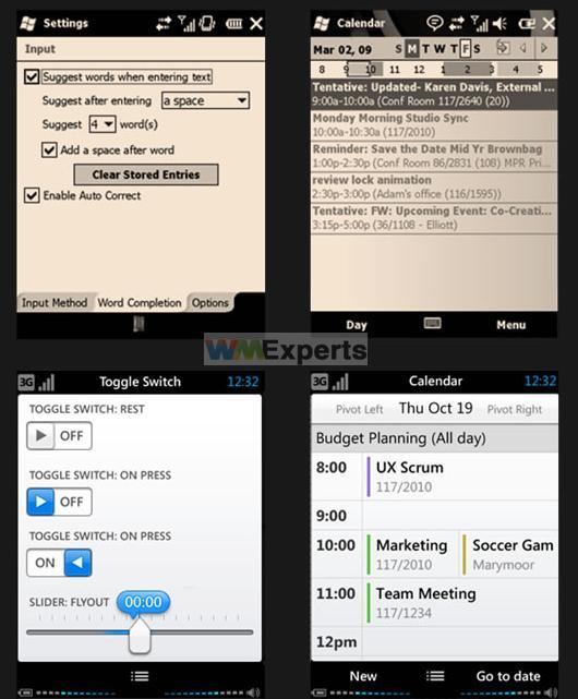
Thanks to WMExperts (and our friends at MobileCrunch), an image has surfaced showing the settings and calendar screens. The two shots on top are 6.5, and internal mockups of the same screens in WinMo 7 follow in the row directly below it.

Niiiice. I mean, it’s just the settings and calendar screens, I know, but this bodes well for the rest of the UI, don’tcha think? I may be an Apple fan, but I sure can’t wait to see this version of WinMo in action.
[via MobileCrunch, WMExperts]