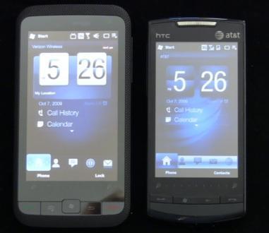
(Left: Verizon HTC Imagio, Right: AT&T HTC Pure)
Microsoft launched the Windows Mobile 6.5 era this week, and thanks to the folks at Microsoft and Verizon, respectively, I've had both an AT&T HTC Pure and a Verizon HTC Imagio on hand for several days now. The two devices both came with WinMo 6.5 pre-installed, and feature full-touch, candybar form factors along with 3G and WiFi connectivity and five megapixel cameras. Pure is more or less a rebadged Touch Diamond2 with slightly different styling and construction, while Imagio is a brand new handset that's akin to a Touch Pro2 with the hard keyboard lopped off.
Honestly, there's not a whole lot to get excited about in WinMo 6.5. This is much more of an incremental update to 6.1 than a huge leap forward, and as other reviewers and bloggers have pointed out this week, the cores of 6.1 and 6.5 remain largely the same. In other words, however "new" Microsoft wants 6.5 to be, it's still based on the same old Windows Mobile 6.x that's gotten, well, pretty old at this point.
What's interesting about these two handsets in particular - and more and more WinMo phones in general these days - is that great pains have been taken to hide as much of the 6.5 experience from the consumer as possible. HTC has outfitted both Pure and Imagio with TouchFLO 3D, a user interface that replaces the WinMo 6.5 "Titanium" Zune-style home screen with a set of screens you can scroll through to access widgets ranging from Mail to Messaging to Music and Photos/Videos. WinMo and smartphone enthusiasts are familiar with TouchFLO 3D by now, and it works on these two devices pretty much as you're used to it working on older phones like the Touch Diamond and Touch Pro families.
Switching the default "Today" settings let me play with the new 6.5 Today screen, and I actually kind of like it. Scrolling is smooth, fonts are big and readable, and the contextual information is nice. TouchFlo 3D provides more functionality that I'm personally interested in, but not all WinMo 6.5 phones will be HTC phones, so it's good to see the new Today screen in a favorable light.

Imagio also dispenses with 6.5's ballyhooed new "Honeycomb" Start screen in favor of HTC's custom Start page (at least by default). Tapping the Start button on Pure took me to the new Honeycomb look and, frankly, I'm not sure what the big deal is. I guess it's a bit more finger friendly, but it really just looks like a collection of offset icons. Okay, it's nicer looking than the 6.0/6.1 Start pages, too. But it's not really any great shakes.
One of WinMo 6.5's biggest upgrades comes in the form of a new Web browser, Mobile Internet Explorer 6. But both Pure and Imagio come with Opera Mobile preinstalled - tapping the "Launch Browser" icon from within TouchFLO does, in fact, launch Opera. I dug around and found IE and launched it on both phones - it's better than IE 5, for sure, but still not as good as Opera (and forget about comparing it to Skyfire or Mobile Safari). Opera renders faster and smoother than IE 6; I guess that's why HTC wanted to pre-install it and both AT&T and Verizon said okay. Playing around with IE 6 yielded enough oddities on some of my favorite Web sites, mainly in the form of strange column formatting, that I said enough is enough and went back to Opera pretty quickly. IE 6 is also slow - did I mention that?
Windows Marketplace is Microsoft's answer to the raging fad that is mobile app stores. Windows Mobile users have been able to purchase and download software from online vendors for years now, but Apple's success with their App Store has caused Palm, Google, BlackBerry and now Microsoft to rethink the whole business of selling mobile software (I wonder how Handango feels about all of this right about now?). Windows Marketplace is fine. There's not much in the way of apps lining the shelves right now, so I'm going to reserve judgement on the whole thing, but I was able to enter my Windows Live ID and successfully download, install, and run the free Facebook app.
6.5 also features My Phone, a wireless backup system. My Phone premium lets you do remote wipe, remote "Locate My Phone," remote text searches, and remote switching from silent to full volume (seriously) in addition to the standard wireless backups of contacts, photos, and the like. My Phone premium is free until November 30 and then will cost you five bucks per seven days of use, which makes it more of an "in case of emergency" service than something you'd want or need on the regular.
Everything else is more or less what you're used to from Windows Mobile 6.x, with a few minor UI and performance tweaks here and there. I understand that a lot of people get a lot of functionality out of WinMo on a regular basis. I get it. I'm not trying to argue against the thousands upon thousands of installations, Exchange users, apps, and other arguments in favor of WinMo. But I am saying that held head-to-head against other modern smartphone OSs - Android, WebOS, Maemo, iPhone - WinMo 6.5 looks pretty old and ragged. Did I say that iPhone's Exchange support kicks 6.5's butt? No, I didn't. Did I say that iPhone looks far more modern than 6.5 and that Mobile Safari provides a far better Web browsing experience than Mobile IE 6? I sure did. And I'll say the same thing about Android, WebOS, and even (gasp) Symbian, too.
Now about those phones.