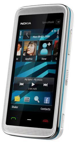
What's good: great looks; 3.2 MP auto-focus cam; MMS; Wi-Fi; Bluetooth, FM radio; accelerometer; proximity sensor; resistive touch screen is pretty sensitive; under $300; cool new home screen; a great little media player.
What's bad: no 3G; although adjusted for touch screen use, Symbian S60 still doesn't feel like a touch OS; on-screen keyboard is inconsistent and unpredictable.
The XpressMusic line of Nokia phones has been a huge success. The 5800, or tube, which trumps the 5530 with 3G is also going for less than $300, but is bulkier, less attractive, and seems to have a less sensitive screen. Not to mention that the 5530 has a beefier processor. The 5530 is focused at 2G markets, which might cause US consumers to turn away. But the browsing on the 5530 really doesn't warrant a full-blown data plan anyway.
If you're looking for a sleek touch screen feature phone with a decent media player, but need to keep an eye on the pocketbook, the 5530 might be for you. It is a Quad-band GSM 850/900/1800/1900 unlocked device. (cont.)

The first time I pulled this phone out, my wife said, "Woah, cool phone!" And it does look cool. I prefer the black version (which I haven't actually seen in person) but the white and blue model is pretty sexy. Nokia went minimal on the buttons and switches here, utilizing only touch sensitive contact points for the front of the phone. I'm not sure of the tech here, but it reminds me of a microwave. You don't detect any movement in these areas - they just sense your touch. Send, end, menu, and the dedicated media button are all situated, without seams, on the face of the phone.
On the top of the body you'll find a power button, on the right, a hold switch, volume rocker, and shutter button. That's it; there are no more controls and I like it that way. The left side of the phone is where you'll find the SD and SIM slots, and they are covered by a plastic strip. The bottom of the body features microUSB, 3.5 mm headphone jack, and the power jack. This is also where you draw the stylus from.
On the back you'll find the lens of the 3.2 MP cam with flash, but the little square surrounding it (that looks like a flip-out kickstand) is actually just for looks. The resistive touch screen is 2.9" at 640 x 360. The included earbuds are better than I'm used to finding in a phone box. (cont.)

The number one complaint I have with the 5530 is the inconsistency of the on-screen keyboard. When I'm entering data into a field on a web page, I can turn the phone sideways for a roomy, full-screen QWERTY. Nice. When I'm adding a new contact, I only have the portrait mode alpha-numeric 10-key or handwriting recognition. Hrmph. When entering settings information, such as a Wi-Fi network password, they keyboard goes landscape, but I only have the 10-key or handwriting options. (What!?) That, to me, feels like a half-baked feature, and I'd love to see system-wide uniformity here.
As for the operating system, I don't want to continually rehash my old complaints about Symbian on touch screens. However, for the benefit of those who may not have read anything else I've written on the topic, I think it's appropriate for me to at least touch on the key points. The operating system that runs the 5530 was not designed for touch screen phones. This edition does seem to feature some tweaks and adjustments that make it more usable than it was a few months ago, but there are still what I would consider to be problems.
Double tapping, or what feels more like double clicking, should not be required on a touch screen phone. Maybe that's just my personal taste, but that alone makes the OS feel like a hacked feature phone system rather than something that was designed from the ground up specifically for this kind of device. I also think the scroll bar is way too thin, but you no longer *have* to use it. You can flick around the 5530 like you can on pretty much every other touch screen. Again, each of these issues seem to have been improved, but they still call attention to themselves.
The phone does come with a stylus, but the screen is good enough that you won't want to draw it out. The experience you are left with is halfway between a touch screen and a non-touch screen. It's an odd feeling, and I can't help but think that Nokia is in an awkward transitional phase in this regard. Still, there is improvement here.
The excessive nag screens, requests for confirmation, and useless notifications remain: "You are about to connect to a secure page. None of your data will be visible by other people. O.K.?" Ummm... yeah, that's fine, Nokia. Seriously, how do I turn this stuff off, and say, "O.K. to all" forever?
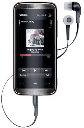
I said I wasn't going to rehash the same old complaints, so let's move on. As a music player, this phone rocks. I love it. The dedicated music button - which sits above the screen and has the same microwave-esque touch sensitive buttons used for send, end, and menu - is a no-brainer. Why aren't more phones equipped with something like this?
One tap and a panel drops down, giving you instant access to music, pictures, video, web, and sharing. Turning on the tunes causes a music control widget to pop up on the home screen, which is handy and nice looking. The front of the phone features well integrated stereo speakers, and the built in EQ sounds great. An FM radio is also available, and it uses the headphone wires for an antenna. I love this feature, but wish for a fix of my AM supernatural talk shows. That's being a bit picky.
The camera is fairly quick and produces images worthy of sharing online at 2048 x 1536. There is a 4X digital zoom. Video isn't so hot, but again - worthy of online sharing. Gags, stunts, and French teachers performing martial arts on students will be served well by this cam. You're not going to be making family movies with it though.
When it comes to basic use; texts, calls, I have no complaints. Everything works as it should, and the quality of communications was fine.
Nokia's XpressMusic phones are a big success, and for good reason. The Symbian S60 operating system still needs a few tweaks to feel like a true touch screen OS, but Nokia has made headway in this arena. Future updates are likely to address the key complaints here. The 5530 is not a killer web or gaming phone, but when it comes to media, this one is strong enough to keep up with my daily use. The 5530 is more elvolved than the 5800, so considering how close they are in price, it should not be a difficult choice if you are debating between the two. That is, unless you really need 3G.
Nokia's product page can be found here.