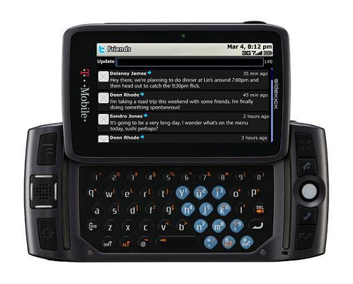
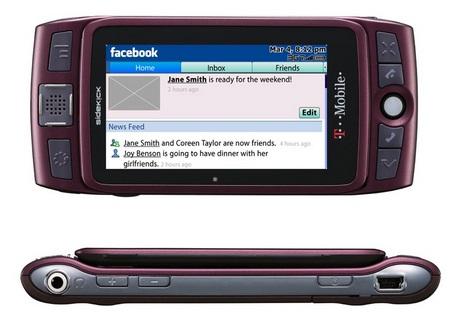
What's good: Incredibly intuitive hardware controls, full QWERTY, 3G, 3.5mm headphone jack, body slimmed-down since previous incarnations, 3.2 MP still and video camera, social features galore.
What's bad: Youthful image drastically limits audience, flashing lights and goofy sounds. Overall, a great design and interface are disguised by gimmicks.
The 2009 Sidekick LX features the same hard and soft interface that long-time fans have grown to love. While a bit larger than the 2008 model, also known as Gecko, this one has a bigger screen that looks great. Modest GPS and a mediocre camera are balanced by killer social media integration and probably the best messaging layout currently available. If you like to type and spend most of your non-call time with your phone in landscape, this is the device for you. In fact I think it was my time spent with Sidekicks that has caused my obsession with landscape QWERTY availability. The Sidekick is the prototype for many messaging phones, and for good reason.
I like Sidekicks. The full QWERTY, trackball, bumpers, combo-capable front buttons, and rotating screen have always been appealing to me. But I've found the device's appearance a little off-putting. When I was in the market, Sharp's hardware looked chunky and a cheap. I had an SK 2 and 3, and by the time the SK3 needed replacing, I was interested in other phones.
The first LX was nice, and I went to the store to check out the brown one on several occasions. It looked to me like the Sidekick might be headed in a new direction. Namely, towards the professional adult demographic. The first LX had a touch of class. But Danger and HipTop have opted for the teen set with the 09 LX. That isn't to say the software isn't becoming capable or functional outside of the social/messaging context, but that is clearly the focus.

The first time I fired it up and flipped the screen open I was taken aback by the barrage of light, sound, and color this thing emits. Wow. Cool for a teen, but not so much for me. Subtle it is not. Built-in theming takes care of some of the taste issues, but not all of them. I have to say that I would feel out of place with this phone at work in an office or at a business meeting.
The hardware is obviously sleeker than the SK2 and SK3, but the screen housing (the pivoting rectangle) feels less solid. The screen itself is great, but the panel it rests in is somewhat bothersome. There is a sticking point, and the motion required to open and close the screen is less intuitive than in early models - less fluid.
The SK3 required a tap on the upper-right corner of the panel to snap open. This one is designed to be lifted at the bottom with your left thumb. It's a difficult change to adjust to. I feel like I need to guide the screen half of the way around, because I can't break the habit of opening from the top-right. The panel wiggles (as intended for the lift-to-open design) a little too much in depth, and doesn't feel as solid as earlier versions. I guess that's the trade-off for a thinner device. I noticed this less and less the more I used the phone, so maybe it won't be an issue for you.
The camera is usable, and great for MMS and social media. The GPS is not well-integrated, but a nice addition to the line. I would say that I'd like to see a touch screen in the next Sidekick, but there's just no reason for it. The hardware controls are so perfectly arranged that I really don't see any possible improvement outside of minor adjustments to shrink the device a bit.

Despite the passage of two years since I last used an SK regularly, I found my self zooming around via key combos less than five minutes after opening the 2009 LX. The interface is so usable that it becomes second nature. It's like riding a bike. One hardware problem that makes the device less usable than previous versions is the give in the trackball.
The trackball is clickable - a sort of action button. But there is some play between the resting position and the depth the ball must be at for scrolling. So if you gently roll the ball without pressing down, nothing happens. Press too hard, and you'll click something you didn't mean to. Maybe I just got a quirky unit. It happens.
They keys of the SK3 were my favorite of the bunch. Those glossy, rounded bubbles felt great and I spent more time looking at the screen than at the keyboard while typing. A lot of people would say those were the worst keys ever to appear in the SK line. It's all a matter of preference, really. I know they gave some blisters.
The 09 LX keys are very different than the models leading up to Gecko. They are nearly flat (like the Gecko and first LX) and look slick and futuristic with back-lighting and a neon frame. They are so flat, however, that a great deal of space is required between them. I didn't think I'd ever say this, but the keys might be too far apart. Again, taste and adaptation. You've got to hold one.
The software has some major improvements over earlier versions. And the MySpace, Facebook, and Twitter apps go a long way in reaffirming the Sidekick's position as one of the top messaging devices out there. Things are where you expect them to be if you've had an SK before. Although there are tons of new options, long-time fans won't find any changes confusing or out of place.
As I mentioned in the design section, the layout of the Sidekick is perfect in my mind. Testing this new model, I've found that it is peerless in some aspects of usability. It isn't for everyone, but Sidekick fans know - you just can't beat beat the standard for a non-smart messaging phone.
The Sidekick brand as a whole represents the pinnacle of messaging phones up to this point. Unfortunately, the folks brainstorming the latest marketing and design angle for these capable devices are fixed on the idea of appealing to kids. When will we see the grown-up version? I've got nothing against having a little fun, but I don't like to trigger a light show and an obnoxious series of sound effects every time I hit the jump screen.
The first LX gave the impression that the Sidekick was on it's way up - getting classy for the professional. The 09 feels like a regression into the tween market - despite the racially diverse group of four young adults who represent different uses of the device at the official website. There is obviously a market in the tween population, and of course a phone should meet the demand. But I think limiting the Sidekick to this demographic is a waste of some brilliant engineering and potential for more widespread adoption. Sidekick Pro, please?