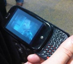
Introduction: To put it as simply as I can, Palm is back in the game. The Palm Pre is a revolutionary device that marks a radical shift for the company, and provides a much needed exclusive device for Sprint. The new webOS platform, combined with a change in hardware, offers a completely new experience from inside and out, and furthermore, represents the first serious competitor to the Apple iPhone. For those that prefer touchscreen devices and those that enjoy a physical keyboard, the Pre appeals to a vast majority, as it offers both. Though there are a few minor complaints, the major achilles heel centers around the battery life. Expect to have to charge during the day, or every night in a best-casescenario.
In the box: The actual box is quite small, and the packaging is very clearly "Apple," sporting a minimalist design and a "made in California" add-in. In the box, a charger, USB cable (which actually doubles as the charging cord), and basic pair of headphones can be found in an interesting wave-like design.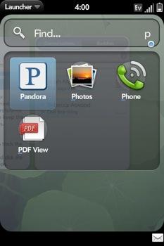
webOS/Synergy: A great deal of the excitement centers around the webOS platform. Contrary to another BlackBerry, Nokia, or something running Windows Mobile (fill in the blank with a manufacturer), webOS is completely new - and quite innovative. The key benefit for me, and what I imagine will be aprimary selling point for the Palm Pre, is the Synergy element. Fromthe exterior design to the functionality of webOS, the device takes the"pretty" aspect of the iPhone and develops the user interface into something that'sincredibly easy to use, and highly productive to boot. For lack of abetter word, it's simple and effective. With the Pre, I'm able to keep mymost-used applications open - Twitter, messaging, and E-Mail - andeasily switch back and forth between them. Synergy is where the Preovertakes the iPhone, in my opinion. The device offers an innovative built-in search option as well. From the home screen, the user begins to type a search query, and the Pre automatically searchesprograms and contacts. If nothing matches the text, the device offers theability to search via Google, Google Maps, Wikipedia, or Twitter. Atthe moment, the Pre's only searching options are programs andcontacts. It's my hope that SMS and e-mail will be added in a futureupdate.
Menus: Menus are clean and well-organized. In the bottom right hand corner, tally marks indicate which menu page the user is on (much like the iPhone's "circles"). A flick to the left or right changes the menu page. By default, commonly used applications such as messaging and memos can be found on the first screen; Sprint programs such as Sprint TV and Navigation can be found on the second screen; and system settings are located on the third screen. Downloaded apps default to the first menu, but can be moved to the menu of choice.
Form factor: According to Palm, the device was made to resemble asmoothed river rock - and when closed, one can tell that they did agood job imitating it. Much like the box, the Pre itself sports a relatively minimalist exterior. The top of the device contains the power button, headphone jack, and vibrate switch, whereas the left and right sides contain the sound toggle and the charging port, respectively.
Some have argued that the device is sharp in places, particularly on the bottom lip. Granted, if I was to rub my hand across the bottom for several hours, I can imagine it being uncomfortable, but to date, I haven't had a problem with it. Additionally, the build quality is being characterized as "cheap" by some. There is a slightwobble in the slide mechanism, but I've never owned a sliderphone that doesn't do the exact same thing. It still feels sturdy, and I have no problems with it in everyday use.
Keyboard: The keyboard on the device is inevitably going to be a loveor hate item. Spoiled by my BlackBerry keyboard, it tookme a day to get used to the Pre's smaller keys, but after 24 hours Ifound myself typing as quickly as I did on my old device. It all boilsdown to your personal preference when it comes to keyboards. Similar to the Centro, the Pre'skeys are grippy and separated, which allowed me to type faster. If you'rea fan of the tight keys found on the Nokia E71 and some BlackBerry devices, you may not like the keyboard. It's a typical case of "try before you buy."
Additionally, comments have been made about the relatively poor auto-correct functionality, which I imagine will be improved upon in future updates. However,with a full QWERTY keyboard, I've needed it no more than once ortwice. I can understand the need for it on a touchscreen keyboard(iPhone or G1), but not as much on a physical one.
Camera: I was very impressed with the camera's capabilities. Coming in at 3.0 megapixels, the Pre offers a flash and a portrait mirror behind the screen (though the slide must be in the "up" position to take advantage of it). Pictures are crisp, and look great on the screen.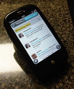
Touchstone: For lack of a better word, the Touchstone charger is neat. Though it is a separate accessory ($69.99 at launch), it offers the ability to charge wirelessly. When using the Touchstone charger, the Pre requires a different, matte back, which is included with the charger. At first glance, you would think that the Touchstone would move around on the desk, but it is firm, and doesn't move when you lift the device off of the charger.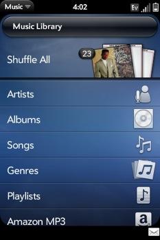
Music: Though a common complaint centers around the lack of a progress bar, the most notable feature in regards to music is the Pre's seamless connectivity to iTunes. Recognized by the program as an iPod, I was able to download my music in less than five minutes. Song shuffling is a bit different than other devices; cover art is displayed, but flicking between songs automatically activates the song. I liked it; it took the several steps required on the iPhone and condensed it into a quick and easy process.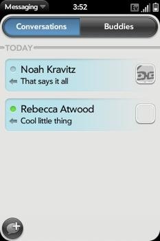
Messaging: Messaging is one of the many places where the Palm Pre shines. Not only does it support threaded messaging, but it also integrates IM clients into the program. Just like it sounds, "Conversations" lists the messages sent/received, and buddy lists can be seen by clicking the "Buddies" button in the top right hand corner. Palm did a great job in the integration of messaging mediums; if a friend and I are messaging via AOL Instant Messenger, and they suddenly log off, I can quickly switch to SMS, all while staying in the message thread. What's more, the Pre offers MMS capabilities out of the box.
Address Book: The address book will synchronize with your Google account. When adding new contacts, the user has the option of saving to the phone or synchronizing with the Google account. A nice feature to have; the concept of lost contacts are a thing of the past. Contacts can also be integrated with other "profiles," meaning you can link a contact's AIM/GTalk account, LinkedIn profile, and more to their address card. Much like a Mac, a green dot appears beside the contact when they're available online.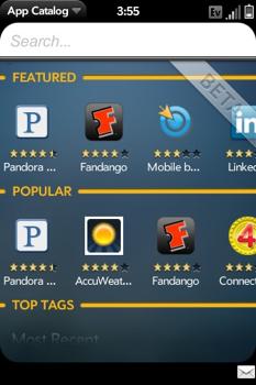
Third Party Programs/Palm App Catalog: First of all, the Palm App Catalog is still in beta mode, which is the primary reason why there are only a few programs available at the moment. There has been a great deal of controversy surrounding the App Catalog and the lack of available programs; most compare the store to Apple's App Store, which presently offers 50,000 applications. To those individuals, I would remind you that on July 11, 2008, one year after the launch of the original iPhone, only 500 applications were available in the App Store. It takes time to build an App Store, and as we've discussed on this website, applications are the way of the future. Keeping this in mind, I'm confident that Palm will expand its offerings in the coming months.
Battery life: With any device, there will be minor frustrations, but the battery life is the only thing that I found to be a major setback. To keep it short and nice, battery life leaves a lot to be desired. In the time that I have had the Pre, I have had to charge my phone mid-day, every day. In today's world, a battery dying after seven hours of moderate use is unacceptable. This is going to be a major problem for a device that is attempting to appeal to the business crowd. The bottom line: if you're anything more than a moderate user, you'll need to have some sort of charger nearby at all times. 
Phone/network: Obviously, the primary purpose of a cell phone is to make calls, and the Pre doesn't disappoint in this category. Though it lacks visual voicemail, the interface is very clean and works well. There are quick access buttons to voicemail and recent calls on the bottom of the screen. Earpiece volume seemed to be just right, and everyone I spoke to claimed that they couldn't tell I was on a cell phone.
Sprint's voice and data network have been great thus far. Voice calls have been clear, data has been very fast, and most importantly, the network has been consistently strong (which is more than can be said about other carriers). We tested the EV-DO connectivity in the Charlotte area, and speeds were great.
Conclusion: For a first-generation device, the Palm Pre is a fantastic. The webOS platform is a delight to use, and beats the iPhone in overall multitasking abilities. More importantly, I see a great deal of potential in the future of webOS. The phone itself is strong in most categories, with the exception of the battery life. Fortunately for Palm, the features of webOS and the overall excitement surrounding the Pre outweigh the terrible battery life. But if this continues without being addressed, I can see a vast majority of users returning the device - a frustrating thought, because the device itself is admirable in almost every other way. In order to be a serious contender in the business realm, Palm must realize that the battery life is unacceptable on a device that's marketed for its multitasking capabilities. Once this issue is addressed in a software update, the Pre will be an absolute pleasure to use across the board.