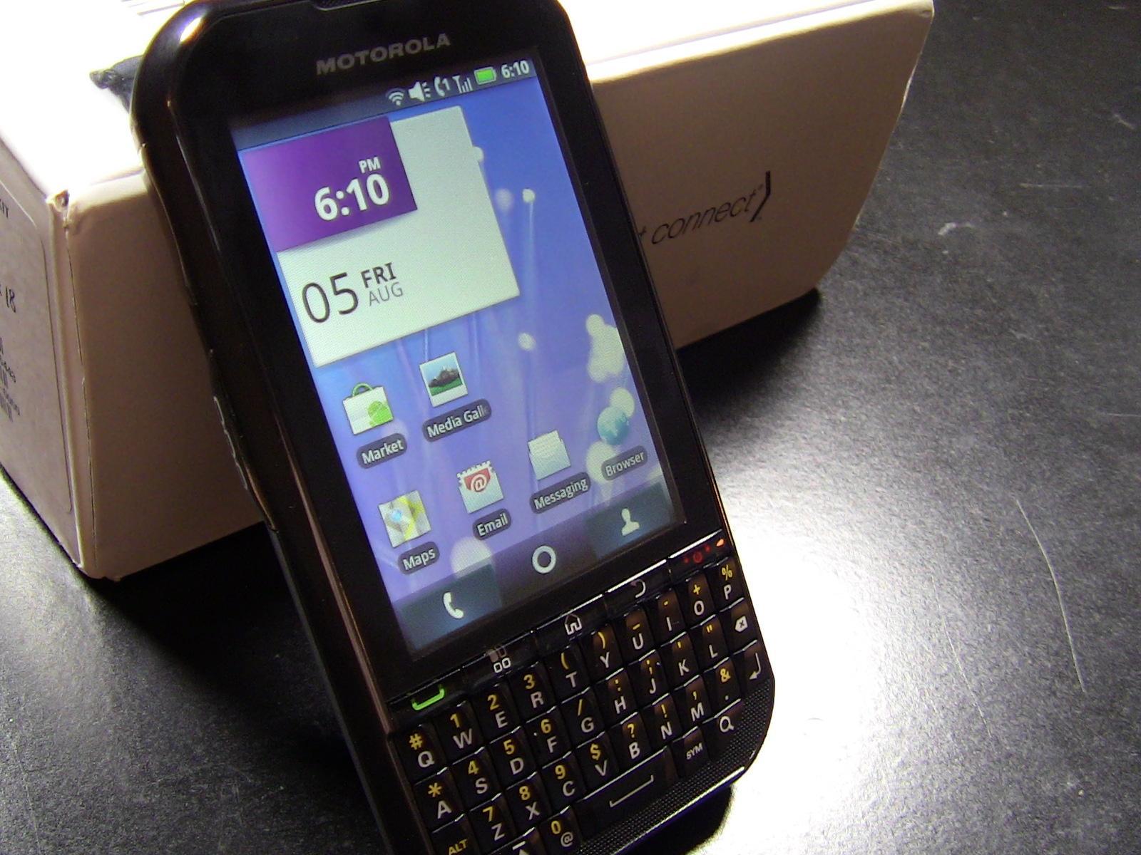
Android may not be a business-oriented OS, but manufactures are trying to point it in that direction. The Motorola Titanium follows that vein and appeals to those who need a smartphone for the business features, not gaming and media. Because the Titanium is from the Nextel side of Sprint's business, it supports Nextel's DirectConnect feature for quick communication. The specs may not be the best, but the features are there. I've had a limited amount of time with the Titanium over the past day and I've taken note a few positives and negatives. Here are my impressions of the phone so far:
- There are some aspects of the phone that disappoint me, namely the slow 504 MHz processor, the fact that it ships with Android 2.1, and the low resolution display, but there are some aspects that impress me, like the 5-megapixel autofocus camera and its flash as well as the awesome QWERTY keyboard. I suppose, in the end, it just depends on what features appeal to you.
- As I just said, the keyboard is excellent. It's very reminiscent of the iconic BlackBerry keyboard, but it does feel a bit smaller. The keys are designed with an angle and the traction on them is great, but the small size means it feels more cramped than other portrait-style keyboards. If you have larger hands, this will probably be a problem.

- The Titanium is an iDEN device so, put shortly, don't get it if you need to use a lot of data services like web browsing or maps. The network simply isn't built for that and your experience will be miserable.
- The 504 MHz Freescale Zeus processor does a decent job of keeping up with general, everyday tasks, but no action is performed without a slight lag or with choppy transitions. The phone's performance may have been better if Motorola didn't pack on their custom UI, but that point is moot by now.
- Speaking of Motorola's UI, the Titanium ships with a version of Motorola's Applications Platform that was released after Moto decided to tone down Blur, but before the newest design came out. The new lock screen is there, the blue gradient is featured throughout the UI, but the homescreen dock still resembles the "in your face" version of Blur. For some reason, the Motorola widgets are not resizable, a feature that should be present. I've never been a fan of Blur, but I'll see if this new version grows on me during the review period.

- The hardware design actually reminds me a lot of the Motorola Photon 4G, a high-end Android phone also on Sprint. The difference is the Titanium's physical keyboard, but the basic design is the same. The phone feels solid in the hand, though slightly heavy. The Titanium also meets military standards for being shock and water resistant and can withstand high temperatures.
- The few pictures I've taken with the 5-megapixel camera have been clear but grainy.
That's all I've got for now. I'll spend more time with the Titanium over the next few days and come back with my full review. In the meantime, check out the unboxing video!