The "My apps & games" section of the Play Store is something Android users access regularly to update their apps. A new leak has shown that that section may soon be getting a redesign.
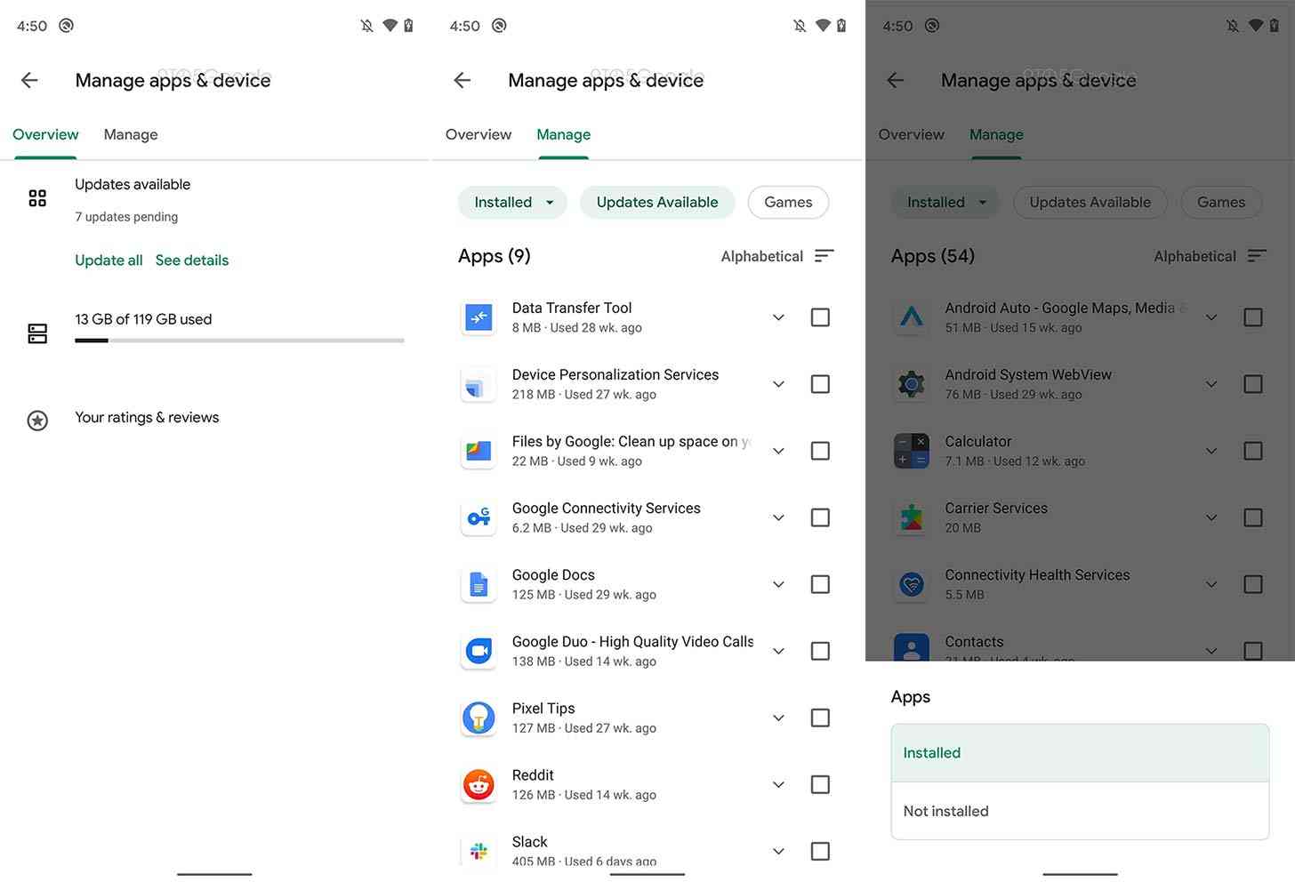
A new version of the "My apps & games" section is apparently in the works at Google. The folks at 9to5Google were able to activate the redesign, revealing that the section is now called "Manage apps & device".
The redesign also reduces the number of tabs in this section from four to two. Currently there are tabs for "Updates", "Installed", "Library", and "Beta", but the new version only has "Overview" and "Manage" tabs.
The "Overview" section will show how many app updates you have available with shortcuts for "Update all" and "See details". It'll also show you how much storage is available on your device and a shortcut to your app ratings and reviews.

Then there's the "Manage" section. Here you can filter apps to see which ones you have installed and which you've downloaded before but aren't currently installed. You can also select an "Updates Available" filter and a "Games" filter. Here Google has basically combined three of the current tabs into one.
You also have the option of sorting your apps by how often you've used them, when they were last updated, displaying them in alphabetical order, and displaying them by size. You can also tap a checkbox next to each app to quickly bulk select apps to update or delete.
Finally, tapping the three-dot menu button in the upper-right corner of the display will bring up a "Send apps" feature that'll let you share apps with nearby friends using a peer-to-peer connection.
There's no word on when this redesign might start rolling out to users. It looks nice, giving you a cleaner look with fewer tabs and a new name that more accurately describes exactly what you do in that section of the Play Store.
What do you think of this updated Play Store design?