Last month we got an early look at a Google Play Store redesign, and now that update is officially rolling out.
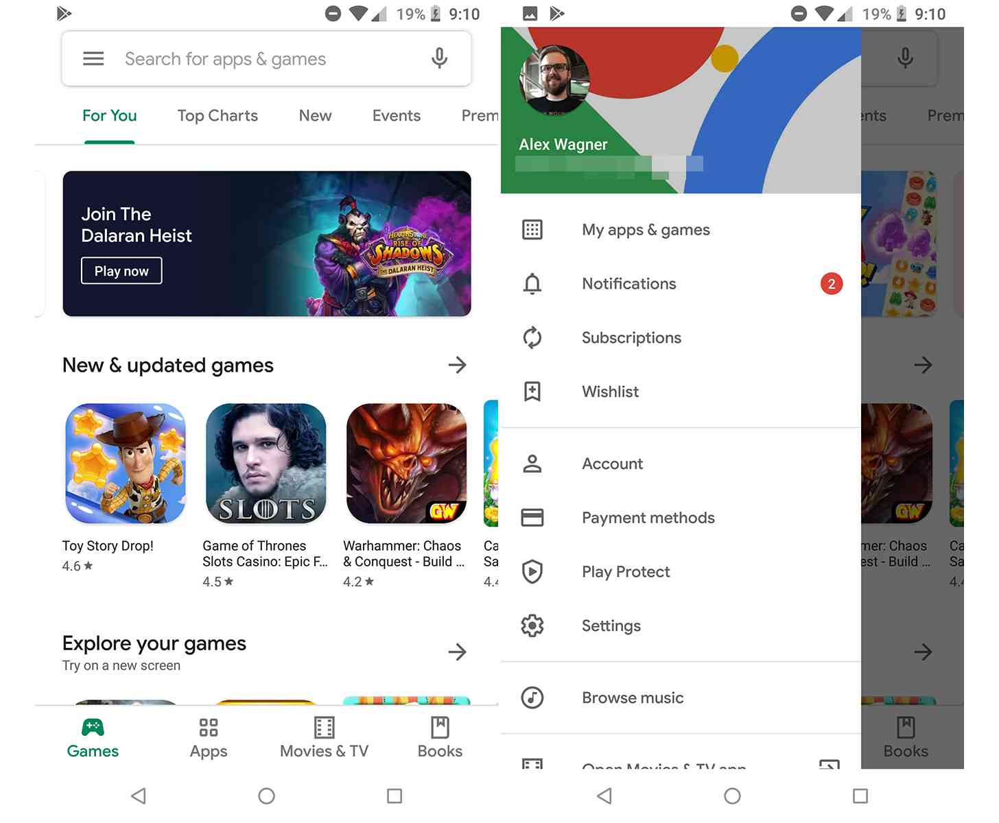
The updated Play Store with Google's Material Theme is hitting devices, bringing an almost completely white user interface with it (via Android Police). Another big change is that there's now a bar at the bottom of the screen with Apps, Games, Movies & TV, and Books tabs. The Music tab is gone, having moved to the sidebar that you access from the left side of the screen.
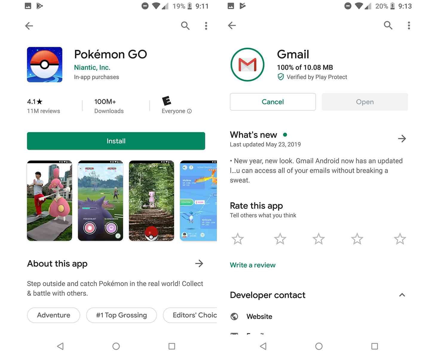
Digging into the specific app pages, we can see a cleaner look that uses Google Sans font. These pages have been refreshed to place more of a focus on the rating, screenshots, and other details, and when you're downloading an app, you'll now see a circle around the app icon that fills up as the download progresses.

To get this new design, you'll need to ensure that you've got the latest version of the Play Store app installed, which is 15.1.24. You can grab it from APKMirror if you don't have it yet. If the new-look Play Store isn't appearing for you and you've got the latest version, you can try going into your Settings app and clearing the Play Store app's cache.
We've seen Google rolling this all-white Material look to its other Android apps recently, so it's no surprise to see the Play Store getting this redesign, too. It definitely looks more modern, and with the upcoming Dark Mode in Android Q, it ought to be a bit easier to darken than the previous versions of the Play Store.
What do you think of this new-look Play Store app?