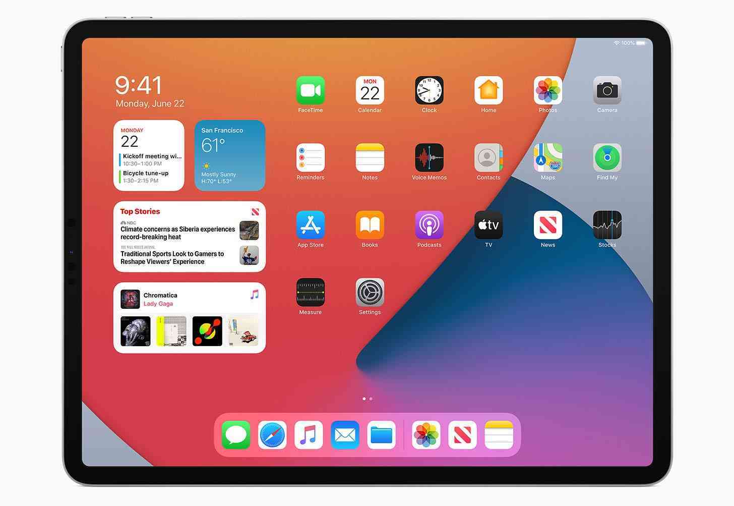
Here we are in 2020 and Apple has finally deemed widgets an essential tool. Not that iOS has been a stranger to widgets up to this point. No, that's certainly not the case. Apple has implemented the feature in some capacity for years now, but they've usually been cordoned off, kept to the perimeter.
Helpful, but not necessarily as helpful as they could be.
But Apple is changing that with the upcoming release of iOS 14 and iPadOS 14. The company showed off the newest versions of the platforms earlier this week, and there is plenty to go over. And while I've already asked if you're looking forward to iOS 14 in general, I want to refocus attention on one of the biggest changes, and that would definitely be the widgets.
More than that, it's about implementation. Because widgets in iOS 14 and iPadOS 14 work the way you'd expect, showing users helpful information at a glance. But Apple did some very Apple things, too, for better or worse.
One of the strangest things is how widgets can be placed on Home screens in iOS 14. Unlike Android, users will only be able to place widgets in the corners and on the sides of the device's screen. Which means you can't put a widget in the middle of the screen. This is such an odd decision I couldn't help but laugh when I saw it in action the first time.
Technically, with the largest widget, the option does cover the middle of the screen. You just can't put a smaller widget in just the middle of the display, it must be in the corner or on the side.
And yet, things get even stranger when you move over to iPadOS 14. Right now (in iPadOS 13), widgets are available in the Today View, a dedicated section directly to the left of the first Home screen. You can either choose to hide the Today View or have it viewable at all times, so it is possible to show widgets at all times. However, there's a catch in iPadOS 14: Apple isn't changing how widgets work.
Despite the fact that iPadOS 14 simply has more screen real estate to work with, and widgets would look great placed on the Home screen(s) just like they do on iOS 14, Apple has decided that widgets must remain in the Today View even with the newest software. It's definitely a decision, but whether or not it's a good one will probably come down to each individual iPadOS 14 user.
But there is good news here, because Apple’s idea for widgets also includes what it calls “Smart Stack”. This uses on-device intelligence to put together a few different widgets together in an interactive stack. This will show you different widgets throughout the day, like your calendar or news stories in the morning, and different options later in the day.
But the iOS 14 and iPadOS 14 user can also create their own custom Smart Stack of widgets. So if you want to quickly be able to sift through weather, stocks, and your calendar, you can make that happen. And these widgets can be swiped through quickly and easily, which is a nice touch.
Overall, widgets with the next versions of iOS and iPadOS look great. There are some parts to scratch the head over, but, all-in-all, Apple seems to be moving in the right direction with how widgets will work with the mobile operating systems.
But what do you think? Are widgets one of the new features you’re looking forward to the most? Let me know!