As smartphone displays have grown in size over the years, one-handed usability has become increasingly important. This week Facebook is rolling out an updated UI for its Android app to make one-handed use easier.
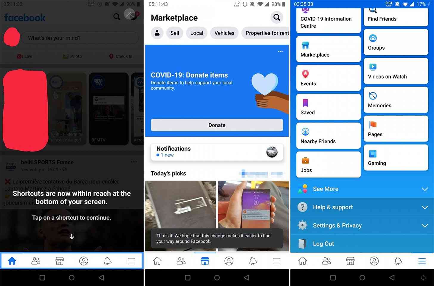
The Facebook for Android app is getting bottom tabs. Screenshots shared by XDA-Developers and folks on Reddit show the Home, Friends, Marketplace, Profile, Notifications, and Menu tabs at the bottom of the screen.

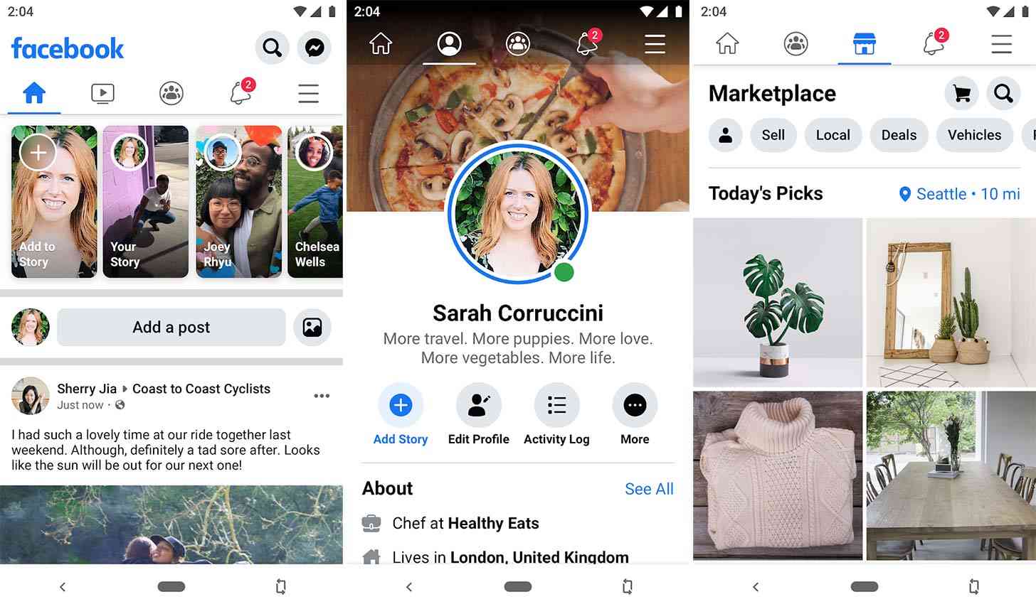
Prior to this change, the Facebook app had its tabs near the top of the screen. You can see this layout in the images below. Reaching them could be difficult if you've got a big 6.5-inch or similarly sized screen, but moving those tabs to the bottom would make them much easier to reach with one hand no matter what size your display is.

Facebook hasn't officially announced this change, but some folks that've updated their Facebook for Android app to version 264.0.0.44.111 are seeing it. It's possible that the rollout is limited right now, though, and so we could see a wider rollout in the coming days.
Have you gotten this refreshed Facebook design?