Google has been working to dark mode all the things lately in its Android apps, and now another app has gotten a touch of dark mode.
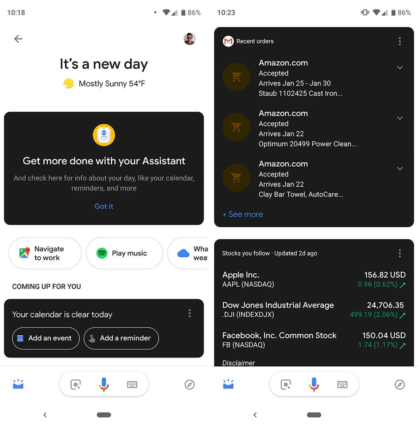
Google Assistant is starting to receive a new dark mode. What's different here, though, is that rather than giving the whole app the dark mode, only the cards are dark. That means you'll be looking at dark cards against a white background.
It's possible that Google will tweak this design or get rid of it altogether, but right now this Google Assistant dark mode looks a little strange. It's nice to see Google extending dark mode to another one of its apps, but this mix of light and dark backgrounds doesn't look great and likely doesn't give you the full effect of the battery savings that having an all-dark layout would give.
What do you think of this Google Assistant with dark mode cards? Have you gotten it on your Android device yet?