With the rise of OLED displays in smartphones, lots of folks are clamoring for dark modes in their favorite apps. Google has added a dark mode to some of its apps, but many are still extremely white, which is part of the company's Material Design. Recently, Google admitted that maybe those mostly white UIs were a mistake.
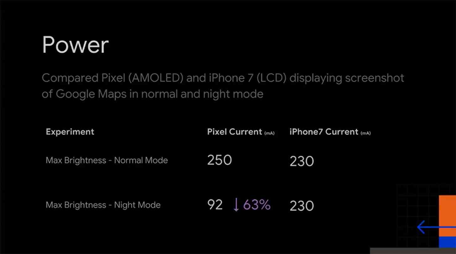
During the Android Dev Summit, Google showed stats that backed up what most people know: dark modes on OLED screens can help save battery life. As you can see below, the mA current used by a Google Pixel is 63 percent lower when showing a Google Maps screenshot at max brightness in night mode when compared to a screenshot at max brightness in normal mode.

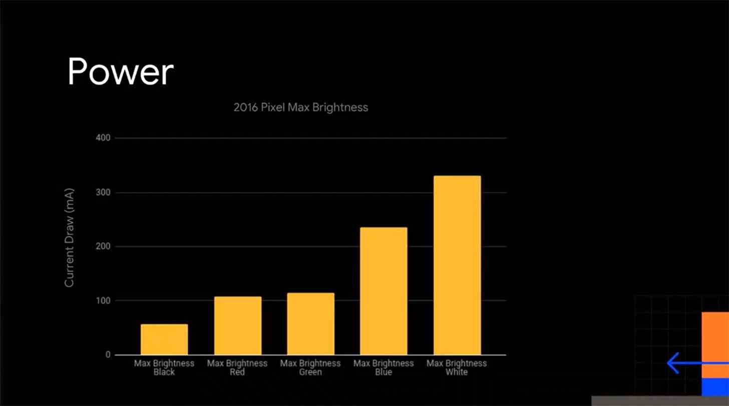
Another graph drives the point home even further. When Google set a 2016 Pixel phone at max brightness, the mA current draw for a black screen at max brightness is in the 60s or 70s, while the mA current draw for a white screen at max brightness is above 300.

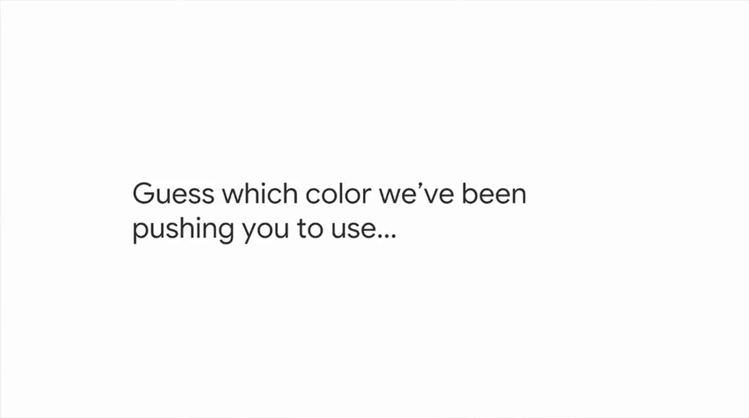
Finally, Google showed the slide you see below, humorously asking, "Guess which color we've been pushing you to use...".

The good news is that Google has slowly been adding dark modes to its Android apps, including Android Messages, YouTube, and Google News, and these findings about the power draw of a black background versus a white background will hopefully spur Google to more quickly add dark modes to other apps in the future.
Do you use dark modes in the apps that support them?