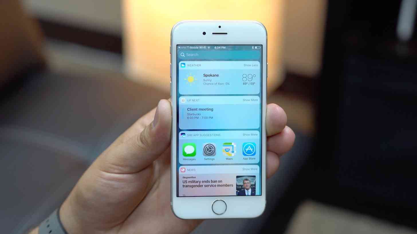
When Apple introduced iOS 8 several years ago, one of the major new features of the mobile operating system was the inclusion of widgets. Yes, this brought plenty of complaints of "copying", but Apple's implementation was very . . . Apple. The option was available only in a "Today" section of the drop-down notification panel -- with "Notifications" move over to its own panel.
But that idea didn't last long. Apparently Apple realized that the Notification Center was already useful for notifications and didn't need to be cluttered up with additional options. But the company didn't get rid of widgets altogether. No, now the feature is available in its own dedicated page in iOS, swiping to the right one more time off the first home page of app icons.
And they're pretty useful!
In most cases, the widgets that can be added to this dedicated panel are more informative than what you'd find if you hard press on an app icon. Using 3D Touch on an iPhone that supports the feature, and an app that also offers up support for the feature, means you can hard press on an app icon and get a box that pops up that will give you some information. It's a quick way to see the local weather, for instance, or even see a scoreboard of your favorite sports team.
The dedicated widget panel means that instead of just one Apple News item, you can have five. Some calendar apps will show you the full calendar month, along with your upcoming events. That aforementioned scoreboard can offer up more than just one team or sport. You get the idea.
I find myself using the widget panel a lot more often than I ever thought I would. Are widgets as helpful as they could be when they're segregated into their own page, rather than just readily available on as many home pages as you might want? Probably not. But it's certainly better than nothing. And considering they do offer up more information than what's available when activating 3D Touch on an app icon, it's worthwhile.
But they are out of the way. One of the reasons widgets on Android are great is because you can add them where you want. If you want media playback controls without having to drop down that notification shade, you can do that. Want a list of upcoming events that you can directly interact with right on a panel? You can do that, too. Widgets have had a lot more time to evolve on Android than they have on iOS, and, as a result, they're usually more helpful and interactive than what's available on Apple's platform.
So, I'm curious, iOS users. Do you use the platform's widgets at all? All the time? Not at all? How would you like to see Apple change the feature for the better in the future? Let me know!