Not every app has the best user experience. Despite plenty of trials and tests, and behind-the-scenes tweaks and improvements, an app's end result can be pretty confusing when used in the real world. Some menus are too deep to be worthwhile, and sometimes even features can be buried to the point where they aren't even worth using.
Finding that sweet spot, where the app's prime reasons for existing are at the forefront, but that navigation is not only simple and easy to understand, but also fun to use is what makes top flight designers so worthwhile. It isn't an easy job by any means.
But apps also have to evolve.
You can't make everyone happy all the time. And listening to an app's audience should be a core principle for developers. Of course, I think we've all seen that while companies may be listening, that doesn't always mean any meaningful changes will actually get made. Some folks might say some apps, like Twitter for example, have just doubled down on their own vision, much to the chagrin of its vocal user base.
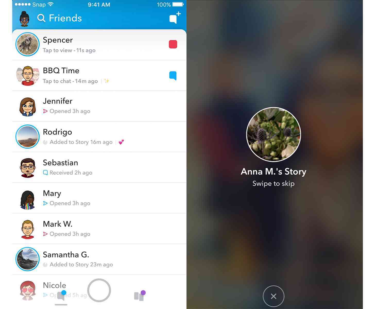
And then there's Snapchat. The company behind the popular social media platform, Snap, which focuses primarily on ephemeral messages, recently unveiled its "major redesign" for the app. And while it might not be a huge overhaul or "disruptive" change, the company is hoping that people will be able to better navigate the experience when the changes roll out to the public in the coming weeks.
I've used Snapchat three times total since its debut. Friends, family, and even acquaintances have asked me if I use it, and have asked if I'd download it and try it out, but the app has never stayed on my phone for long. When I did try it, which was just last year, I didn't see the appeal. I'd rather just send a text message. (Does that make me old school?)
But, my brief time with Snapchat didn't leave me thinking it was very difficult to use. Then again, I didn't follow any brands, and I was corresponding with four people, tops. It was a brief trial period, and it didn't end with me wanting to adopt Snapchat into my life.
I've heard that Snapchat is not fun to use, or that the user experience could be better for a variety of reasons. And this is from heavy Snapchat users, so I tend to believe their viewpoint on the topic. This is a sentiment echoed largely on social media, too. One that even Snap has admitted to, with plans to make changes to fix it.
So even Snap knows Snapchat could be better. Which is incredible to me, mostly because that means so many Snapchat users have stuck it out with the app, despite not liking the user experience. That speaks to the power of Snapchat, I think. People willing to ignore what they might consider a poor experience just so they can keep using the platform.
So, out of curiosity, I wanted to find out if you thought Snapchat needed a major overhaul/redesign, and, if so, are you happy with what Snap has outlined? What else would you change about the app's experience? And what are some apps you've used in the past that you disliked the UX after spending some time with it? Let me know!