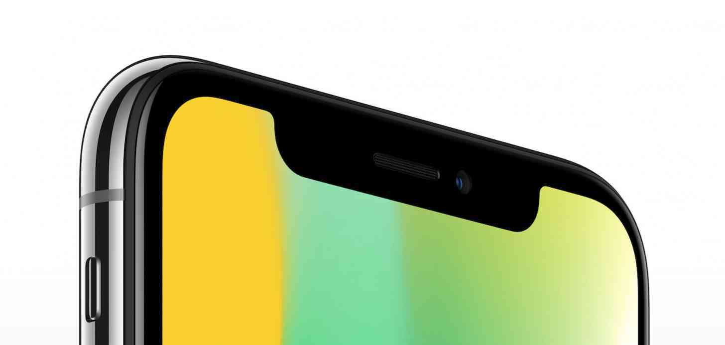
Before Apple unveiled the iPhone X, there were plenty of rumors circulating around talking about the upcoming device's design. At the time the smartphone was expected to be called the iPhone 8, or even the iPhone Edition, among other speculative titles, and there were plenty of concept designs envisioning how Apple would adopt the "bezel-less" design that had been rumored since last year.
As the product's announcement neared we got some official-looking ideas, with the "notch design" being fully adopted by those who speculate on this sort of thing. Even an accidental leak by Apple for a different product essentially confirmed the design. And, sure enough, Apple welcomed the notch, or horns, or what have you, back in September of this year.
They were panned on social media pretty heavily.
The questions were on point, though: How would these horns, or this notch, look when being used in an every day routine? The iPhone X has a terrific display, but would people want to watch movies, YouTube videos, or even look at pictures with that notch so obvious all the time?
I wasn't a fan of that notch in early renders, but, eventually, I started coming around on it. With the way the phone's designed, and the information like Wi-Fi, network connection, and the time flanking it, I realized it wouldn't be that big of a deal more often than not. Not in Portrait Mode, anyway. And, after using the iPhone X I can say that is indeed the case.
As plenty of reviews pointed out, after just a few hours with Apple's newest flagship, the notch does eventually disappear from thought. Yeah, it's there, but it's not as prominent as one might imagine. Not all the time.
And while I don't mind the notch more often than not, that sentiment takes a hard 180 when in landscape mode and I'm watching content, or looking at photos. In those scenarios I hatethe notch. Maybe not so much in photo viewing, but when watching a movie or YouTube video, that notch is very much in the way.
(I'm not going to talk about aspect ratio and how viewing 16:9 content on a device with a display aspect ratio of 19.5:9 is annoying, because that would take up more room than I want to use here.)
Some folks say to just cover up the notch with your thumb, but that doesn't make any sense to me. There's a speaker there, and the speakers on the iPhone X are pretty awesome -- why would you want to cover it up? And, for that matter, if I cover up part of the display with my thumb, then there's still something in the way. It doesn't matter if it's part of the phone's design or my finger.
The notch is probably even more distracting because there is content flanking it while watching in full screen. And let's be clear: Apple wants you to watch content in full screen mode. To take advantage of that display. But when there's an obvious one-sided emptiness that's flanked by moving images, that's distracting. And yeah, you can zoom out, but then you're watching content on your iPhone X like it was an iPhone 8. That's not optimal at all.
But, I want to hear from you, the iPhone X owners out there in the wild. After you've spent some time with the flagship smartphone, what are your thoughts on the notch design? Do you hate them, or are they something you've accepted? And if you didn't buy the iPhone X, is that notch design the reason why? Let me know!