Smartphone manufacturers have jumped on a new bandwagon: Minimized bezels. While some companies are going to bigger extremes than others in this endeavor, shrinking the bezels on our smartphones is becoming the biggest focus these days. Which is a good thing, at least in practice, as far as I've been able to tell from brief usage.
I wasn't completely sold on the idea when we first started hearing the rumors. But that had more to do with the fact that I was just used to how things were. When I did get my hands on the Galaxy S8+, the benefits were immediately clear. And my biggest fear with the new design was pretty much squashed: Handling the Galaxy S8+ with its minimized bezels didn't mean random activations on the display.
I may not have been keen on the idea to start, but it didn't take a lot of convincing to bring me around.
The iPhone X goes up for pre-order tomorrow. Apple is calling it the future, and has positioned the smartphone as the next big design move. So it wouldn't be too surprising to see the same philosophy make its way to other Apple-branded devices. After all, users love displays, and having more of it, while reducing the bezels, seems to be a hit.
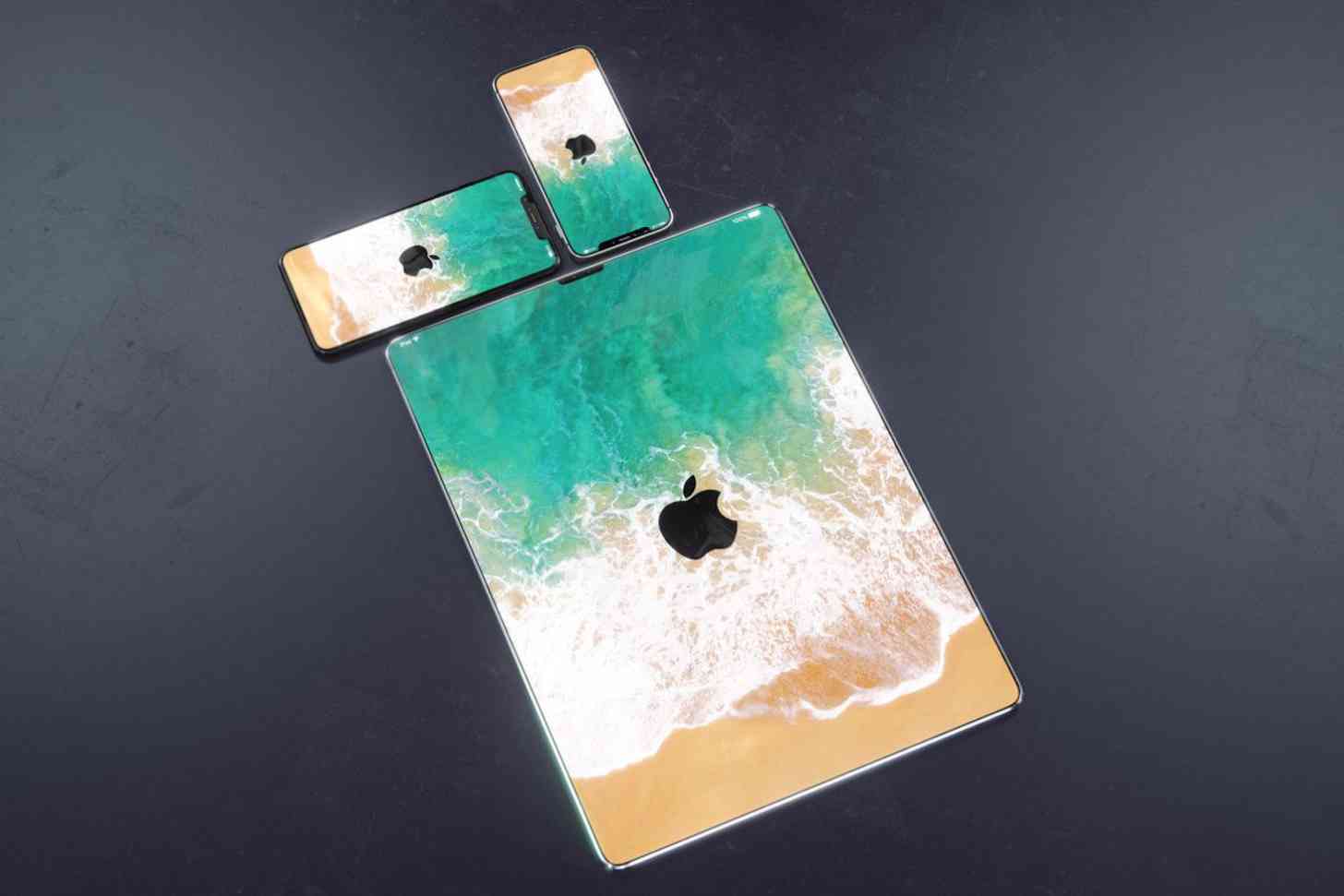
Yesterday, renders were published that showcased that idea. The folks over at Curved.de put together what the Apple Watch, iPad, MacBook, and iMac would look like if Apple dropped the bezels and even adopted the notch design from the iPhone X. One could easily argue that the notch design wouldn't really be necessary for devices like the iPad or Macs, because they've got plenty of room to work with to include the TrueDepth camera system.
But that doesn't mean that Apple can't slim down the bezels. I liked most of the designs, even the Apple Watch, but the iPad model didn't really win me over. It is a lot of display, which is great, but the more I looked at it the more I thought that maybe, just maybe, tablets are the one devices we might keep bezels around. At least small ones.
The current iterations of the 10.5- and 12.9-inch iPad Pro models reduced the side bezels when compared to previous generation models. It's not a lot, and the top and bottom bezels are definitely still there, but it's enough to get the job done. Watching content on those devices is great, but I don't think we need to get rid of the bezels altogether.
Then again, this may be a situation like the smartphone all over again. The concept that envisions a bezel-less tablet may not win me over, but actually using the device may get the job done.
Where do you stand on the idea? Should tablets keep bezels around, even small ones? Or are you ready to remove the bezels there, too? Let me know!