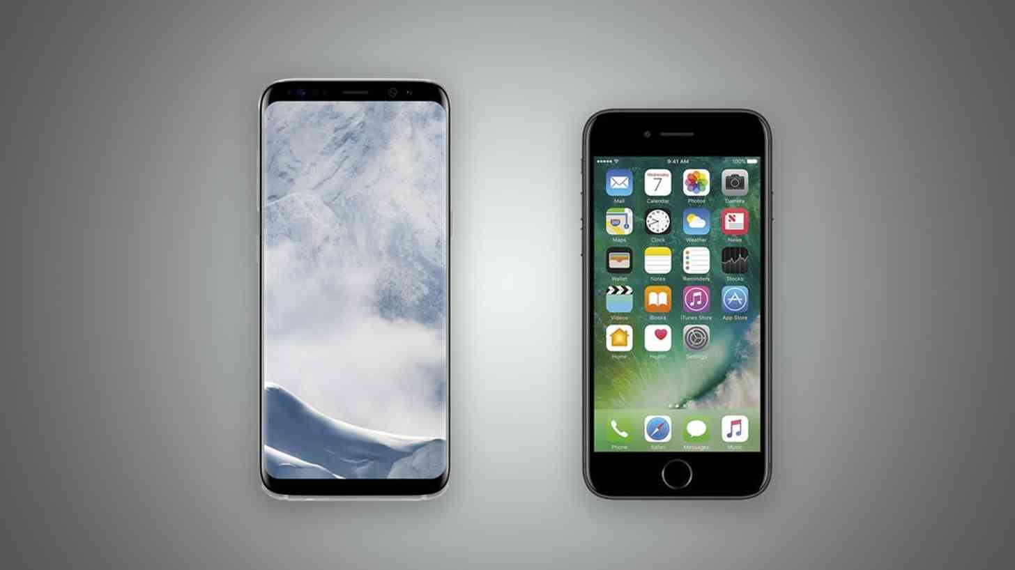
The past few of years, to me, have felt a little stagnant when it comes to innovative smartphone designs. It mostly felt like it was the same slabs with the same colors and the same features. Occasionally something new would come alone, like Samsung’s Edge displays or LG’s and Motorola’s modular designs last year, but for the most part those features stayed unique. LG even gave up on the modular dream this year in the LG G6 to return to its roots.
Yet, even by going back to a more traditional design, LG managed to turn heads with the G6. How? The same way everybody else is: slimming down the bezels.
Having slim bezels is rapidly becoming an expectation of consumers, likely because it gives them something they want without much compromise. Remember when “big phones” were just a phase, and became quite obviously not a phase, mom? Even I, self-proclaimed president of the People for Compact Phones Club, have experienced fleeting moments of missing the benefits of a larger screen since returning to the Hobbit-sized iPhone SE with its 4-inch display. However, even big phones have their limits – but those limits are much less restrictive if one can increase the screen size without increasing the size of the phone itself. Therein lies the beauty of slim bezels.
I have yet to move on to a smartphone with slim bezels, but it’s becoming harder to ignore at this point. Between the Xiaomi Mi Mix, LG G6, Samsung Galaxy S8 and S8+, Essential, Galaxy Note 8, and presumably the Apple iPhone 8 and Google Pixel 2, it’s abundantly clear that bezel-free (or close to it) is the way to be. And it doesn’t stop there – numerous budget phones are getting in on the hype, too.
I had my reserves at first, mostly because I had a less-than-stellar experience with the Galaxy S7 Edge. With the Edge features turned on, I experienced constant accidental palm and finger registries. They were much less frequent when I turned them off, but it still occurred from time to time. Also, Samsung is still somewhat of a loner when it comes to sloped edges on their displays; thus far, most OEMs who are keen on shrinking bezels just make really slim bezels with a traditionally flat display, so if edges aren’t your thing either, it’s pretty easy to find alternatives.
It’s clear from the rapid growth of the trend that this is the new “normal” going forward. Big phones took a while to take over as much as it has, but slim bezels truly became an overnight sensation. Considering so many flagships already feature this stunning design, it already feels likes phones without slim bezels have an outdated design in comparison.
I think this year will still be forgiving to phones that opted not to slim bezels down, like the HTC U 11 and Nokia 8, but I predict that consumers and reviewers will have different expectations next year. Phones with big bezels are quickly going the way of the dodo bird, and I’m finding it increasingly difficult to argue against it as it’s exactly the solution I’ve been waiting for. As somebody who values compact-sized devices but also enjoys larger screens, this new age of slim bezels has quickly grown on me.
Readers, what are your thoughts? Do you think slim bezels are the only way to go from here on out, or is there a significant amount of people who prefer larger bezels? Let us know your thoughts in the comments below!