Looks like Instagram isn’t the only social network that’s undergoing some design tweaks.
Facebook today announced that it’s rolling out design updates to its mobile apps. The goal of these changes is to “make News Feed more conversational and easier to read and navigate.”
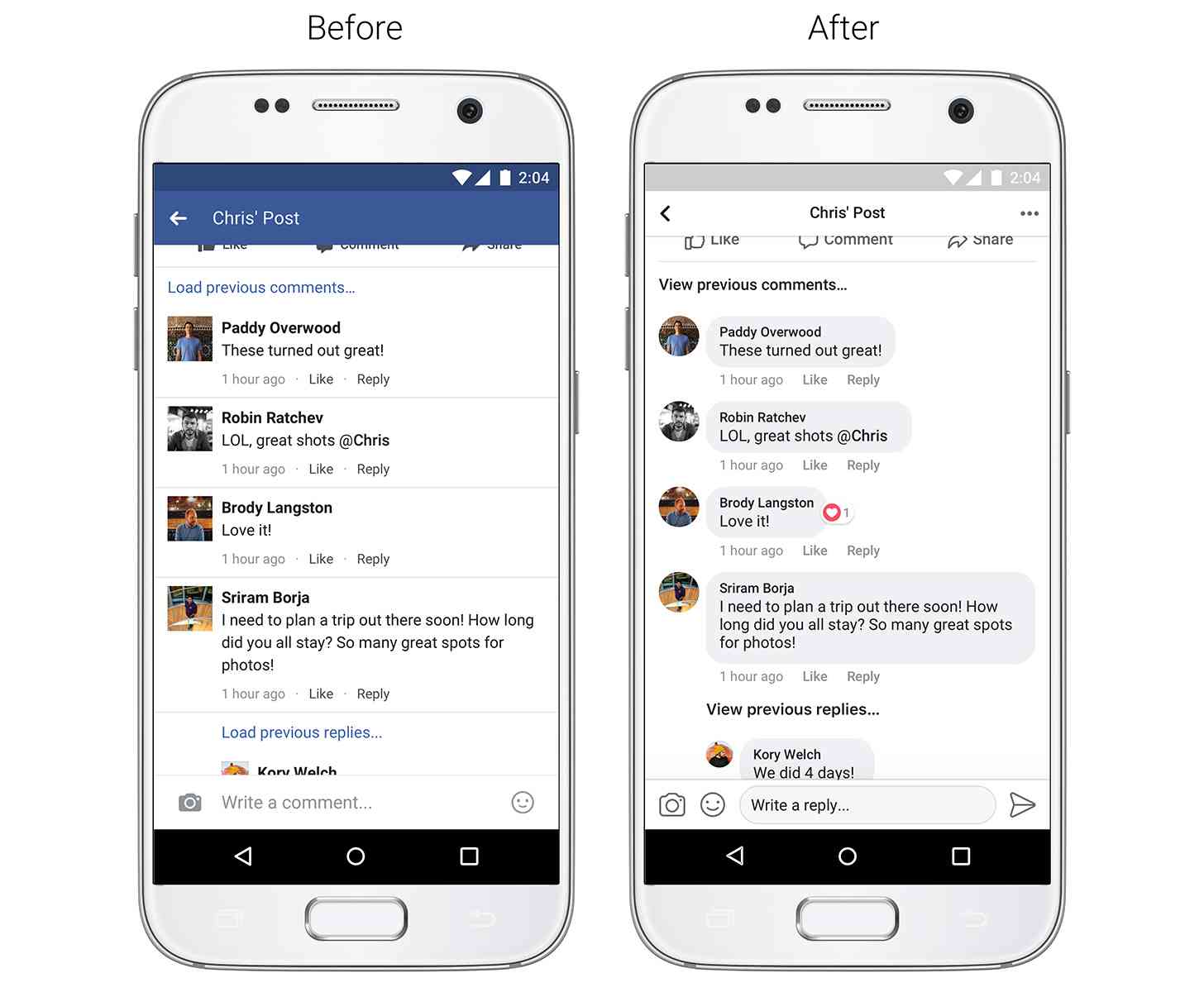
Like Instagram, Facebook comments will be undergoing some changes to make it easier to see which comments are direct replies to another person. Comments will be placed inside gray bubbles to make it easier to discern the different comments.

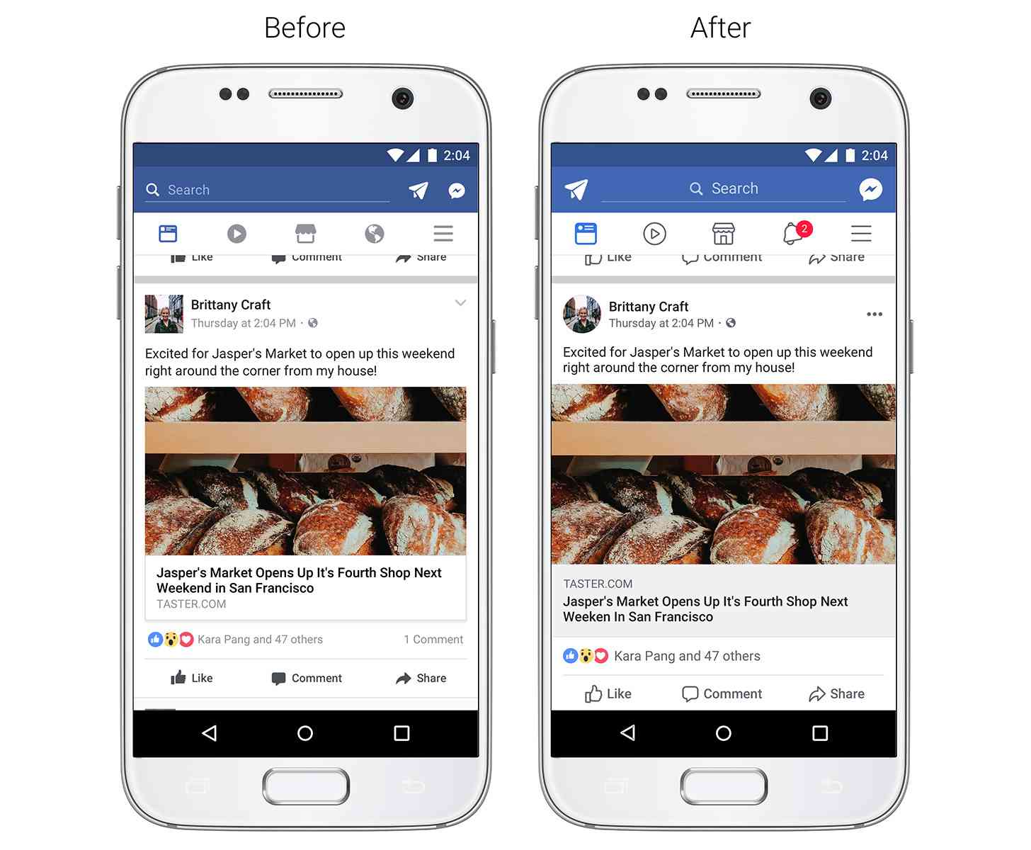
Facebook is also rolling out tweaks to improve the readability of the News Feed by increasing color contrast to make text more eligible, enlarging link previews so that they’re easier to read, and updating the Like, Comment, and Share icons so that they’re easier to tap. Facebook is also changing the shape of profile photos from a square to a circle.

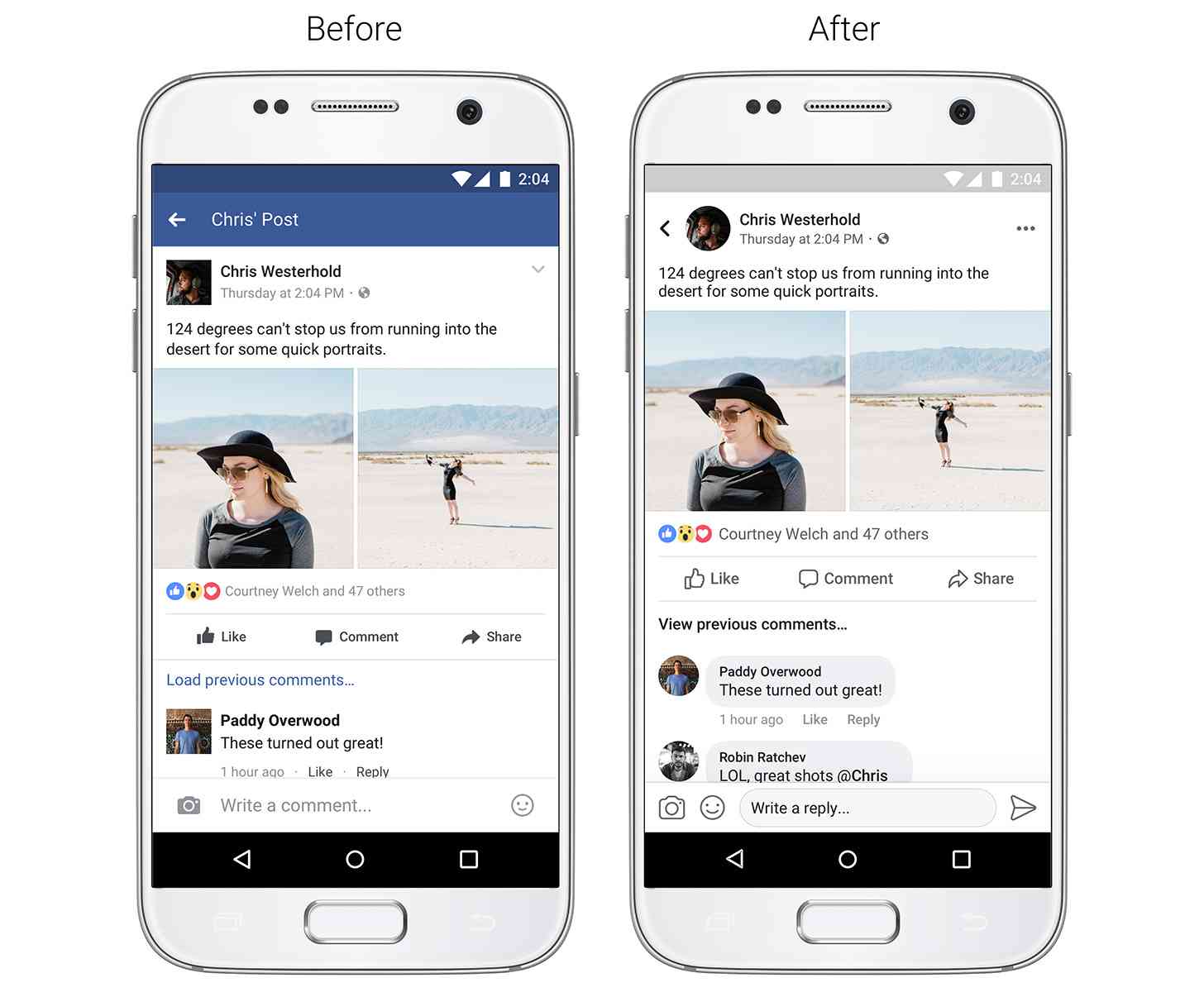
Finally, Facebook is making some changes so that its app is easier to navigate. This includes seeing where a link will take you before you tap it, seeing whose post you’re commenting on or reading while you’re in the post, and adding a more prominent back button to make it easer to get back to your News Feed.
Facebook says that these changes will roll out over the coming weeks.