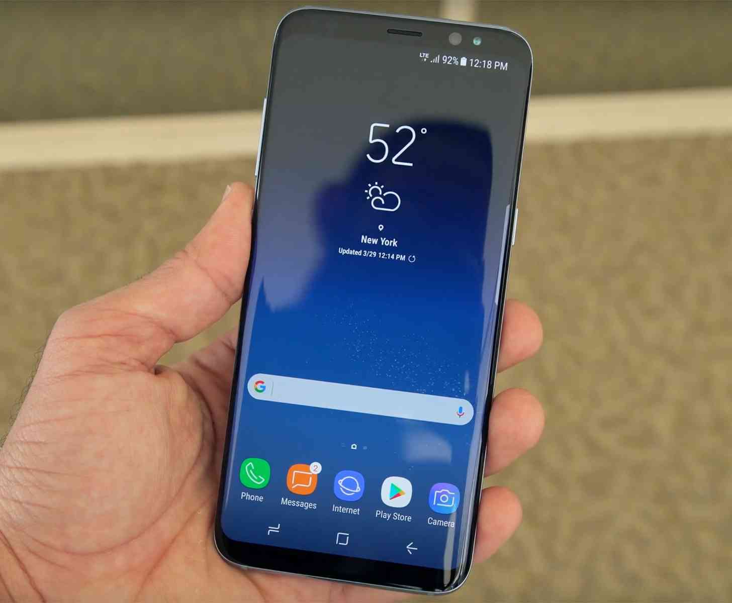
We're seeing a trend these days when it comes to smartphone design. Minimal bezels and tall displays are all the rage these days, and it doesn't look like that momentum is going to slow down anytime soon. We've been hearing about Apple reducing the bezels in the iPhone 8 for months now, dating back to just weeks after the launch of the iPhone 7/7 Plus last year. Of course, Samsung, and even LG, beat Apple to that punch on the big stage, but of course there are still plenty of people waiting to see what Apple will do with the iPhone design later this year.
Depending on how accurate the rumor mill is this year, we may have already seen the final design of the iPhone 8. And every time I've seen these images crop up, it's usually accompanied by a title informing me that I'll be "blown away" by the iPhone 8's design, or that it's the next best thing since sliced bread. And it's not just the iPhone 8 get this sort of praise, either. Every time the Galaxy Note 8 pops up, I'm told iPhone 7 owners will be jealous.
The design of a smartphone is what gets someone in the door. It's the primary reason they either want a phone or don't. If they don't like the way it looks they're not going to take it home. Companies work long and hard trying to find the best possible design, but obviously you can't make everyone happy. Some folks who like the Galaxy S8 design aren't going to like the Galaxy Note 8, for instance. Luckily for Samsung they've got options.
But the trouble that we've been running into for many years at this point is the fact we've adopted these big phones that are primarily adopted by displays. There's not a lot of wiggle room there, which is why it makes sense that minimal bezels are taking hold. Sure, it means phones are going to look even more like the other, at least from the front, but at least we get more screen real estate.
But all of those 3D renders, and accompanying headlines, got me thinking about being "blown away" by a phone these days.
The last time that I can say I was genuinely awed by a phone had more to do with the technology packed inside of it than anything else. When streaming music over a Bluetooth headset first arrived on the scene, I used it on a Nokia-branded smartphone that, for the life of me, I can't remember the model number of. But I loved being able to have that headset on, without any wires connecting me, and listening to music. (It's sad that this took so long to really take off.)
As far as design goes, though? I really miss the days of our phones that had crazy flip designs, or even the Sony Ericsson phones that actually spun around. Those were some pretty exciting designs. I know we can't really get back to that these days, at least not until we get folding phones, but it's fun to think back on. I will say, as I've said in the past, I really loved the design of the original HTC Hero, too. That chin was silly and awesome all at once.
I really like the Samsung Galaxy S8, and it's probably the first phone in awhile to actually surprise me in a positive way. That display on the phone is ridiculous. Technology marches forward, with constant improvements, so writing something like "It's the best display so far," is pretty obvious. But it's also true. It's just beautiful to look at, and I can't wait to see what comes next in display technology.
But what about you? When is the last time a smartphone blew you away, surprised you, either in a good or bad way? Let me know!