Google is the company behind Android, the most widely-used mobile operating system in the world. And while Google is working hard on the next major Android release, and probably one or two releases after that, it’s also cooking up something else that aimed at smartphones.
Google is working on Fuchsia, an OS that isn’t based on Linux like Android and Chrome OS, but rather is based on Google’s own microkernel called “Magenta.” According to Google, Magenta is aimed at “modern phones and modern personal computers with fast processors, non-trivial amounts of RAM with arbitrary peripherals doing open-ended computation.”
While Fuchsia is nowhere near ready for public use, it does now have a user interface called Armadillo, and the folks at Ars Technica downloaded and compiled the Fuchsia UI into an Android APK and loaded it onto an Android device. This gives us a super early look at the UI. You can also see a video of the UI put together by Hotfix at the top of this post.
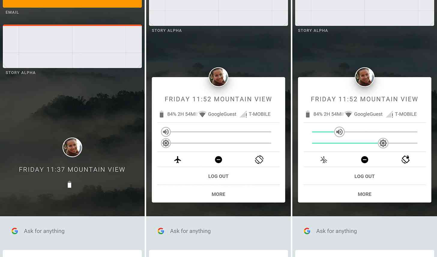
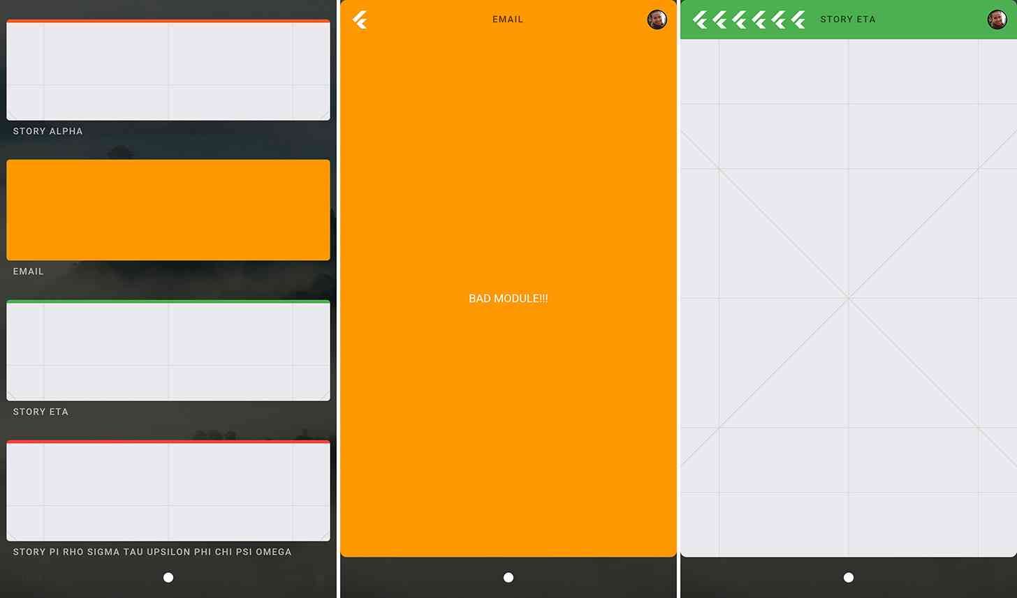
The Fuchsia UI starts with a round profile picture that, when tapped, will show controls for sound and brightness, toggles for Airplane Mode, Do Not Disturb, and rotation lock, as well as info like your Wi-Fi and mobile networks. Above this profile picture is a list of recent apps displayed in cards, and below it is a Google Now-style scrolling list of suggestions.

Tapping on the recent apps cards will launch it into full screen mode. You can also long press on a card and drag it around, and when you combine it with other cards, you can split your screen with multiple apps, including a 50/50 split, a 75/25 split, a 33/33/33 split, or you can even run four apps at once.
It’s worth noting that Fuchsia is still in early days, and so its future is unclear. Fuchsia developer Travis Geiselbrecht has said that the OS isn’t a “toy thing” or a “dumping ground of a dead thing that we don’t care about anymore.” Things can always change, though, especially since we’re likely at least a few years out from seeing Fuchsia on any kind of hardware meant for public use.
The early UI that we’re seeing in these Fuchsia screenshots is interesting. You can see some Google design in the cards and some of the other design elements, but the UI is different than those currently found on Android and iOS. The multi-window support is also pretty neat and could be handy on a tablet, especially since it’ll let you easily size three or even four apps running side-by-side.
To see even more of this early Fuchsia UI, hit up the link below. What do you think of this project so far?
