Do you ever find yourself browsing the app store for something specific, but you end up coming across a completely unrelated app that piques your interest instead? I do, and that’s exactly what happened when I found Evie.
I don’t even remember what I was looking for in the first place; I don’t recall ever getting around to it later. I certainly wasn’t in the market for a new launcher, but when I saw that the Evie launcher was highly rated, I had to try it out for myself. The worst that can happen is that I don’t like it and I restore my Nova launcher settings in a matter of taps.
That was around two weeks ago, but I have yet to return to Nova. Much like ASAP Launcher, which I wrote about around a year ago, Evie is a simple launcher – simpler than ASAP, even - which is exactly why I find it so charming. As somebody who is consistently torn between the simplicity of iOS and the ability to customize my device with Android, Evie is just the right balance between the two.

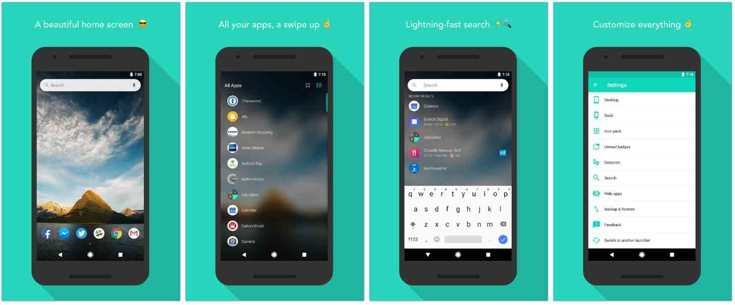
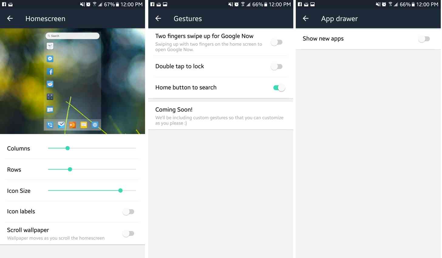
For the most part, I just wanted an interface that was responsive, looked good, and allowed me to adjust simpler aspects like icons and rows and columns, and for the most part, that’s exactly what Evie offers. From the customization screen, there are options to make changes to the homescreen, dock, icon packs, unread badges, gestures, app drawer, search bar, and the ability to hide apps. You also have the option to backup and restore, give feedback, or switch to another launcher. Much less daunting than the options presented in Nova, in my opinion. Even the sub-options in each category is pretty limited, which some may find off-putting depending on how much you wanted to change.

My home screen is set up with my most-used apps, a search bar, an alarm and Month widget. I chose to use a dock, but Evie gives the option to omit it. Whether the dock is enabled or not, you access your app drawer by swiping up. The app drawer customizations are limited; you can only choose whether they appear in grid or list form and whether new apps show up at the top, but no ability to customize their row and column size. The drawer’s background is blurred wallpaper, which is its only option. You can slide your finger across the letters on the righthand side of the app drawer to locate apps alphabetically. I find it’s more convenient to open apps through the homescreen’s search bar.
I also use the search bar for… well, searching. One of the options in Evie’s settings enables your search to open through the browser, but it isn’t automatically enabled. Without it, search results appear to open through Google Now, which didn’t feel as responsive as a browser does.
That’s pretty much all there is to Evie. If you’re like me and like to keep things fresh by switching launchers from time to time, it’s a good idea to create a backup of your setup so if you decide to use the launcher again there won’t be nearly as much work needed in order to get things sorted to your liking. It’s inevitable for me to switch launchers again at some point, but for now I’m perfectly happy with this simple launcher and setup.
Android users, which launcher is your favorite? Do you frequently switch between launchers to keep things fresh, or are you loyal to one particular launcher? Let us know in the comments below!