
Every once in a while, I’ll look at my phone – a phone with a premium, yet uninspiring look – and ask myself why I became so interested in these little computers in our hands. At this point, I’ve figured out that I’m still interested in them because of the software more than the hardware, but when I first started getting into mobile tech as an enthusiast, it was mostly because I was fascinated with the diverse hardware being produced at the time.
It’s been nearly 10 years since the first Apple iPhone surfaced, a device that wasn’t necessarily the first smartphone, but arguably the most influential. Fast-forward to today, and smartphones are nearly discernible from each other at a glance. They’re almost always flat slabs that are made out of glass, aluminum, or polycarbonate. The most common differentiating factors between them are logos, button placements, screen sizes, and colors. Other than that, there’s not much to be said about most smartphone designs today.
But that wasn’t always the case. The further we go back, the more interesting smartphones looked. It made sense, since back then manufacturers were trying to peg which direction smartphone design needed to go, and what worked best for consumers. At some point, it just seemed universally accepted that keeping things simple was what people wanted. While I don’t necessarily disagree with this sentiment, I do sometimes yearn for the years where smartphone design was more varied and, in many ways, more fun.
I can’t bring those years back (and I’m not sure that I’d want to) but we can still reminisce about those unique smartphone designs over the past decade. Here I’ve compiled a list of 7 smartphones whose designs have left a lasting impression on this mobile enthusiast.
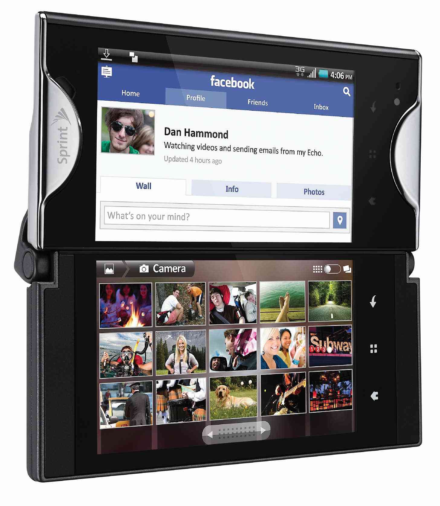
Truly, this isn’t the most memorable smartphone design for most people; however, when I think back to unique smartphone designs, the Echo is always the first to come to my mind. At the time this phone was being sold, I worked at Sprint. This phone was cool in theory but was the source of many headaches for Sprint customers and employees alike. This phone was constantly coming in with issues or cracked screens, which can be particularly troublesome when your smartphone’s screen and keyboard are both screens. It was also pretty mid-range in specs, so it wasn’t a top-performer to begin with.
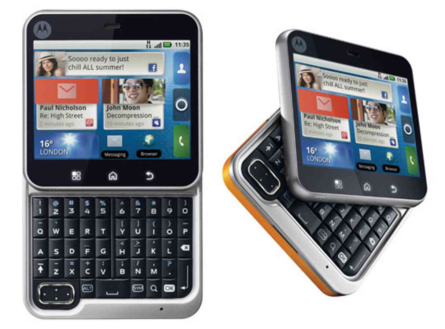
During this sensitive transition between feature flip phones and smartphones becoming the new norm, it wasn’t too uncommon to see smartphones with flip mechanisms in order to keep it compact (compact phones were still trendy at the time). The Motorola Flipout was one such phone that had a unique flipping mechanism to either hide or produce the physical QWERTY keyboard. This was a phone that I almost purchased for myself, but decided against it in favor of the first Samsung Galaxy.
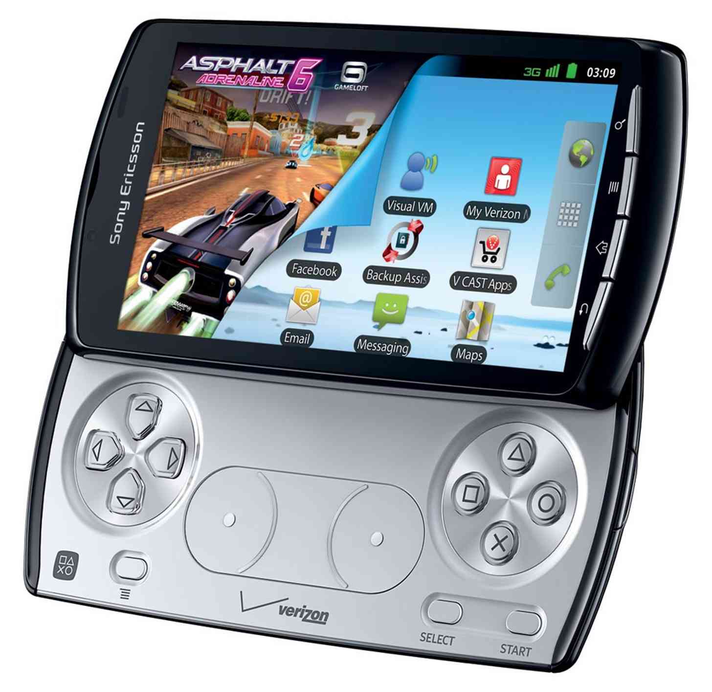
A phone that never gained much traction, the Xperia Play was one of the most unique smartphone designs back in the day. Sony was a big name in the gaming world due to the PlayStation, and Sony Ericsson was also big in mobile at the time. It didn’t seem too far-fetched to attempt to combine the two as mobile gaming started gaining traction with smartphone apps.
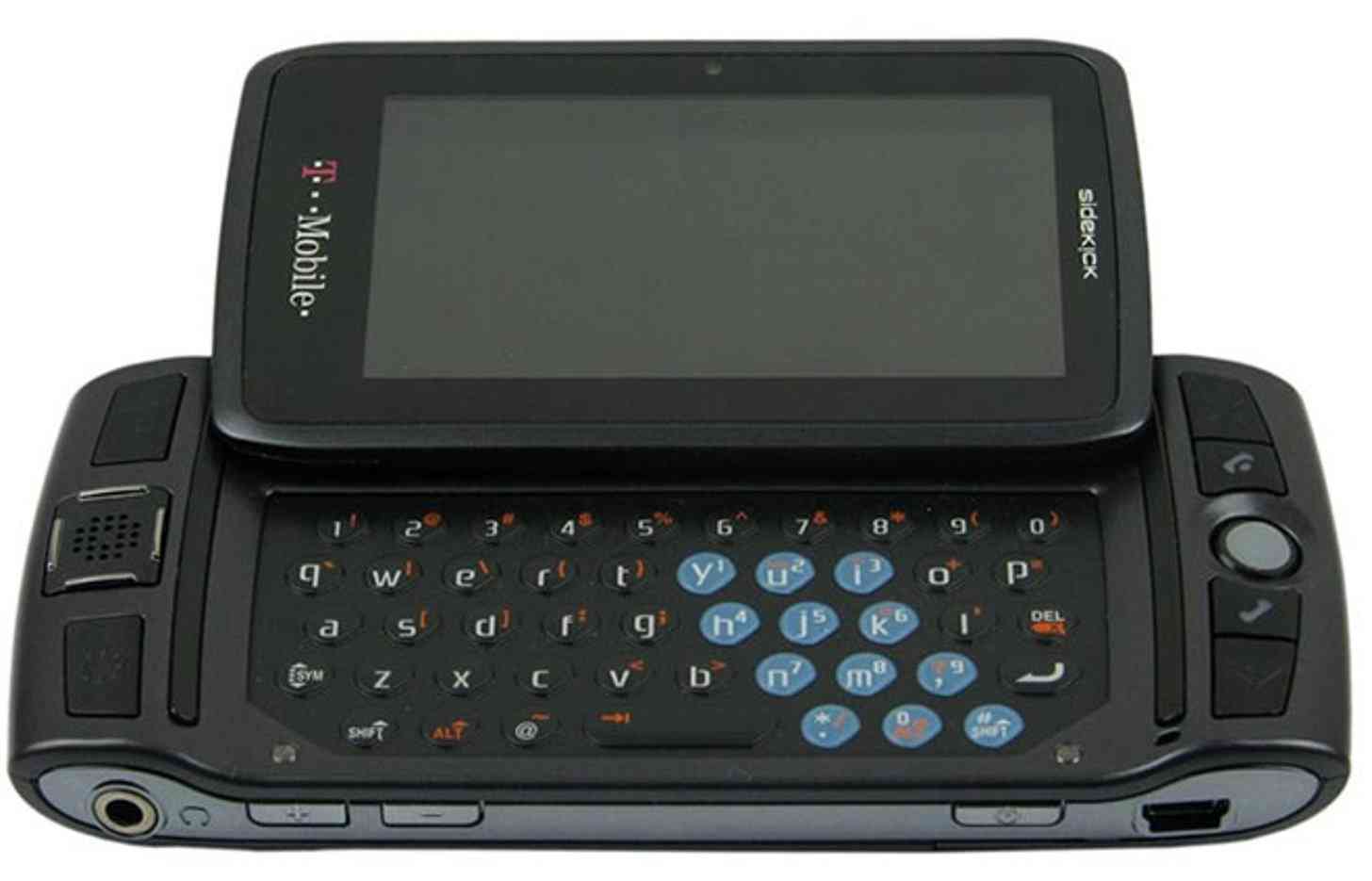
I don’t know why, but I had always had a certain fondness for the T-Mobile Sidekick. I think the first time I ever saw one was before I had a cell phone of my own (so before they actually qualified as smartphones, but they eventually evolved into it), but I remember asking a co-worker “what handheld she was playing on” and she laughed and said it was her phone. My mind was blown. I never did buy one.
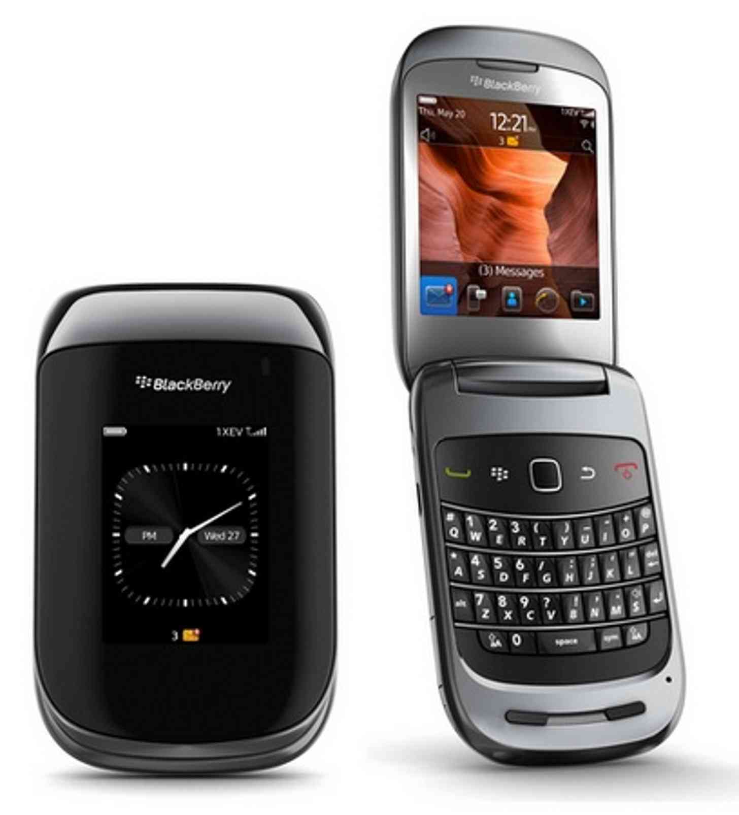
BlackBerry forayed into flip versions of its once-popular smartphone line at least a couple of times, but my favorite iteration was the BlackBerry Style. It was slim, compact, and in my opinion looked pretty good, too.
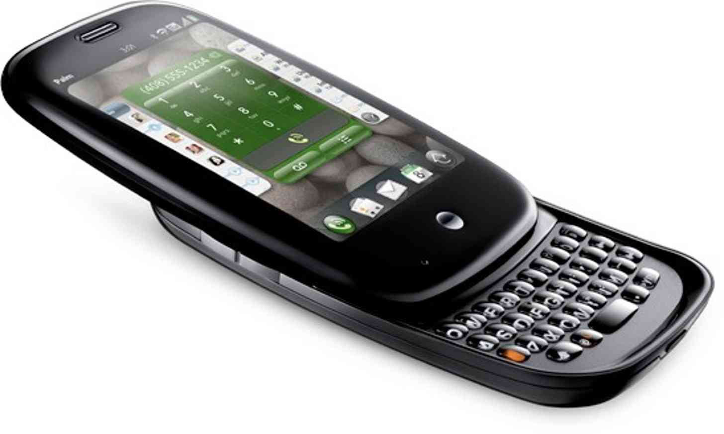
Ah, webOS, how I occasionally miss thee. I initially hated the design of the Palm Pre because of how rounded and sloppy it was, but I still recognized that it was innovative. I was a much bigger fan of the Palm Pixi, which traded the slide-out keyboard for a candy bar style. The thing I liked most about the Pre and the Pixi (as well as other Palm products) however, was the rubberized keys on the keyboard. Most smartphones didn’t have keys that worked well with longer nails, but Palm’s keyboards worked very well with nails.
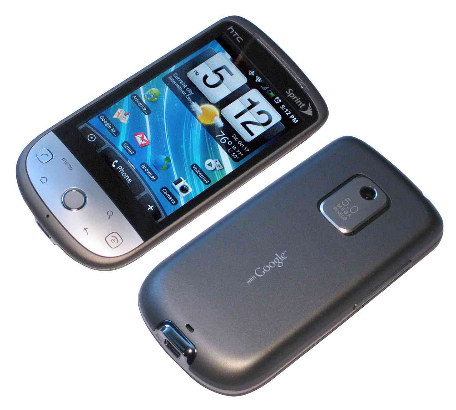
The Hero was one of Sprint’s flagship smartphones once upon a time, and despite its superior performance I just couldn’t get past the weird way that the phone looked. Between the weird rounded chin, trackball (which wasn’t uncommon at the time, but I much preferred trackpads), and inconsistency between its physical button designs, I just didn’t like the way it looked. It was still pretty unique, though.
There are plenty more examples out there of smartphones with unique (or just plain weird) designs, so now we want to hear from you, dear reader: Which smartphones have left a lasting impression on you over the past decade? Let us know in the comments below!