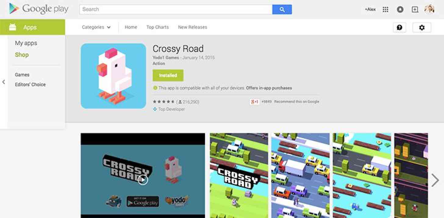
If you use Google Play on the web to install new apps onto your phone or tablet, you may soon see a slightly-updated version of the marketplace appear if you haven’t already.
Some users are seeing an updated version of the Google Play web store that relocates the “Similar” section from the bottom of the app page to the right side, letting users view related apps more quickly. Compared to the old Google Play web store, which you can see below, it looks like the new version also places all of the main app info inside of a white box.

While this Google Play web store update isn’t exactly huge, it does make the shop a bit cleaner and makes it easier for users to find similar apps. That could come in handy if you’re reading the description of one app and you’re not feeling it because you could just glance over and find similar apps to check out.
Have you gotten this refreshed Google Play web store yet?