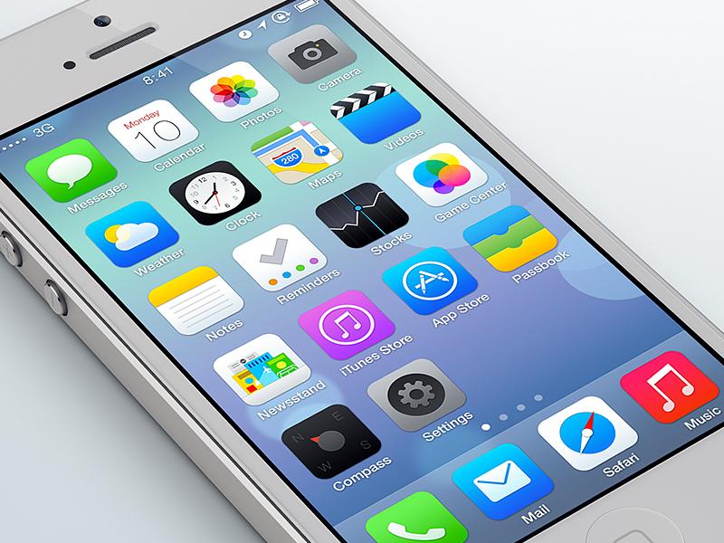
Some of you might remember my recent post that basically said my Moto X is out of commission, and until I can really decide what phone I want to use next I actually decided to backtrack a few phones to the iPhone 4S. Reason being? I have an interest in the iPhone 6, but remembering my distaste I initially had for the design changes in iOS 7 I didn’t want to dive head-first into that decision without making absolutely sure I could deal with iOS 7. After all, I only had a limited experience with the update before making the switch to the HTC One last summer.
After about a week of using iOS 7, I’ve come to the conclusion that it’s workable, but I still don’t really like it. iOS 7 functions well, and if this had been 2011 all over again I think I probably would have been just as thrilled with it as I had been when I used the iPhone 4S using iOS 6. However, that’s not the case, and the design changes between iOS 6 and 7 are really very drastic. Just drastic enough for me to really not like it.
The biggest difference that I noticed is that there is an awful lot of white going on, and there’s not a lot of clear boundaries. Where iOS 6 offered a lot of blue and a bit of depth, iOS 7 just has a lot of stark white and a ton of minimalism. In most areas of the phone I find the layout to be boring. In other areas, like the homescreen, I feel that there is far too much going on. The various brightly colored gradients just don’t look that great to me. Design-wise I feel that there is either too much going on, or too little. I have not yet found an application that is in-between enough for me.
Performance-wise, I can’t say I’m unhappy. I left my iPhone 4S with a sour taste in my mouth, but I also realized that I had nearly two years’ worth of photos, music, and video stored on there that was probably slowing the phone down. I’m also aware that iOS 7 probably optimized the software in order to make it run even better. Either way, I’m starting off using this iPhone 4S with a fresh start, so when it comes to speed and smooth transitioning the iPhone 4S still performs surprisingly well in this department. Battery life still leaves much to be desired, but I fully expected this as it feels like only recently phones have begun to really take battery life to the next level.
Another thing I do like about iOS 7 is the Control Center. The ability to swipe up on just about any screen and activate a flashlight, change the brightness, lock the screen orientation and a few other important toggles makes a world of difference in how user friendly iOS is. Still, these are functions that have been available on Android for a long time, so it’s nothing really new or revolutionary - just a nice addition.
I’m also kind of happy that I don’t have to worry about making my home screens look lovely anymore. For some reason over the years, maintenance of my Android homescreens became less and less of a priority to the point where I just didn’t care anymore. My Moto X homescreen was a mess. Nothing was organized, and nothing made sense. With iOS the apps just go where they go and that’s how things are. I rearrange it so the ones I use most often are on the first home screen, and the ones I don’t use go into one folder. After that it’s just whatever, and it still looks good. That’s always kind of nice.
Overall, I think that iOS 7 brought some good things to the table for iOS, but the design just kind of kills it for me. Is it a deal breaker when it comes to the iPhone 6? So far, not really, but I’m not exactly thrilled to be using it either. I always find pros and cons for each mobile platform, and when it comes to iOS it just so happens that the overall design falls on the ‘con’ side of things for me.
Readers, what has your opinion of iOS 7 been since its release? Did you prefer iOS before, or do you prefer the design now? Let us know in the comments below!