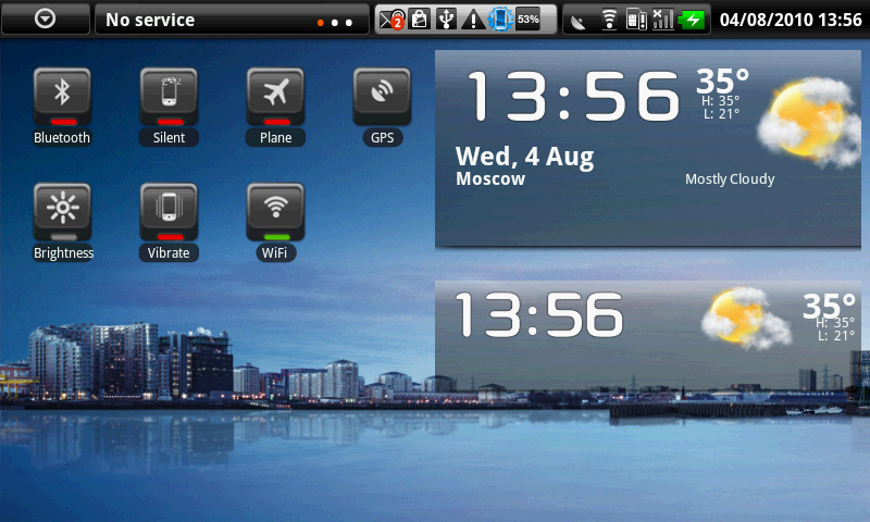
Back when I got my very first Android phone, my Samsung Vibrant, I was completely overwhelmed with how much I could do with the phone. The entire experience was completely different from my Samsung Instinct, or even other smartphones like the Palm Pre or BlackBerry phones. I’ve had touchscreen devices, but what Android allowed me to do was way more than I had ever been able to do on a phone before. It was beautiful, it was brilliant, and it was extremely time consuming. At the time, I spent a lot of my free time customizing my phone.
What most amused me was probably the widgets. I thought it was amazing that I was able to read my e-mails straight from my home screens. On the same screen, I could also read my ever-updating Facebook feed. I also had a cute interactive clock, and on another homescreen I had a calendar widget set up. Instead of just having a homescreen full of applications I could click on, it was full of all of the information I needed at a glance. It was great! Until, for whatever reason one day, it wasn’t.
I don’t recall when it happened, but at some point I decided that I really didn’t like widgets. Perhaps it was the limited view. Despite that widgets did a good job of giving me previews, I found that I generally always needed to open the app anyway if I wanted to get more information, or in the case of social networking, ‘Like’ or comment on a status. It also might have been that I simply liked how clean my iPhone looked when I had it. That’s the first time I remember specifically avoiding widgets - when I returned to Android with the Galaxy S4 and HTC One.
I used my iPhone 4S for almost 2 years. Honestly, it was one of my favorite phones. The retina display was beyond beautiful at the time (it still is, in my opinion), and the phone was still small enough to be considered comfortable in the hand. (I could have done without the glass back, though.) The biggest change moving from Android to iOS, however, was the fact that there wasn’t a whole lot to change. You could rearrange your applications, you could change your wallpaper and ringtones, but other than that there just wasn’t much to it. Some might have considered it boring, but I actually kind of welcomed the change.
After a while, though, I started to get curious about Android again. I liked the iPhone, but iOS 7 was coming and it didn’t impress me as much as I was hoping. When I switched back to Android, I realized that I actually really liked the simplicity of the iOS layout. So I stuck to it. No more widgets for me; I just wanted the apps I used most on one homescreen. What I do like more about Android is that I could stick everything I didn’t want in the app drawer, which is a big plus for me. I know it’s not much different than scrolling 3 or 4 pages to the right to find an app, but for some reason it just seems more tidy.
I also like having the option to customize further should I ever decide to. But for now, I have no desire to use widgets. I don’t use a calendar, e-mail, Facebook, or even a clock widget anymore. They look pretty, but are they all that useful? For some people, maybe. For me? Not really. As boring as it might sound, for the most part, I prefer my Androids without the pizzazz.
Android users, what about you? When it comes to widgets, do you use them often? Or do you find that you skip out on using widgets as well? Let us know your thoughts in the comments below!
Images via No Brainer App Reviews, Being PC