Ever since the CyanogenMod team announced last year that it would be forming its own company known as "Cyanogen Inc.," it's been pretty busy making big moves and establishing itself. It launched a one-click installer, partnered with Oppo on a special version of the N1 and then teamed up with OnePlus to create "CyanogenMod 11S" for the upcoming One smartphone. Today Cyanogen Inc. unveiled another piece of big news: its new branding.
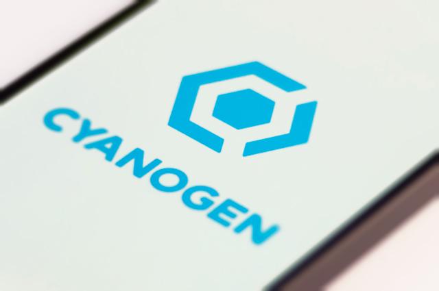
Cyanogen Inc. has introduced a new logo and brand that takes cues from its old CyanogenMod branding but also features a new design to help the the company stand out with its own identity. The firm went on to explain that choice was always a big deal to CyanogenMod and that it'll continue to be important to Cyanogen Inc. It wants users to be able to customize their device and control their data, and it promises that choice will always be an important part of its mission.
As for Cid, the CyanogenMod mascot has been replaced by a screw-like logo that has a secret meaning. The center of the logo represents the user and his or her importance to Cyanogen Inc., the blue "C" represents both the company and the community that helped make it what it is today and the arrow is pointing forward. Taken as a whole, the new logo represents tools, building and a project that's in motion.
Cid isn't going away completely just because Cyanogen Inc.'s got a new logo, though. Cid represents community, the company has explained, and he'll always be a part of the open source project.
Cyanogen Inc. has come a pretty long way from its early days as a T-Mobile G1/HTC Dream ROM, and it's great to see that the company is thriving and creating a shiny new identity for itself. When it officially became Cyanogen Inc. last year, the firm said that it hoped to eventually become the third major mobile operating system on the market, and while it remains to be seen whether or not that'll actually happen, the team is definitely doing pretty well for itself so far.
![]()