The market is flooded with all kinds of keyboard options, especially on the Android platform. You can swipe, sweep, press, push and talk, and pretty soon you may even be able to just think your texts (probably not). With all of these options available, it's easy for users to become overwhelmed, or not take any of the non-mainstream alternatives seriously. But sometimes you need a change. Sometimes your life requires you to focus on other things and not the keyboard. No, this isn't me saying it's okay to text and drive, but there are instances in which it's nice to have the ability to text quickly, efficiently and maybe even with just one hand. Let me introduce to you FlickKey Keyboard, available as a free downloadable keyboard on Google Play and as a notepad app on iOS.

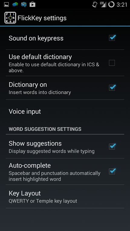
You might be comfortable with the standard QWERTY keyboard found on every other phone, but if you give FlickKey a try, you just might find that typing can get quite a bit easier. Obviously results will vary from person to person, so there's no guarantee that you'll love FlickKey. However, anyone looking to switch from the standard QWERTY keyboard to something a little less traditional should definitely give FlickKey a try.
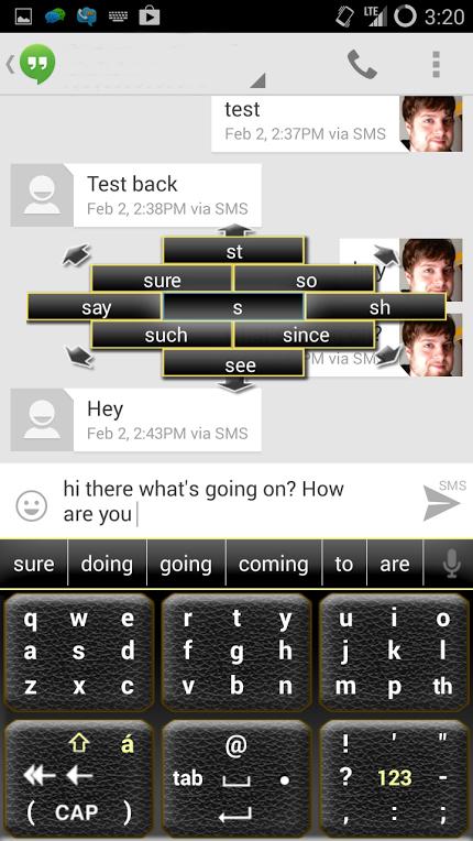
The FlickKey Keyboard is made up of three large buttons that have all 26 letters distributed evenly between them, either in the QWERTY order that we are used to, or in the Temple key layout. The only difference between this keyboard and a regular keyboard is how you activate each letter. Instead of the pushing each letter, you push one of the three larger buttons and then slide in the direction of a particular letter. This input method is much more accurate and decisive that results in fewer mistakes and, with time, faster typing.
When you hold down a key for a moment, a popup window will appear above the keyboard filled with words that correspond to whichever of the three large keys or letters you have pressed. At first glance this seemed like any other predictive text system. But where other systems will offer words that they think you might need, these popup flick-keys offer the same words every time for whichever letter or key the user presses. This makes creating whole thoughts and sentences without looking possible, and is a really neat feature. One, that I might add, I didn't understand at first, but really enjoyed after a little practice.

FlickKey's presentation style is a winner in my book. Keyboards are often confusing or too flashy to be considered practical. In this case, FlickKey is simple to use, looks great and it doesn't feel like it's intruding on whatever app you're using it with. While it would be cool to see some downloadable color or theme options, FlickKey looks simply great as it is.
The Wrap-Up:
The Good: With practice, FlickKey became easy to use and efficient. It works well in all different apps and it doesn't feel like it's trying to steal the show with too much flash or user interface tweaks.
The Bad: FlickKey has a learning curve that some users won't understand. More customization options would be great.
The Verdict: For any users that want to get away from the traditional QWERTY-style keyboard, I recommend giving FlickKey a try. With some practice, it becomes easy to use use and can be far more efficient than other options. Be sure to check out FlickKey on Google Play and the App Store and then let us know what you think!