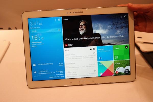
CES 2014 is in full swing right now, and with yesterday being Day 1 we had a lot of new ground to cover when it comes to anticipated tech we'll be seeing in 2014. We were able to see plans from companies like Pebble with their new Steel smartwatch, Meizu with what they'll be offering in the U.S. later in 2014, and were also able to get some sneak peeks at some changes coming from Samsung. While one of the changes is so far just a (rather believable) leak of a design change in TouchWiz, we also saw some change in the form of their new Galaxy Tab Pro tablet series.
The Galaxy Tab Pro is a new tablet line that we haven't seen from Samsung before, but there are certain design elements of the tablet that you are likely to recognize. All four iterations of the tablet, ranging from an 8.4-inch screen all the way to 12.2-inches, have the same pleather backing that we saw unveiled with the Galaxy Note 3 late last year. The devices also feature the same three buttons that most Samsung Galaxy products feature recently, which would be the physical home button in the bottom center, surrounded by two capactive buttons on either side: a menu button on the left and a back button on the right. White and black seem to be the colors of choice for this tablet line.
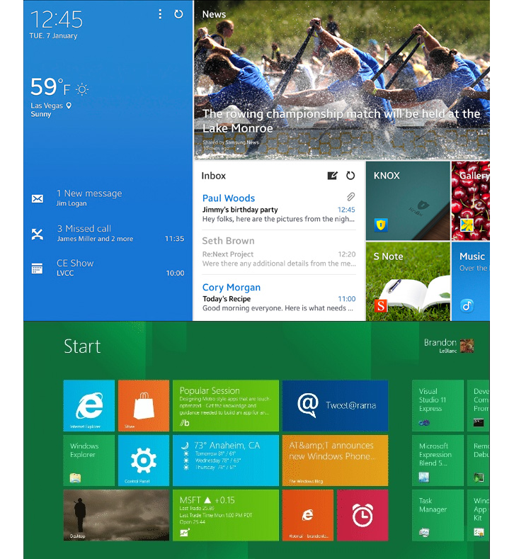
What isn't left the same is the UI used on the tablet. With the unveiling of the new line of tablets also came the reveal of Samsung's new tablet-specific UI dubbed "Magazine UX". While this design looks different from what users are typically used to seeing from Samsung's most popular devices, which run on TouchWiz, it's not exactly something that's never been seen before. You might recognize the elements that make up Magazine UX from another less popular mobile platform. Can you guess which one?
If you guessed Microsoft's Modern UI seen on Windows 8 devices, congratulations! You're absolutely right.

The new tablet-optimized UI struck me as familiar the second I started watching our hands-on video yesterday. Magazine UX doesn't do a very good job of hiding the similarities. What has been described as "moving interactive tiles" seen across the homescreen of the tablets is just a fancy way of saying... can you guess? Live Tiles! But while the homescreens of Magazine UX might (somewhat strongly) resemble Metro UI with some TouchWiz undertones, Samsung doesn't really seem to care. According to an interview conducted by TrustedReviews, when questioned about the design and functional similarities between the two UIs, Samsung brushed it off.
“I don’t think it matters [that it looks like Windows],” said Shoneel Kolhatkar, Samsung’s Senior Director of Product Planning. “As long as consumers like it, they can compare it to Windows or compare it to something else.”
I read that and I think my eye kind of twitched, because I could almost hear the subpeona hitting Samsung right in the face. Yes, the design is ultimately different (and looks better too, I can't lie) but in the end it seems like it would be a blatant rip-off, and while customers might not care about the interface looking similar to another, I think I might know somebody who might care: Microsoft.
Magazine UX looks good in my opinion, especially for a tablet. It's simple, but not as minimalist as Microsoft went with in Modern UI. Regardless, the functionality and idea is pretty much the same. A rose is a rose by any other name, and so are Live Tiles. Will people love it? Probably. Hell, I even like it. If there's one thing I could say that I dig about Windows 8 products is that the design is fantastic for easy navigation on a touchscreen, so I can't blame Samsung for wanting that for their own. But being bold enough to basically say they don't give a flying fish about the repercussions of ripping off the idea? I guess that's just Samsung - now we get to wait and see how the rest of the story unfolds.
Congratulations on your new baby, Samsung; it's a lawsuit!
Image via Laptop Mag