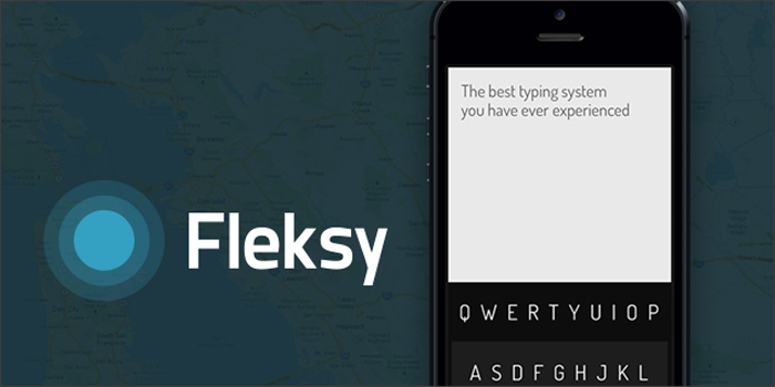
The keyboard experience on our smartphones have evolved from physical to virtual in a very short amount of time. With the transition of smartphones going the way of the virtual keyboard we have continued to look for the keyboard that makes typing tasks that much easier on our devices. While the "stock" keyboardon each platform suits many people's needs just fine, others are on the search for a more seamless experience. We've seen Swype, SwiftKey, and more emerge from third party developers for platforms, and now we have the introduction of a fascinating new keyboard: Fleksy.
So what makes Fleksy different than the others? We pretty much have the whole convenience thing down at this point in several different forms; each of the previously mentioned keyboards all manage to make typing on a keyboard easier to people in one way or another. While convenience isn't necessarily something that's lacking in the alternative keyboard department, one other thing is: wasted space, and Fleksy's job is to take care of the issue of potentially wasted space on two different levels.
Most of the keyboard on our screens take up a fairly large portion of our screens when in use - typically about a third to a half of the screen is used for just the keyboard. When referring to a previous message or website it can be annoying to constantly swipe down on your keyboard to read a snippet of something and then pull it back up to continue writing where you left off at. So how do we take care of the wasted space? Well, the first thing you can do is resize the keyboard to be smaller not once, but twice! Three times if you count what I like to call "hard mode", which makes the keyboard completely invisible.
But "hard mode" isn't exactly as hard as it sounds.
Although it might be strange to know that the keyboard isn't visible, it's even stranger that alongside my own experience with it, the Fleksy keyboard is generating rave reviews on its autocorrect performance. I don't know what kind of dark magic the creators at Fleksy are using, but it has been proven time and time again that the autocorrect feature on this keyboard is about as good as good can be. Although you can make the keyboard completely invisible, Fleksy seems to have this crazy knowledge of what you're trying to type even if you completely mistype the word.
Fleksy is actually pretty on par, if not better in some ways, than the Minuum keyboard that I wrote about not too long ago. While Minuum also strives to provide simplified typing within a limited amount of space, Fleksy takes it a step further by allowing the entire keyboard to vanish while still being available to use. Also, Fleksy takes it a step further by allowing you to turn on the "Invisible Keyboard" settings, which gives you a full screen invisible keyboard that allows you to type wherever - that's pretty cool for people who are sighted, blind, or for us rebels who are sick and tired of typing in the same, lower-half-of-the-screen format! Or, you know, for people whose screen only works halfway after their phone had been absentmindedly used as a cookie for milk-dunking.
This keyboard is still in beta, but it's in open beta - which means you can try it out, too! (Available in iTunes for iOS, open beta for Android). For Android users, all you have to do is join Fleksy's Google+ circle and sign up to be a tester.
This keyboard seems really interesting, and I'm excited to see how it plays out once the kinks have been smoothed out in iOS 7 and the official release arrives in the Google Play Store!
Readers, what do you think about the idea behind the new Fleksy keyboard? Do you think that you would want an invisble keyboard to be the next keyboard that you use on your phone, or do you prefer a different kind of keyboard? Let me know in the comments below!
Images via Mashable, Tech Cocktail